Vibrant Clapham Family Home Makeover: Dopamine Décor Meets Joyful Miami & Bauhaus Shapes
Photo credit: Neil Perry Photography
A bold, playful transformation rooted in colour, memory, and family joy
What do you get when you mix Bauhaus curves, a sun-soaked Miami memory, and two kids with big imaginations? A home that feels like joy on every wall, and this family’s daily dose of colour therapy.
Project Snapshot
Project type: Residential
Location: London, United Kingdom
Scope: Full-home interior design & colour strategy
Timeline: 3 months (design + execution)
Interior Design Style: Miami nostalgia meets Bauhaus geometry
Highlight Features: Bold colour blocking, kid-personalised rooms, statement stairs, custom carpentry
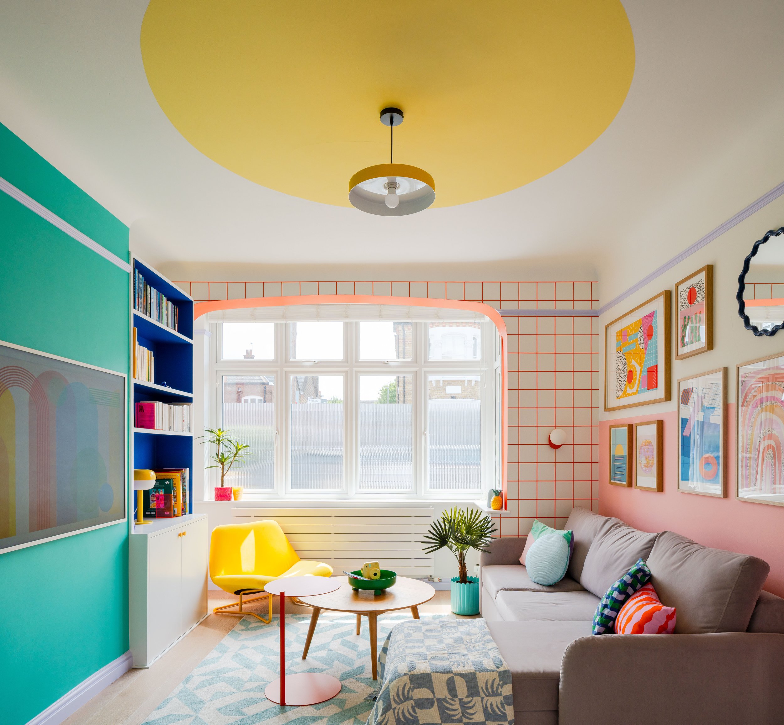
Rainbow Shaker - Welcome to Miami (but in London)!
Initial Challenge: A House Full of Potential—but Low on Energy
When I first stepped into this South London home, the structure had promise—but the mood was unmistakably… grey. The walls were neutral. The atmosphere was flat. The house didn’t reflect the family’s big-hearted energy, and after years of telling themselves they’d “get around to it,” the space was starting to weigh them down.
One parent, working from home every day, admitted the environment was draining. The rooms weren’t just uninspiring—they felt disconnected from who they were: a family full of imagination, humour, warmth, and love.
They wanted light. They wanted joy. But more than anything, they wanted their home to feel like theirs.


My Approach: Designing from Memory, Not Trends
I always start with empathy — I walk, sit, lie down, and follow the morning rush and bedtime routine to understand how the space flows (or doesn’t). The goal is to make the home work for the family, not the other way around.
Then we dig into who they are. Instead of asking the usual “What’s your favourite colour?”, I ask, “How do you want to feel here?” — the aim is to design from memory, not fleeting trends.

In this case, the answer came quickly. The family recalled a holiday to Miami Beach—sun-drenched days, playful colour, and a sense of total freedom. Later, when the client took my Colourful Memory Palette Quiz, guess what came up? Yep. Miami again. Her words? “Joyful, energised, warm.”
That became our emotional blueprint.


From there, we wove those feelings into every decision: Bauhaus curves, colour-blocked walls, sun-inspired zoning, and playful surprises around every corner. Because when a home reflects your story, you don’t just walk through it — you feel held by it.


Bringing the Vision to Life: Room by Room
A Staircase that Says “You’re Home Now”
One of the first design moves we made was reimagining the entry staircase. What was once a bland pass-through became a moment of delight, with custom-designed vinyl risers full of movement, colour, and rhythm. It now sets the tone from the very first step inside.


✨ Shop the Look✨
Love the bold vinyl stair risers from this project? Now you can bring them home! 🌈
🎉 Launch offer: 20% off – limited time only!
To elevate the hallway even further, I worked with the brilliant The Chisel Sisters, a female-led carpentry team, to redesign the under-stairs storage. The original space was a deep, messy closet—frustrating and inefficient. We created pull-out drawers and hidden compartments, turning the area into a streamlined, family-friendly storage system that feels joyful and works hard.


Every Room, a New Emotion
Each space in this house was designed with intention—emotion first, then function, then form.
For the parents, that meant more colour and calm. For the kids? It meant imagination. Big imagination.
The little girl dreamed of a jungle hut. So we built one, complete with timber textures, leafy wallpaper, and tucked-away lighting.


In the girl’s room, we also reworked her existing closet. The original layout wasn’t serving her—so together with The Chisel Sisters, we added drawers, divided the hanging space, and made it easy for a child to use on their own. Practical and empowering.


Her brother wanted a disco vibe—so we gave him colour-blocked walls, glowing lights, and a party-style arched entrance that screams celebration.
Pink, But Make It Personal
One of my favourite design moments? The son quietly confided that he loved pink — but was worried what his friends might think. So, we turned that vulnerability into something empowering. Together with The Chisel Sisters, we built a custom banquette with hidden storage, tucked into a cosy alcove. We lit it with soft LEDs and wrapped it in curtains to create a secret hideaway — perfect for reading, daydreaming, or plotting his next pillow fort.
It’s his safe space. His happy place. A quiet, proud little pocket of self-expression — made real.


Overcoming Challenges with Creativity and Teamwork
No design process is without curveballs—and this one had a few.
With the right team, every challenge became an opportunity to get creative—and to build something even better than the original plan.
Women on Site, Joy in the Process
For this project, I collaborated with the all-female trades platform TaskHer, plus the brilliant female carpentry duo The Chisel Sisters. As a former rocket engineer (yes, really!), I know how it feels to be the only woman in a technical space. So working with women who lead with clarity and care? Game-changing.
And the best part? The kids started shadowing the team, asking questions, helping out, and even declaring their dream careers: one future carpenter, one future designer. Representation really does matter.

The Dream team ✨
Lights That Lead the Story
Lighting was a major focus in this home. One of the family’s biggest complaints was how dark and flat the house felt.
So, we changed that—literally and emotionally. We added ceiling lights, wall lamps, and clever accents throughout.
In the home office, we installed a yellow wall lamp and designed a bold colour-blocked triangle behind it to echo and extend the light beam.


A blue alcove hugs the banquette seat, grounding the desk space and tying into the hanging pendant above. The colours and shapes weren’t just decorative—they were dictated by light itself.


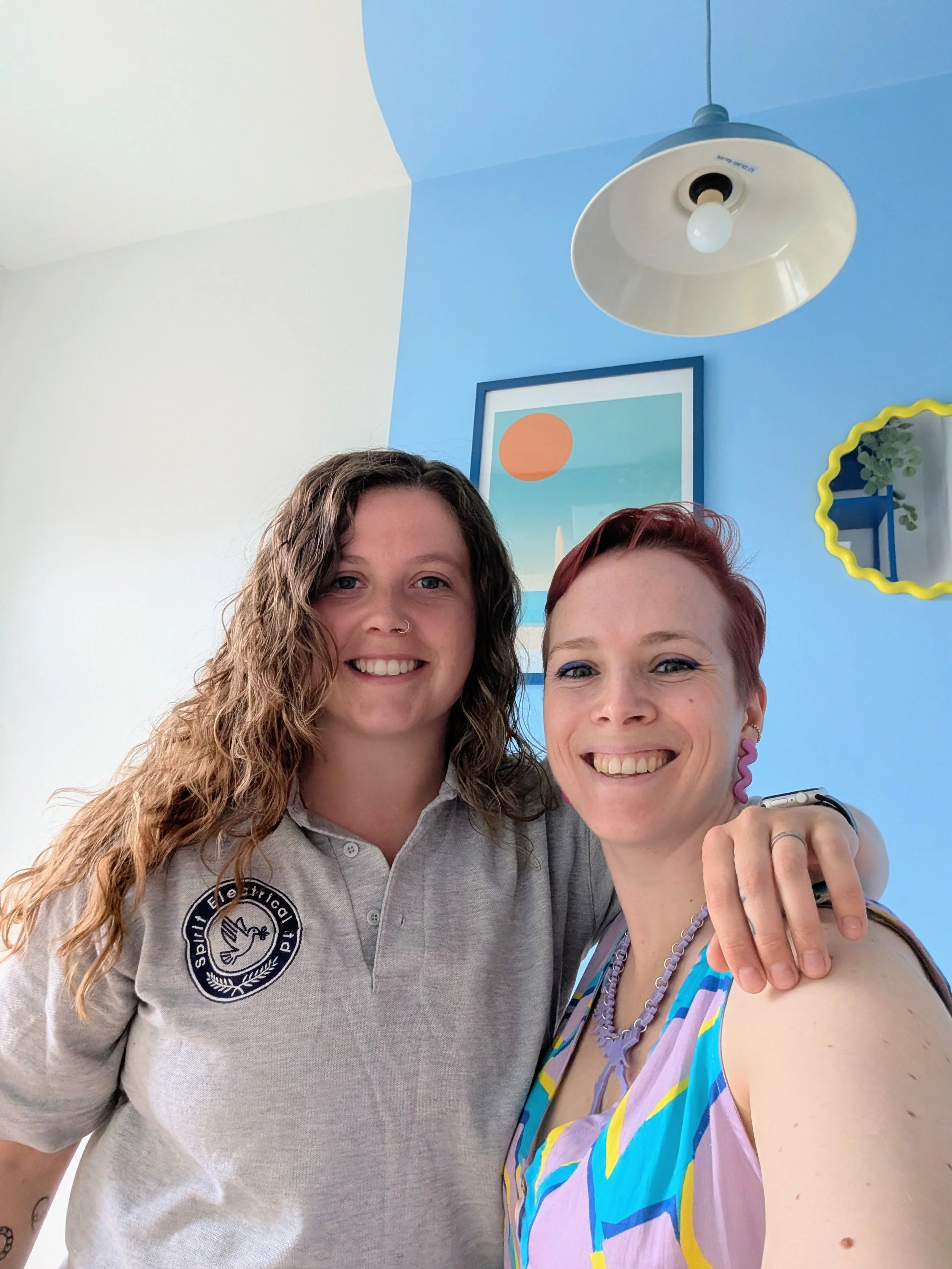
I collaborated closely with our fantastic female electrician, Erin from Spirit Electrical ltd, to get every detail right—and to make each light feel like part of the narrative, not an afterthought.
Decorator Dreams (and Crisis Averted)
I also worked with an experienced female decorator, Sharon, who brought incredible skill—and a seriously steady hand—to the job. Whether it was crisp colour-blocked corners or complex wallpaper installations, she handled every wild request I threw her way like a pro.


One standout moment? The daughter’s bed.
We’d planned to paint it a bold colour—but the paint refused to stick. Our decorator spotted the issue immediately and didn’t move forward until we problem-solved. The solution? Wrap it in vibrant vinyl instead. A simple fix, but one that required care, trust, and clear communication.
What the Client Said

“I had the pleasure of working with Justine who brought both creativity and technical expertise to our project of decorating our Victorian house in a fun, dopamine-inducing way. Not only is Justine highly imaginative, but her engineering background means she’s also exceptionally practical and knowledgeable when it comes to DIY and implementation.
She is flexible, open-minded, and a true professional. One of her greatest strengths is her ability to combine bold design ideas with smart, functional solutions. If you work with her, trust her. For instance, I was initially unsure about the orange square wallpaper she suggested; it turned out to be one of my favourite features in the house.
She works tirelessly, often around the clock, and is fully committed to getting the best possible outcome. Throughout the project, she continually sought ways to improve the work in progress and never once let us down.
I would wholeheartedly recommend working with her. Trust her vision: she knows what she’s doing, and the results speak for themselves. I am beyond impressed.”
The Outcome: Bold Colour Meets Deep Comfort
This wasn’t about decorating—it was about designing a life that feels better to live in.
The home now flows with energy. It supports real routines, real moods, and real people. It’s bold and playful, but also calm and deeply functional. Every curve, every colour, every choice tells a story.
And most importantly? Everyone feels seen in it.
Curious to see more? See the full photo gallery here 🌈!


Ready to Design Your Own Joyful Space?

Whether you’re dreaming of a jungle nook, a disco breakfast, or simply a space that feels more you — I’m here to help!
🌈 Try the free Colourful Memory Palette Quiz to start designing from emotion
📅 Book a free discovery call and let’s chat about your space and story