Fearless Colour: How to Move Beyond ‘Safe’ Neutrals Without Regret
The ultimate guide to making bold, joyful design choices — without second-guessing yourself
Let’s be honest: most of us didn’t grow up in homes filled with cobalt blue ceilings, chartreuse kitchen cabinets, or murals inspired by tropical memories. Most of us grew up in spaces that were... safe. Neutral. “Tasteful.”
We were taught — often without even realising it — that beige = elegant, and colour = risky. We learned that choosing bright hues was brave, even childish. That “growing up” meant toning it down. And suddenly, there you are: staring at a blank white wall, Pinterest board full of neutral inspo, heart quietly craving something more alive.
If that’s you? You’re not alone.

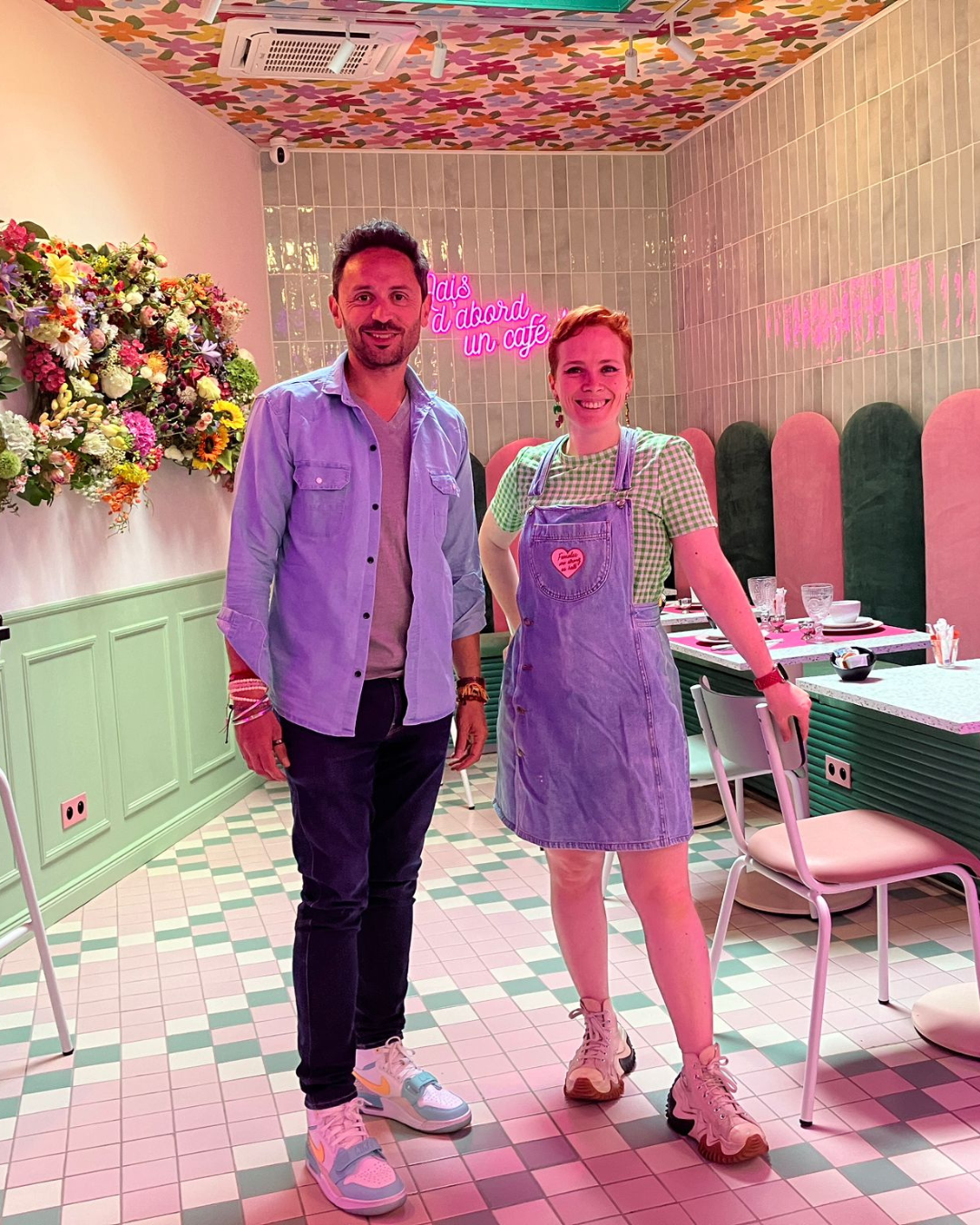
As an interior and set designer who helps people design joyful, personality-packed homes, I hear this all the time:
👉 “I love colour, but I’m scared I’ll regret it.”
👉 “What if I mess it up?”
👉 “I want something fun... but also timeless.”
👉 “I just don’t trust myself with bold choices.”
So let’s talk about it — the real reason colour feels scary, and how to move past the fear without painting your whole house bright red (unless you want to).
💭 First: It’s Not Really About Colour
Let’s start with a little truth bomb: fear of colour isn’t actually about colour.

It’s about fear of regret. Of judgement. Of getting it wrong.
We live in a world obsessed with “good taste.” With resale value. With what the neighbours will think. And in that world, colour can feel like a risk — one that says too much, stands out too far, or can’t be undone.
But here’s what I’ve learned from designing dozens of bold, beautiful spaces for real people:
The only “wrong” design choice… is the one that doesn’t feel like you.
🚦 Why Neutrals Feel Safer (But Aren’t Always Better)

Let’s be clear: there’s nothing wrong with neutrals. Soft, muted palettes can feel calm, grounding, even poetic. But the question is: are you choosing them because you love them… or because you’re afraid of what it means to love something else?
When I dig into this with my clients or students inside my course, Colour Your Home Happy, we often find that the fear of “going bold” is actually fear of:
Being judged (“My friends won’t get it.”)
Making a mistake (“What if it clashes?”)
Committing (“I’ll get bored of it… won’t I?”)
Standing out (“I don’t want my home to be too loud.”)
But here’s the thing. You’re the one living in that space. Every single day. You’re the one walking through the door, waking up in that bedroom, cooking in that kitchen. Not Pinterest. Not your mum. Not your guests.


So if your space doesn’t make you feel good… what’s the point?
🎯 Start With a Feeling, Not a Swatch
The biggest shift I teach? Don’t start with “What colour should I use?”
Start with: “How do I want to feel here?”
Do you want to feel calm in your bedroom? Energised in your kitchen? Supported in your office?
Those feelings are your compass — and colour can help get you there.


In fact, inside the first module of my course, I guide you through a little exercise where you design from memory — not from a trend forecast. You revisit a moment in time when you felt truly yourself. Happy. At ease. Then we pull colour inspiration from that moment.
→ That sunset in Greece.
→ That picnic in the park.
→ That perfect velvet blazer you always wear when you need a confidence boost.
Suddenly, your palette isn’t just a palette — it’s an emotional map. A story. A secret weapon.

🛠️ Tips for Moving Beyond Beige (Without Panic)
Here’s what I recommend if you’re itching to go bolder… but not quite ready to paint the ceiling coral pink (yet):
1. Choose One Feeling to Design For
Not five. One. Maybe it’s “joyful.” Maybe it’s “soothing.” Maybe it’s “bold and a little rebellious.” Whatever it is, let it be your anchor. Every colour decision flows from there.
2. Build a Mini Palette from a Memory
Pick one photo (yes, just one) from a moment that meant something to you. Use a free tool like Coolors.co or Adobe Capture to pull the main colours from it. Now you’ve got a palette that’s yours — not one plucked from someone else’s living room.
3. Start Small (But Start!)
Paint a doorframe. A window ledge. The inside of a cabinet. Buy two colourful cushions. Play! The more you see bold colour working in your space, the more confidence you build.
4. Pick a Room That’s “Just Yours”
Start in a space where no one else gets a vote. Your home office. Your dressing area. Your laundry room, even! Use it as a lab to try something playful — without needing buy-in from the whole household.
5. Remember: It’s Not Permanent
Paint is paint. A mistake isn’t the end of the world — it’s a data point. And with every colour “oops,” you learn something about what works for you.
🌈 But What If I Regret It?
This is the question I hear most.

What if I choose the wrong colour? What if I hate it in six months?
Here’s my answer: that’s totally okay.
Design isn’t about getting it “perfect” forever. It’s about letting your home evolve with you. Your moods, your growth, your changing life seasons.
And honestly? I’ve never had a client regret a bold choice they made from a place of joy.


You might outgrow it, yes. But you’ll remember what it felt like — to choose something that made your heart skip. To create a space that felt alive.
✨ Real Talk: What If People Judge Me?
They might. But also?
They might love it.
They might smile the second they walk in.
They might say “I never would’ve dared do this, but now I want to!”


And even if they don’t — their opinion doesn’t get to matter more than your happiness.

If I had listened to everyone who told me colour was “too much” or “not serious design,” I’d still be designing grey kitchens with white splashbacks and a potted cactus in the corner.
Instead, I’ve built a business on joy. On colour. On homes and hotels and sets that feel like people — layered, imperfect, emotional, human.
🧠 Still Nervous? Here’s a Little Mindset Trick
When I’m helping someone pick colours and I can tell they’re frozen with doubt, I ask:
“What’s the worst that happens if you try it?”
And then:
“What’s the best that happens?”
Try it now, for yourself.
The worst? You repaint. You change your mind.
The best? You fall in love with your space. You feel more like yourself. You start dancing in the kitchen again.

Totally worth it, if you ask me ✨!
💛 You Don’t Have to Do It Alone
If you’ve read this far, you probably feel that pull — toward a home that reflects more of you. That’s not just “nice”… but you.
The good news? You don’t need a massive budget. You don’t need to be an artist. You just need a little clarity, some permission, and a nudge.
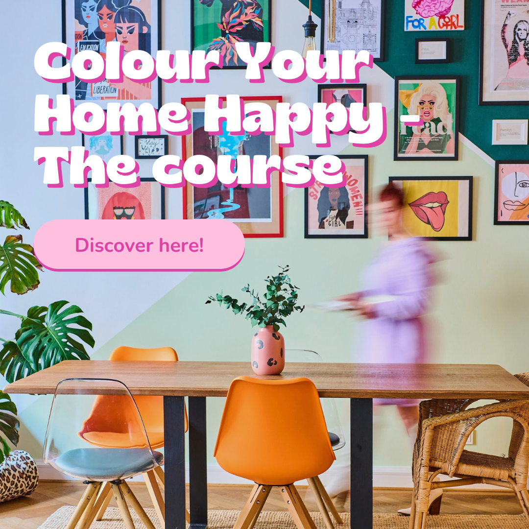
That’s why I created my online course, Colour Your Home Happy — to give you the tools to design a home that feels like yours, not just another beige box.
🌈 You’ll learn:
How to build your palette from memory and emotion
How to use colour with intention (even clashing colours!)
How to create playful zones and highlight what matters
And most of all — how to trust your own instincts
👉 The first video + exercise are free. You don’t need to commit to anything. Just start!
💬 Let’s Keep Talking!
Have you made a bold design choice that felt scary but worth it? Or are you still sitting on the fence, wondering what colour courage might look like?
I’d love to hear your story. Message me, tag me on Instagram @rainbow.shaker, or try my Colourful Memory Palette free quiz to get started with your own colour story.
Just remember: “safe” isn’t always satisfying.
Beige won’t judge you. But it also won’t celebrate you.
So go on — add a little boldness. For you. Just because it feels good.