Blue Monday, But Make It Sunny ☀️
5 Dopamine Colour Palettes to Hack Your Mood (and Your Home) This Winter 🌈
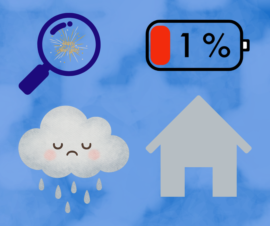
Let’s talk about Blue Monday.

You know — that day in January that’s supposedly the most depressing day of the year.
The one where the sky is grey, your inbox is loud, your house feels darker than usual, and you briefly consider moving to Lisbon / Miami / anywhere with sunlight and good coffee.
Is Blue Monday scientifically real? Debatable.
Does winter gloom feel very real in our homes? Absolutely.
And here’s the thing: while we can’t fast-forward to summer, we can change the way our space makes us feel right now.
That’s where colour comes in.
Not beige. Not “safe greige”. Not “I’ll wait until spring”.
I’m talking dopamine colour — the kind that lifts your mood before you’ve even had your first coffee.
As a colourful interior designer (and former rocket engineer — yes, really), I’ve spent years observing how colour affects our emotions, our energy, and our mental health at home. And winter is when colour matters most.
So today, let’s break down:
what Blue Monday actually is (and why your home feels part of the problem),
why colour is such a powerful mood tool,
and how to use five sunshine-infused palettes to bring holiday energy into your space — without redecorating your entire life.
No toxic positivity. No “just be happy” nonsense. Just colour, intention, and a little joy ✨

What Is Blue Monday (and Why Your Home Feels It Too)
Blue Monday usually lands on the third Monday of January.
The theory goes something like this:
the novelty of the new year has worn off,
daylight is still scarce,
motivation is low,
and your home suddenly feels… a bit heavy.
Whether or not the formula holds up scientifically, there’s a reason the idea stuck: our environments deeply affect our mood.
In winter, we:
spend more time indoors,
rely more on artificial light,
and see fewer natural colour cues from the outside world.
If your interior is already muted, grey, or low-contrast, winter amplifies that feeling of flatness.
The good news? It can also do the opposite.
Why Colour Is a Dopamine Shortcut (Not a Trend)
Dopamine is often called the “feel-good” neurotransmitter. It’s associated with pleasure, motivation, curiosity, and reward.
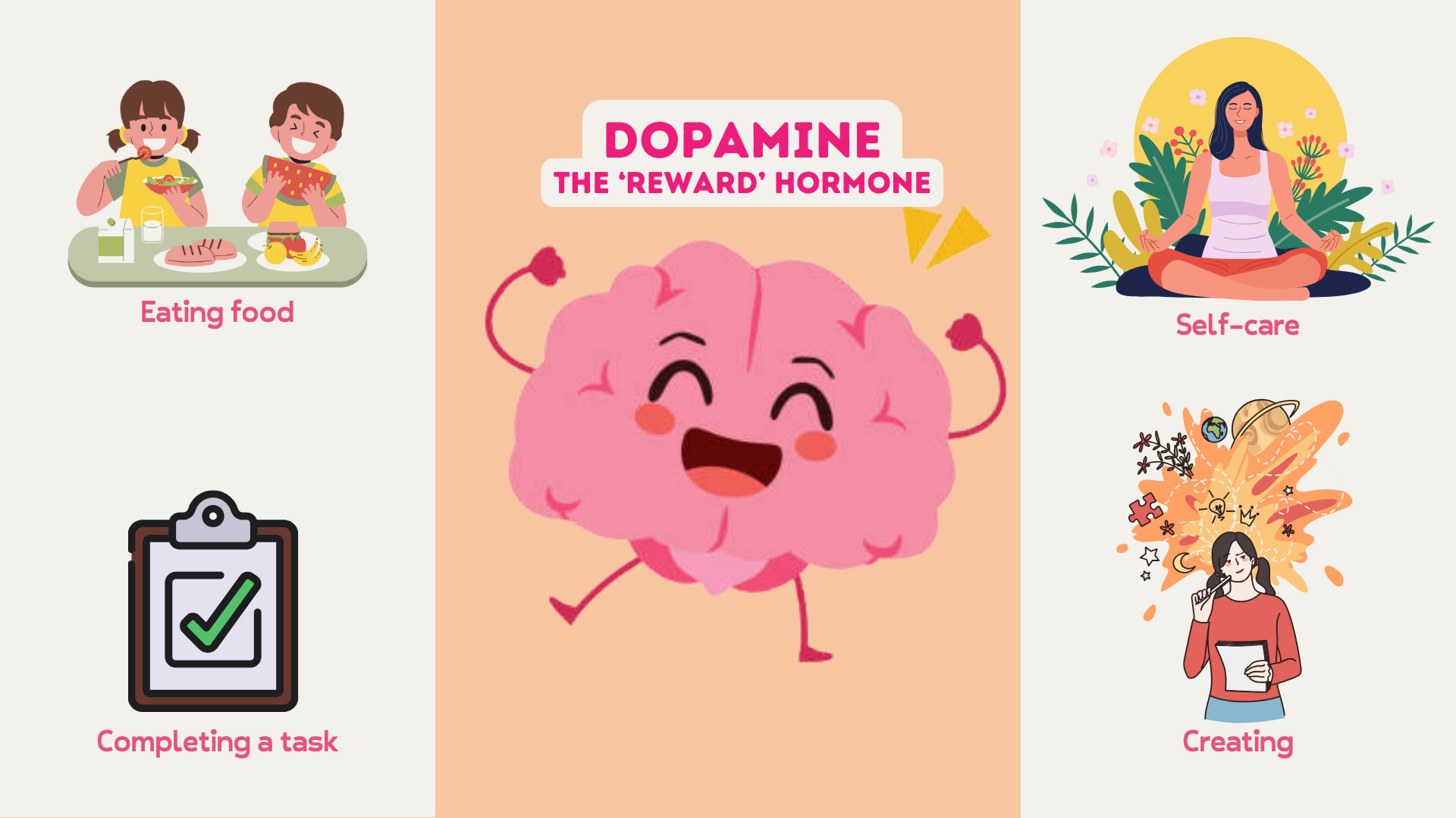
Bright, warm, high-contrast colours can:
stimulate the brain,
increase alertness,
and create emotional uplift — especially when natural light is limited.
This isn’t about painting every wall neon pink (unless you want to — no judgement here). It’s about intentional colour placement.
Colour works best when it’s:
emotionally resonant,
connected to memory,
and used where you actually live.
That’s why many of my projects start with questions like:
What place makes you feel most alive?
What colours remind you of ease, warmth, or holidays?
When was the last time your home made you smile?
Which brings us to… happy and sunny holiday memories.
Why Holiday Colours Hit Different in Winter
Holiday memories are powerful because they combine:
colour,
light,
freedom,
and emotional safety.
Think about it:
sun-bleached pastels,
citrus yellows,
sea-washed blues,
lavender evenings,
warm terracottas at sunset.


These colours are stored in your brain alongside rest, joy, and connection.
When you bring them into your home — even subtly — you’re not copying a trend. You’re activating a feeling.
So let’s look at five dopamine-boosting palettes you can use to fight the winter blues — starting now.
1. Lavender Field Palette
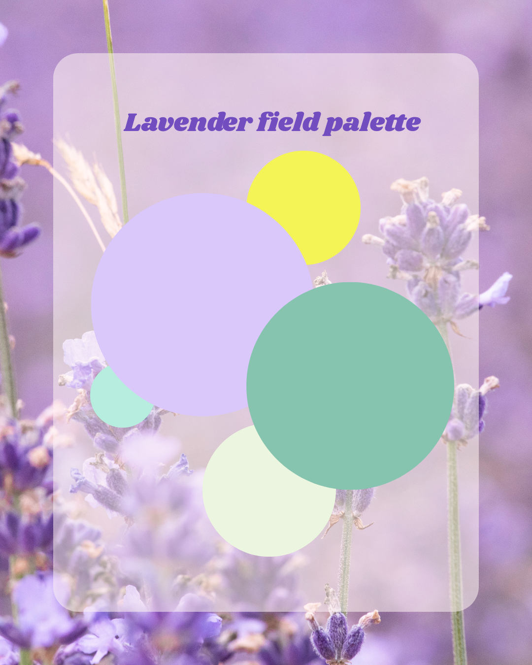
Soft calm with a sunny twist
This palette is all about gentle optimism.
Lavender tones bring calm and softness, while fresh yellow adds just enough energy to keep things from feeling sleepy. Muted greens ground the palette and keep it natural rather than sugary.
Why it works in winter:
soothing without being dull,
light-reflective in low daylight,
perfect for bedrooms, reading corners, or calm living spaces.
How to use it at home:
Lavender on walls or soft furnishings (curtains, cushions),
Pale yellow in lampshades, artwork, or accessories,
Soft sage or mint as a grounding base.
This is the palette for people who want colour — but also want to breathe.
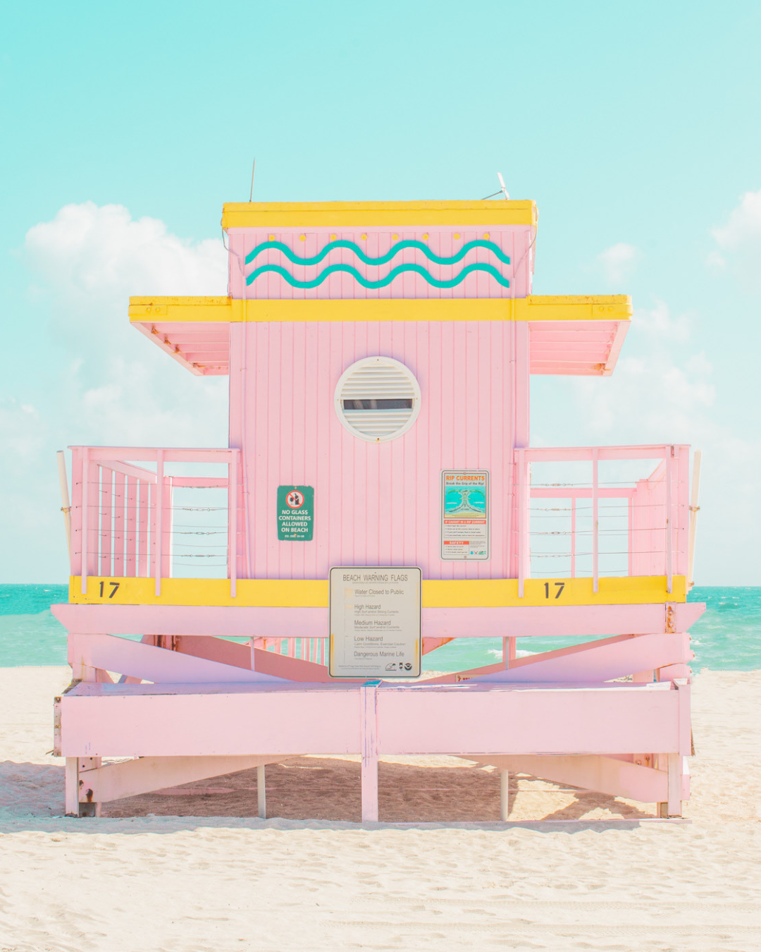
2. Ice Pop by the Sea Palette
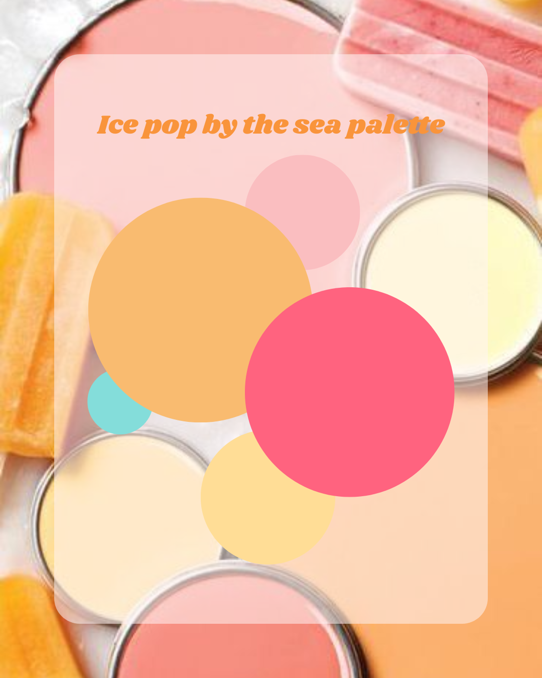
Playful, nostalgic, unapologetically joyful
This one feels like sticky fingers, melting ice creams, and seaside laughter.
Warm peach, coral pink, soft cream, and aqua blues combine into something playful but not childish.
Why it works in winter:
instantly lifts the mood,
high contrast = high energy,
reminds your brain of summer freedom.
How to use it at home:
Perfect for kitchens, dining spaces, or creative rooms,
Try colour-blocking with accessories rather than walls,
Mix glossy finishes (tiles, ceramics) with matte textures.
If your home feels too serious right now — this palette is your permission slip.
3. “Just a Zest” Palette
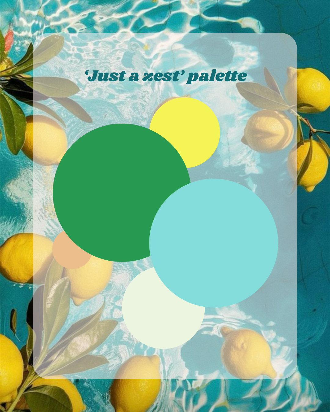
Fresh, sharp, energising
This palette is basically a wake-up call.
Zesty yellow, rich green, aqua blue, and crisp white create a combination that feels fresh, clean, and alive.
Why it works in winter:
mimics daylight energy,
cuts through grey days,
feels optimistic without being loud.
How to use it at home:
Amazing in hallways and entryways (first impressions matter),
Works beautifully in bathrooms or utility spaces,
Pair with plants for maximum impact.
This is the palette equivalent of opening a window and breathing deeply.
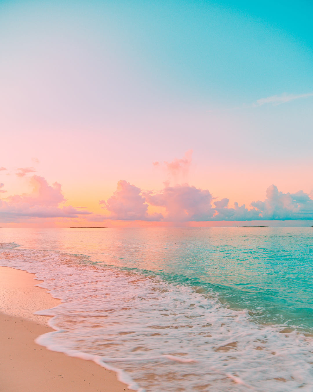
4. Sunset on the Beach Palette
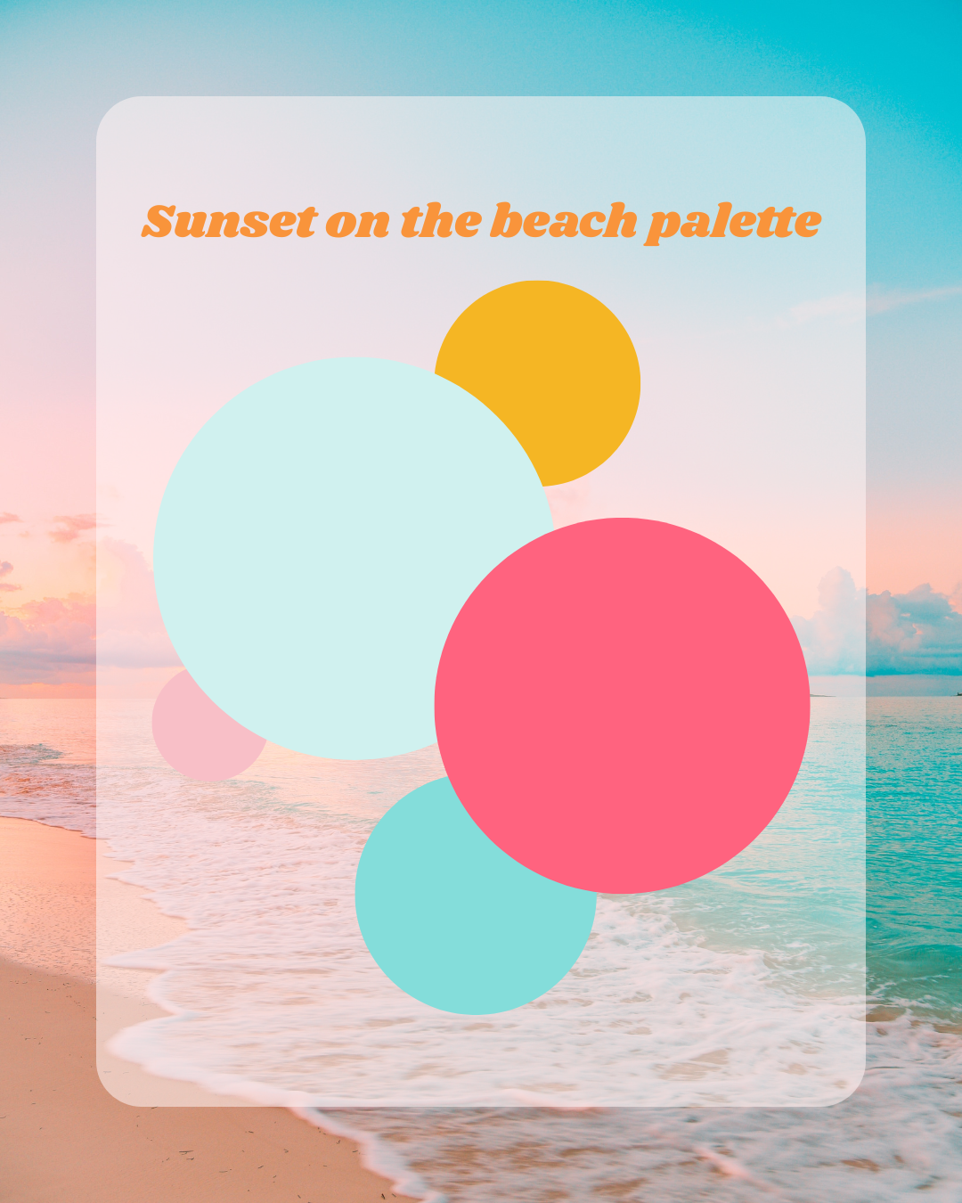
Warmth, comfort, and golden-hour glow
This one is emotional — in the best way.
Soft turquoise, coral pink, warm sand, and golden yellow recreate that exact moment when the sun dips low and everything feels possible.
Why it works in winter:
adds warmth to cold light,
flatters skin tones (hello cosy evenings),
feels comforting rather than stimulating.
How to use it at home:
Ideal for living rooms and family spaces,
Use warmer colours lower in the room to create grounding,
Layer textures: velvet, linen, soft rugs.
This palette is a hug — but make it colourful.
5. Pastis & Gelato Palette
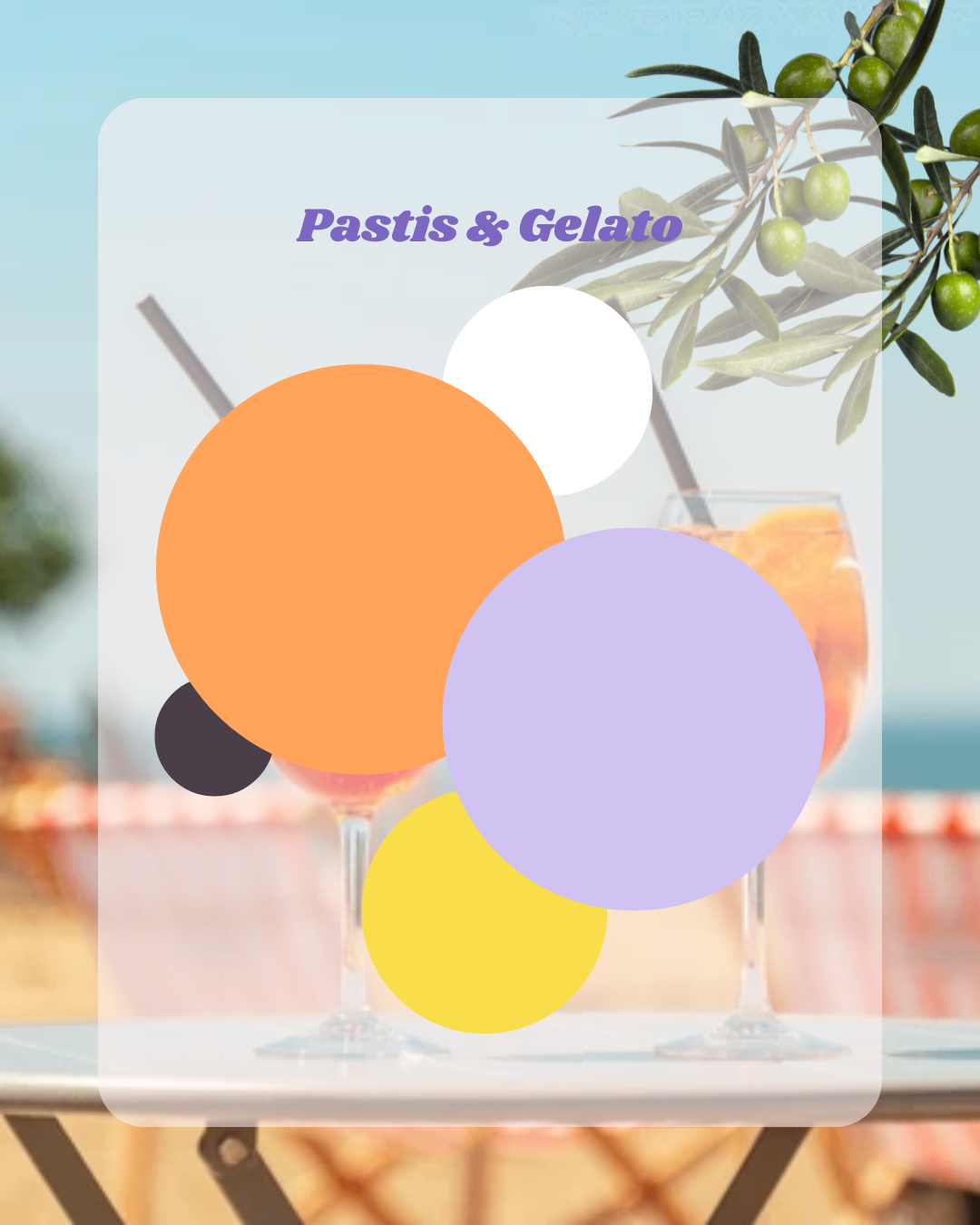
Playful Mediterranean confidence
This one doesn’t whisper. It smiles at you.
Orange, lilac, lemon yellow, crisp white, and deep accents come together in a palette that feels bold but balanced.
Why it works in winter:
replaces grey with personality,
sparks conversation,
makes spaces feel alive again.
How to use it at home:
Great for social spaces or home offices,
Use white as breathing space between colours,
Perfect for art walls, furniture, or statement pieces.
This palette is for people who are done waiting for summer.
Not Sure Which Palette Is Your Palette?
If you’re reading this thinking “I love all of them… and none of them?” — that’s actually very normal.
Colour isn’t about trends. It’s about memory, experience, and emotion.
That’s why I created the Colourful Memories Palette Quiz.
Instead of asking what colours you like, it takes you on a mini trip around the world, exploring places, moods and memories — and translates that into a palette that actually makes sense for you.
How to Use Dopamine Colour (Without Overthinking It)
You don’t need:
a full renovation,
a massive budget,
or a perfect Pinterest board.
If winter has been feeling heavy, you might also enjoy my previous blog post:
The Colour Cure for Winter Blues: How to Brighten Your Home (and Your Mood!) This Season 🌈❄️
In it, I share simple, creative ways to bring warmth, energy and personality back into your home — even when the days are short and the skies are grey.
Think small shifts, low-pressure changes, and colour used as emotional support rather than decoration, like:
cushions,
lampshades,
artwork,
paint a door,
change one wall.
Colour confidence builds through action, not theory.
And if you’re feeling stuck — that’s normal. Most people don’t struggle with taste, they struggle with permission (which, by the way, is exactly what I help with 😜)
Blue Monday Isn’t the Problem. Grey Living Is.
Winter doesn’t have to feel flat. Your home doesn’t have to wait until spring. And colour isn’t something you “earn” after everything else is perfect.
Sometimes, joy comes first —and the rest follows.
If one of these palettes made you pause, smile, or imagine it in your home… that’s not an accident.
That’s your intuition talking. And yes — you can trust it. 🌈
Feeling Inspired… but Not Sure Where to Start?
Most people don’t need more inspiration.
They need clarity, reassurance, and permission.
That’s exactly why I created a few different ways to work together — depending on how hands-on (or hands-off) you want to be:
If you want to DIY, but with guidance:
Colour Your Home Happy is my online course where I walk you through colour, emotion, function and confidence — step by step, without jargon or rules.If you’re stuck or second-guessing yourself:
My 1:1 colour coaching sessions are for untangling ideas, calming the Pinterest spiral, and helping you move forward with confidence.If you want a space designed, minus the chaos:
I also offer remote and full interior design packages, tailored to your home, your life, and your story.
No pressure. No “one-size-fits-all”. Just colour — done in a way that actually feels like you.
👉 You can explore all options here: