Cloud Dancer has spoken: I’ve decided to drop colour 🙅🌈
Why Pantone’s New Colour of the Year Isn’t Your Colour Guide — And Why You Should Choose Emotion Over Trends
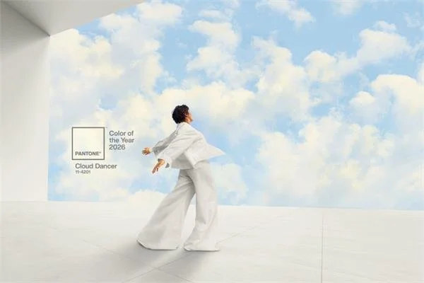
Last Wednesday, Pantone announced the Colour of the Year 2026: Cloud Dancer — a slightly-greyish-not-quite-white that left a lot of people blinking at their screens, unsure whether they had clicked on the wrong post.
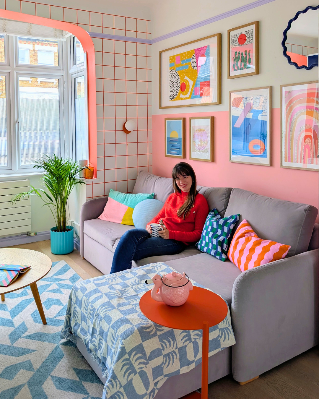
So I did what any colour-obsessed designer would do… I announced that I was officially dropping colour.
Goodbye rainbows. Goodbye dopamine shades. It’s been fun — Cloud Dancer has spoken.
…
…
…
Obviously, that was a joke. But the reaction wasn’t.
I noticed the same pattern everywhere — in comments, stories, design forums, group chats: a lot of people were confused, surprised, or quietly disappointed. Just thinking: “…really? That’s it?”
Because, when the world feels heavy, uncertain, and overstimulated, people crave colours that lift, energise, comfort, or anchor. Not a shade that reminds them of an overcast Tuesday at 4pm.
Colour is emotional — not obedient. And this year, the emotion many people needed simply didn’t match the announcement.
But before we get too deep, let’s back up. Because Pantone’s Colour of the Year is fascinating… and often misunderstood.
What the Colour of the Year actually is (and isn’t)
Pantone’s Colour of the Year isn’t plucked out of thin air.
It’s the result of:
trend forecasting
cultural observation
design research
global mood analysis
and the work of incredibly talented colour experts
It’s thoughtful. It’s studied. It’s meaningful… to Pantone’s interpretation of the world.
Check my podcast conversation S1 Ep23 - ‘Colour Trends Unveiled’ with Marie-Chantal Milette 👇
(Available on Spotify, Apple Podcasts and Youtube)
But here’s the key: Pantone’s Colour of the Year is not a rulebook.
It’s not a decree. It’s not an order to repaint your living room. And it’s definitely not a sign that colour is “out”.
It’s a lens — one perspective of how colour reflects culture.
Why this year’s reveal felt off for so many people
Let’s be real: choosing a nearly-white in a moment when so many crave vibrancy felt… anticlimactic.
Not wrong. Just emotionally mismatched.
Colour psychology tells us something simple and powerful:
When we feel low, our brains seek stimulation.
When we feel overstimulated, we seek grounding.
Colour is a tool that responds to our emotional landscape — not the other way around.
White (and its near-white cousins) often evokes:
clarity
simplicity
calm
neutrality
Beautiful qualities… when you’re in the right emotional place.
But when people feel weary or anxious, muted colours can feel like emotional silence — or even emotional avoidance.
This is why so many people felt disappointed:
They didn’t want a colour that whispered.
They wanted one that spoke to their nervous system.
This isn’t about Pantone being “wrong”.
It’s about remembering that design trends are not emotional trends — and they don’t replace what your home is asking for.
Colour is emotional — not obedient
Here’s the part what we need to understand:
We don’t choose colours because they’re trendy, we choose them because they do something to us.
Colour:
energises
comforts
inspires
grounds
sparks joy
heals
motivates
softens
focuses
uplifts
Your home is, essentially, an emotional landscape.
And the people who feel the most disconnected from their space are often the ones who decorated from the outside in — by following trends instead of following themselves.
An example:
A client once told me she wanted “the neutral Instagram look”. Soft white walls, beige sofa, minimal everything. It was pretty on paper.
But she hated being in her living room. It felt “flat”, “cold”, “empty”.
When we talked, I learned she was a vibrant, funny, expressive person who loved deep saturated colours, bold art, and lively dinners with friends.
Her home wasn’t reflecting her life — it was reflecting Pinterest.
The moment we brought in mustard, deep teal, rust, playful shapes, and warm textures, she told me: “I didn’t know a home could feel like a personality.”
This is why Cloud Dancer cannot define your home. Your emotions, your memories, your energy, your story — that’s the real colour palette.
Trend colours aren’t commandments (and sometimes, they’re distractions)
Every year I see two kinds of reactions:
1. “Pantone said it’s THE colour, so I guess… I’ll use it?”
These are people decorating from a place of pressure or uncertainty.
2. “Pantone said it’s THE colour, so I HATE IT.”
These are people decorating from rebellion, not intention.
Both miss the point.
Trends are invitations — not obligations. They’re insights — not instructions.
And sometimes, the most meaningful colour choices are the ones that would never be chosen by a forecasting committee because they’re too personal, too nostalgic, too emotional.
Your grandmother’s green. Your favourite childhood blue. The red that reminds you of a trip to Marrakech. The yellow that feels like the best version of summer.
So what do you do if you hate Cloud Dancer?
Or if you feel totally confused?
Simple:
Step 1 — Ignore the announcement for a moment
Step 2 — Ask yourself what you actually need from your home right now
Do you need:
Energy? → Bold warm tones
Calm? → Soft greens or blues
Joy? → Bright saturated colours
Grounding? → Earthy hues
Creativity? → Playful contrasts
Clarity? → Light neutrals (yes, including whites!)
Colour serves people — not the other way around.
If Cloud Dancer soothes your nervous system, use it generously. If it bores you, ignore it. If it confuses you, don’t make a decision yet.
Your home is not a press release.
How to choose colours that support your life — not the trends
Here’s a simple, honest framework that I use with my clients:
1. Identify the EMOTION you want the room to create
Not how you want it to LOOK. How you want it to FEEL.
2. Let colour psychology guide you, not dictate you
Different people respond differently. There’s no universal truth.
3. Use your personal history as a palette
What places, moments, objects made you feel alive?
4. Layer meaning through contrast
Your home should have as much personality as your wardrobe.
5. Choose colour with curiosity, not fear
You can always repaint (Cloud Dancer won’t call the police.)
Final Thoughts: Colour is freedom, not a forecast
Pantone’s Colour of the Year is fun.
It sparks conversation. It helps designers frame cultural moods. And Cloud Dancer will look beautiful in many contexts.
But it should never have the power to override your instincts.
Your home deserves more honesty than a trend announcement.
More depth than a yearly reveal. More emotion than a press release.
You don’t need Pantone’s permission to choose colour that supports your life.
Choose colour with intention. Choose colour with courage. Choose colour with joy.
And most importantly: Choose colour that means something to YOU.


