Why Your Room Feels "Off" (And It's Not the Colour) ⚡
The secret ingredient nobody talks about, and why more colour isn't the answer 🌈
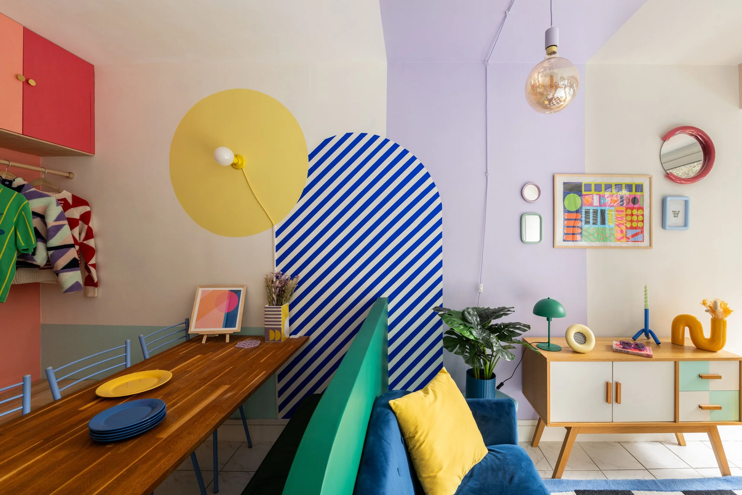
There's a sentence I keep coming back to: A space without contrast is a forgotten space.
And it's absolutely true.
Because here's the thing nobody tells you when you finally pluck up the courage to use colour:
Colour alone isn't what makes a room sing. Contrast is.
You can pick the most beautiful palette in the world, dreamy pinks, deep teals, sunny mustards, and your room can still feel… flat. Lifeless. Like a Pinterest board that didn't quite translate.
And nine times out of ten, when a client tells me "I don't know what's missing", that's what's missing. Not more colour. Not more stuff. More contrast.
So let's fix that!
1. Contrast Is The Secret Ingredient Nobody Talks About 🎭
When most people hear "contrast," they think black and white. Maybe light and dark. Maybe a bold cushion on a neutral sofa.
But contrast is so much bigger than that.
Contrast is tension, the deliberate friction between two elements that makes both of them feel more alive. It's why a velvet chair looks even more luxurious next to raw plaster. Why a curvy lamp feels even more sculptural against a sharp-edged shelf. Why a single fuchsia cushion can save an entire navy sofa from feeling like a black hole.
Without contrast, even the most colourful room becomes a flat wash of stuff. With contrast? Every element earns its place.
Think of it as the signal-to-noise ratio of design (yes, the rocket engineer in me had to sneak in there 🚀). You need quiet moments so the loud ones can sing. You need rough to make smooth feel intentional. You need shadow to give light somewhere to land.
2. The 6 Types of Contrast (And Why You Need All Of Them) ✨
Here's where most people go wrong: they think about contrast in one way (usually colour) and stop there. But a truly alive space layers multiple types of contrast at once.
These are the six I work with on every single project, and the ones I talk about inside Colour Your Home Happy:
🎨 Colour Contrast

Warm vs cool. Bold vs muted. Complementary opposites that vibrate next to each other, like cobalt and mustard, coral and olive, fuchsia and forest green (this is exactly what we play with in Module 2's clashing colours exercise, those "yuck" pairings that turn out to be magic.)
🌗 Light & Dark Contrast
A pale ceiling against a moody wall. A black frame around a soft pastel print. Dark grout under pale tiles. This is the contrast that gives a room weight.
〰️ Shape Contrast
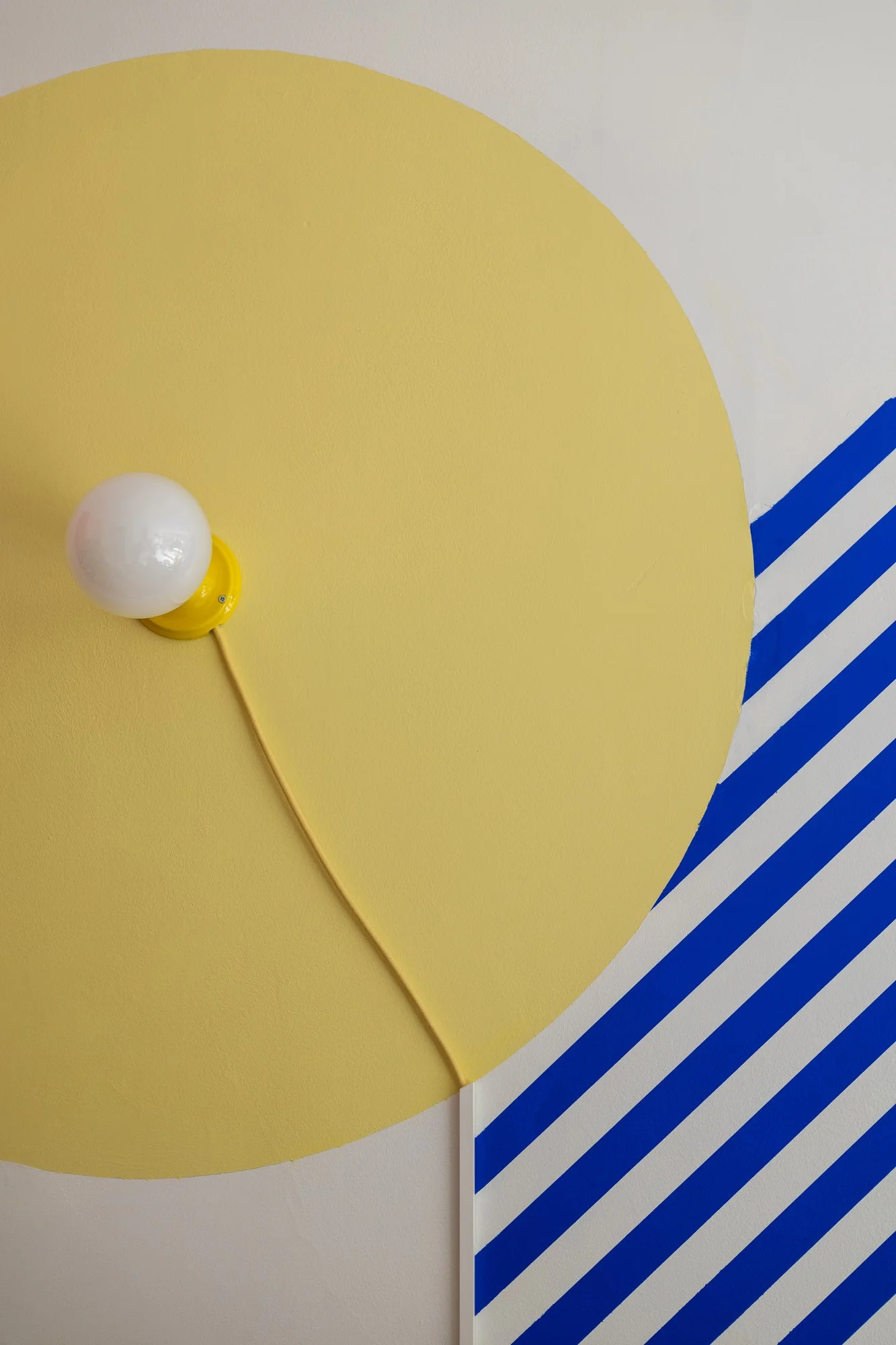
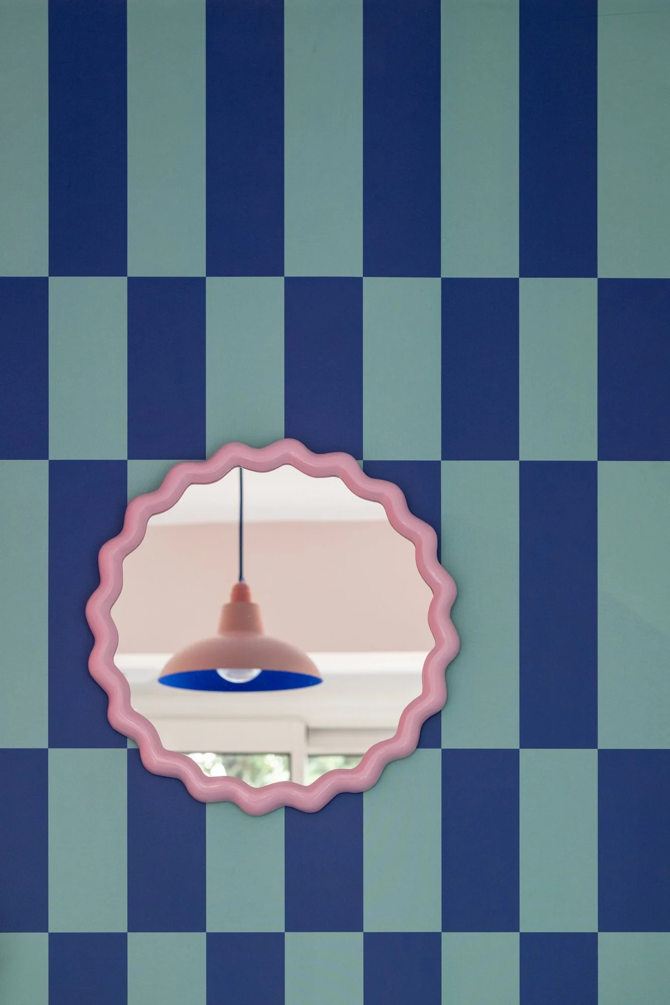
Curves vs angles. Arches softening square doorways. A round rug under a rectangular dining table. A blobby mirror beside a strict shelf (in my course Module 3, I dive deep into this, how cosy zones love curves while motivating zones thrive on angular shapes.)
✋ Texture Contrast
Glossy vs matte. Smooth vs nubby. Polished brass against rough linen. Velvet against rattan. This is what makes a room feel touchable.
⏳ Era Contrast
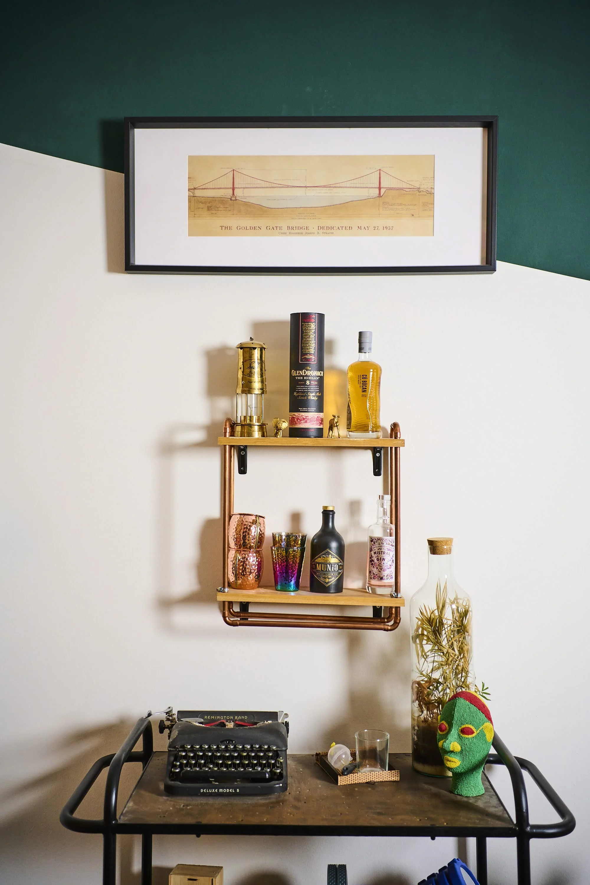
A vintage chair under a hyper-modern pendant. A '70s tile in a brand-new bathroom. Past meets future = personality.
🤫 Loud vs Quiet Contrast
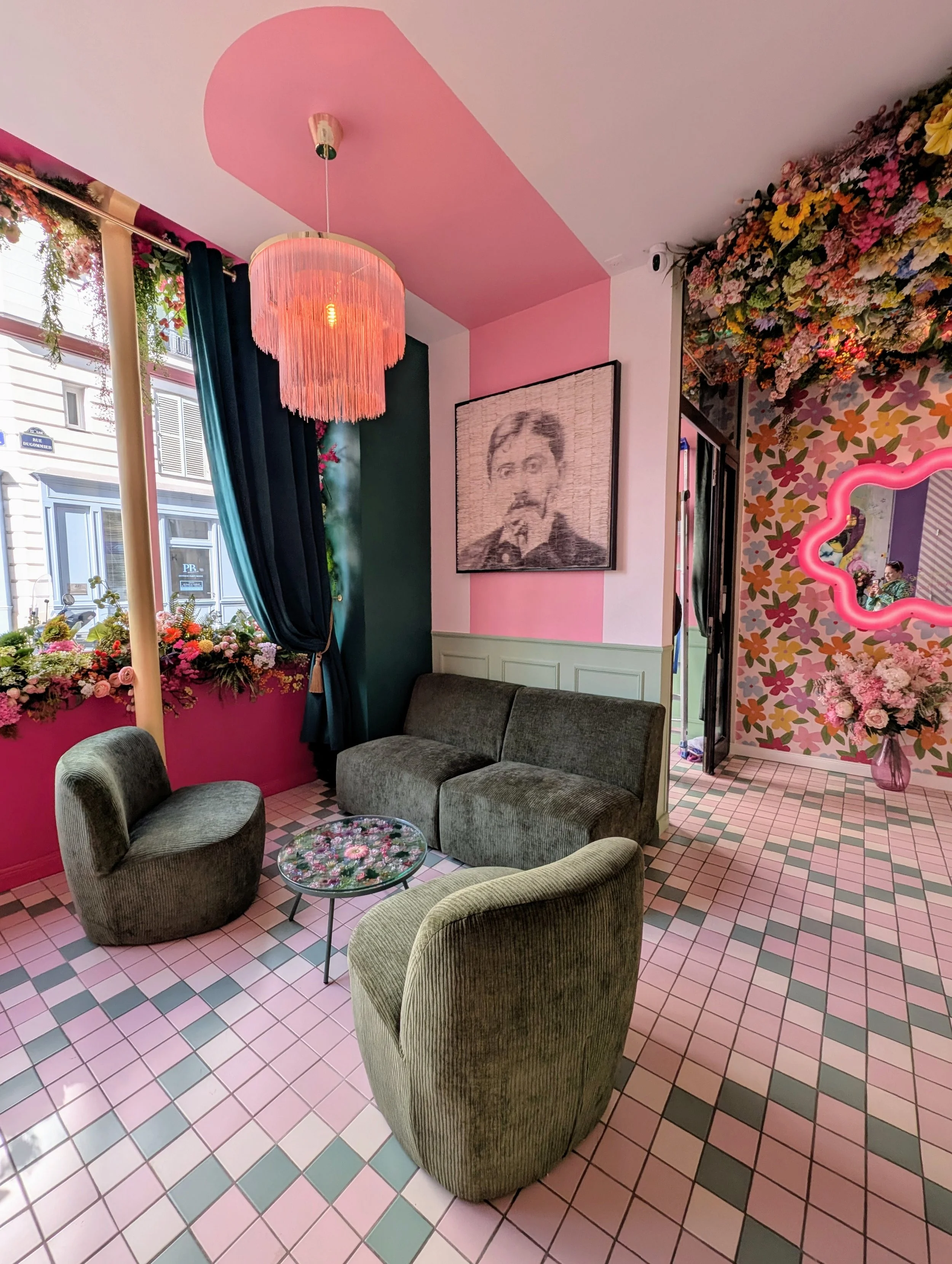
This one's my favourite. Every bold space needs a breath. A plain wall behind a wildly patterned sofa. A calm corner in an otherwise maximalist room. Think of it like the way I personally balance kickboxing with curling up to read, your home needs both energies too. This is where the magic gets a little muffled, when we go loud everywhere, the boldness has nowhere to land. Give it some quiet, and it sings.
The more layers you mix, the richer your space feels. Most "boring" rooms have just one type of contrast. The best rooms have four or five working together.
3. Why "Safe" Rooms Feel Sad (And What's Really Going On) 😴
You know that beige-on-beige-on-beige room you've seen a thousand times on Instagram?
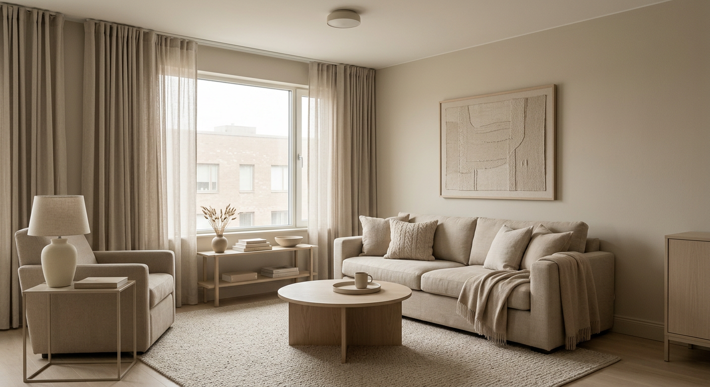
It's not the beige that's the problem. It's the lack of contrast.
Take that same beige and pair it with a black-framed window, a chocolate velvet sofa, a sisal rug, and a single ochre lamp, suddenly you've got a Vogue Living moment.

The colour didn't change. The contrast did.
This is also why so many people end up disappointed after a big paint job. They've finally gone bold — beautiful pink walls, gorgeous green skirting — but they paired it with safe, matching, mid-tone everything else. And the room feels muddy instead of magical.
Tip: if you've gone bold with colour, you need contrast somewhere to set it off. And if you've gone soft with colour, you need contrast even more.
4. The Rainbow Shaker Contrast Test 🌈
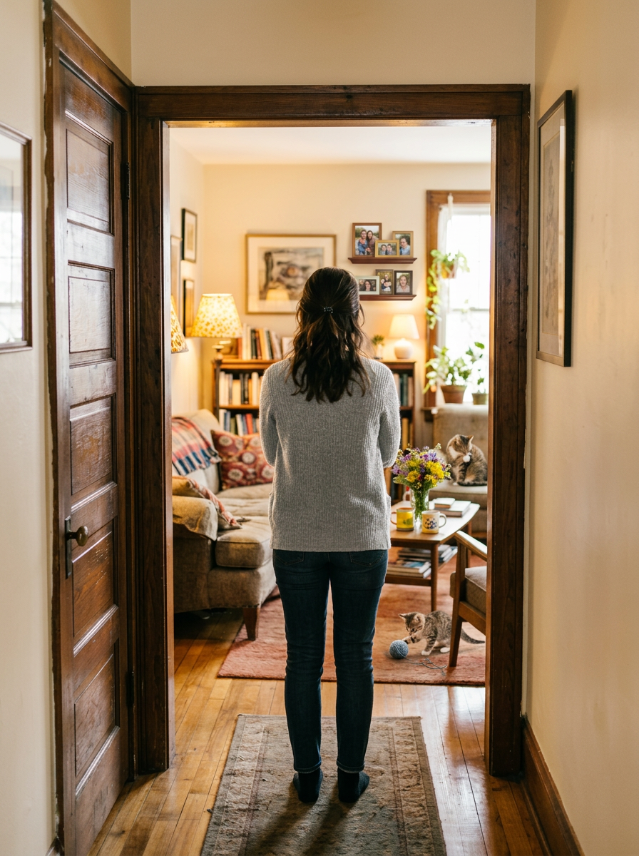
Stand in the doorway of any room in your house. Squint your eyes (yes, properly squint). What do you see?
If everything blurs into one soft mass, you need more contrast. If your eyes find clear focal points, distinct shapes, and a rhythm of "loud, quiet, loud, quiet", you've nailed it.
I do this in every consultation. It tells you in 3 seconds what 30 minutes of staring couldn't.
5. 7 Easy Ways To Inject Contrast 🛠️
You don't need a renovation. You need a few clever swaps:
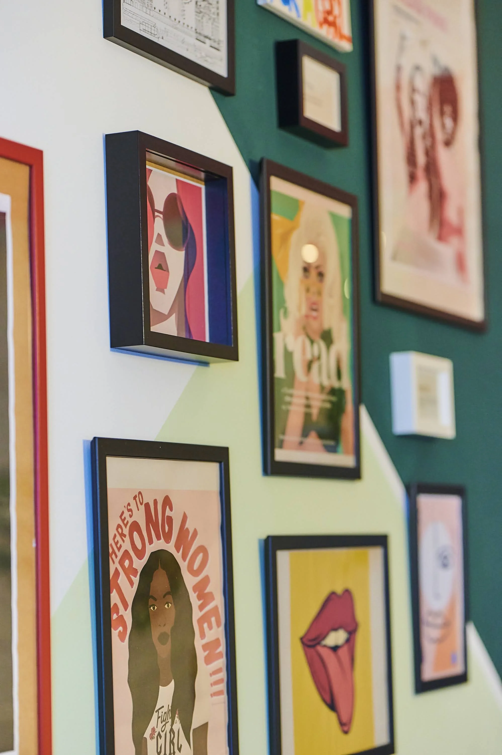
✔ Frame your art darker. Black, walnut, or deep brass frames against soft walls = instant gallery energy.
✔ Paint your skirting bold. Even if the wall stays neutral. Try a deep green, oxblood, or chocolate against pale walls.
✔ Mix one curve into a square room. A round mirror. An arched headboard. A blobby rug. Just one.
✔ Add a high-shine moment. Glossy ceramic, mirrored tray, polished brass — anywhere the rest of the room is matte.
✔ Drop in one vintage piece. An old wooden stool. A '70s lamp. A second-hand frame. Era contrast = soul.
✔ Create a quiet corner. If your room is loud everywhere, leave one wall, one shelf, or one chair deliberately calm.
✔ Use the "ugly pair" trick. Combine two colours that "shouldn't" work — terracotta + lilac, olive + pink, mustard + teal. The tension is the point.

Final Thought: Contrast Is Permission 💫
Here's what I want you to take away:
Contrast isn't a rule. It's a permission slip.
Permission to mix the old chair with the new sofa. Permission to paint the door a colour that "shouldn't" go. Permission to leave one wall bare in a room full of pattern. Permission to be unexpected.
Because a space without contrast is a space we forget. And your home? Your home deserves to be remembered. By you, by your guests, by every version of yourself walking through that door 🌈.
🌈 Want to learn this properly?
Everything I just covered is part of a much bigger framework I teach inside Colour Your Home Happy — my online course where I walk you through designing spaces that aren't just beautiful, but emotionally yours. From building a colour palette rooted in your memories, to playing with clashing combos, to mastering shapes, sensory layers, and personal storytelling — it's the whole toolkit, the way an ex-rocket-engineer-turned-colour-obsessed designer would teach it ✨.
Or if you'd prefer a tailored approach for your space, book a free Discovery Call and let's chat.