My Honest Report from Paris Design Week + Maison & Objet 2026
The trends I loved, the craft I couldn't stop touching, and one wildly unexpected direction interior design just took
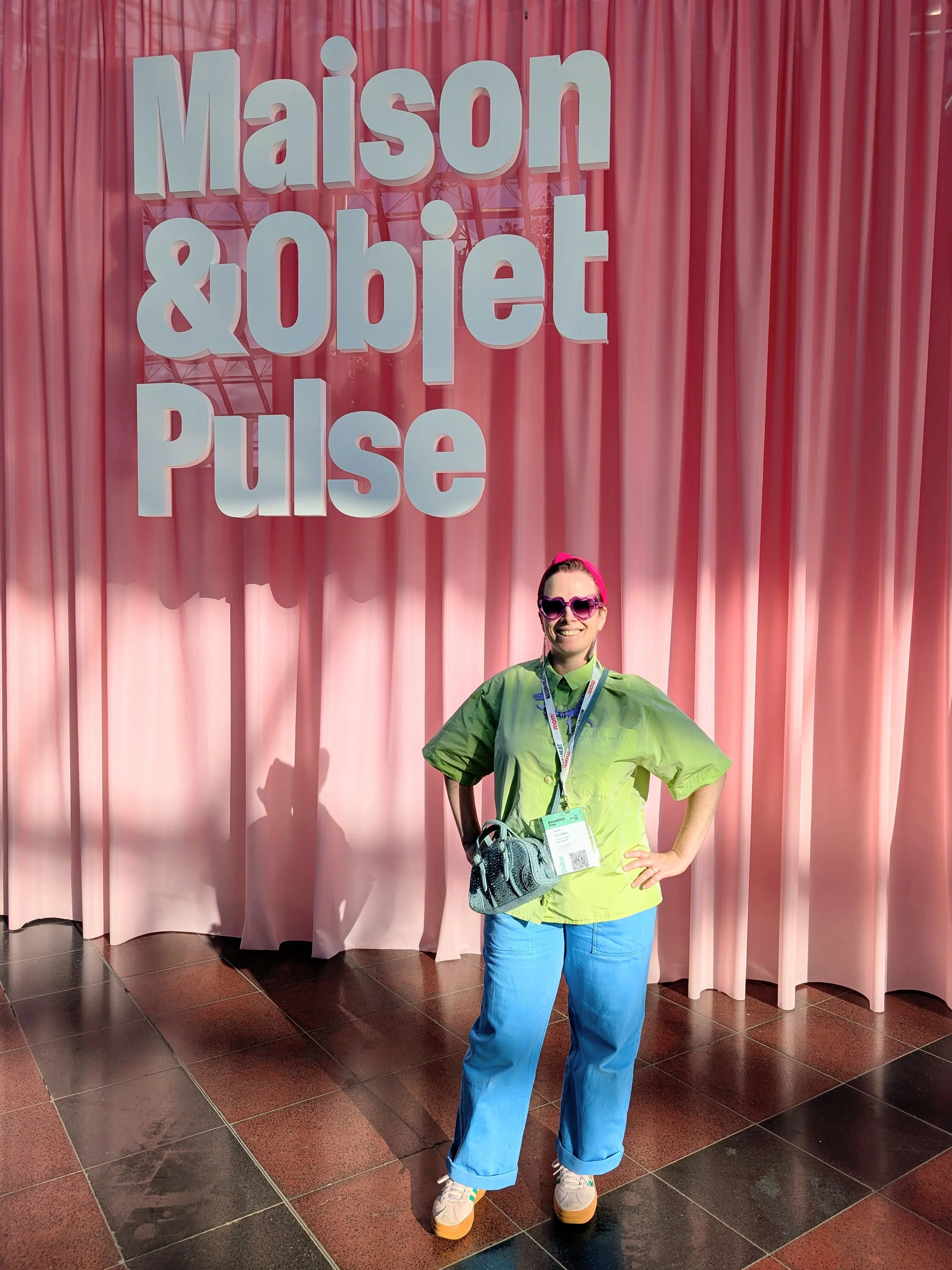
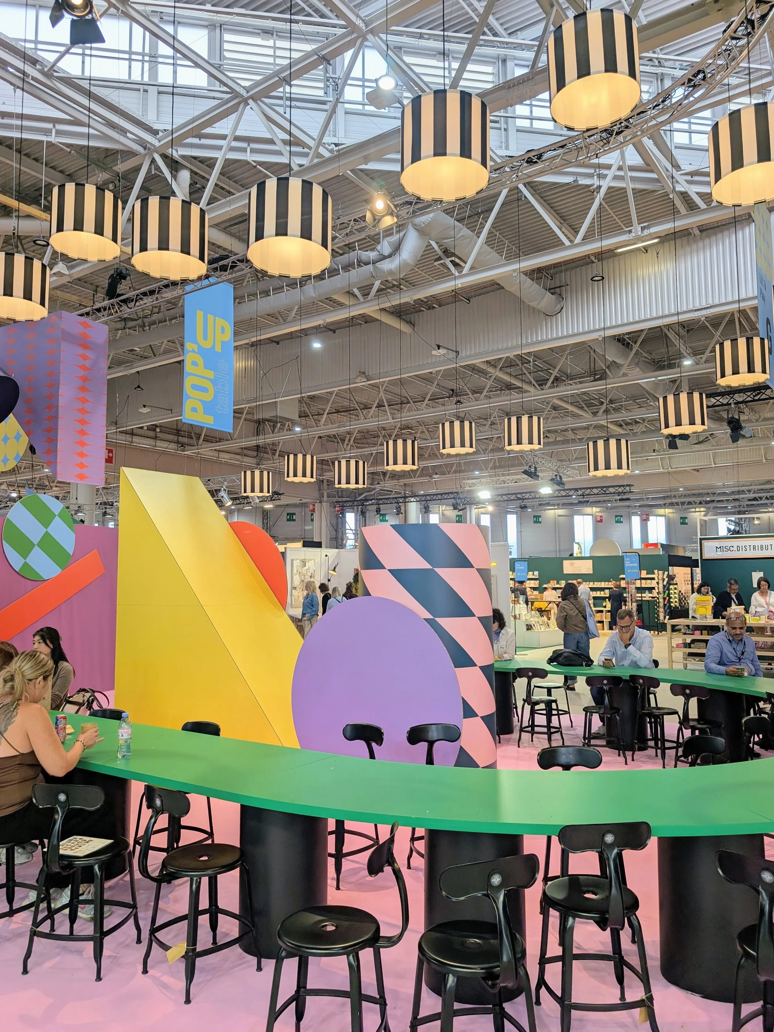
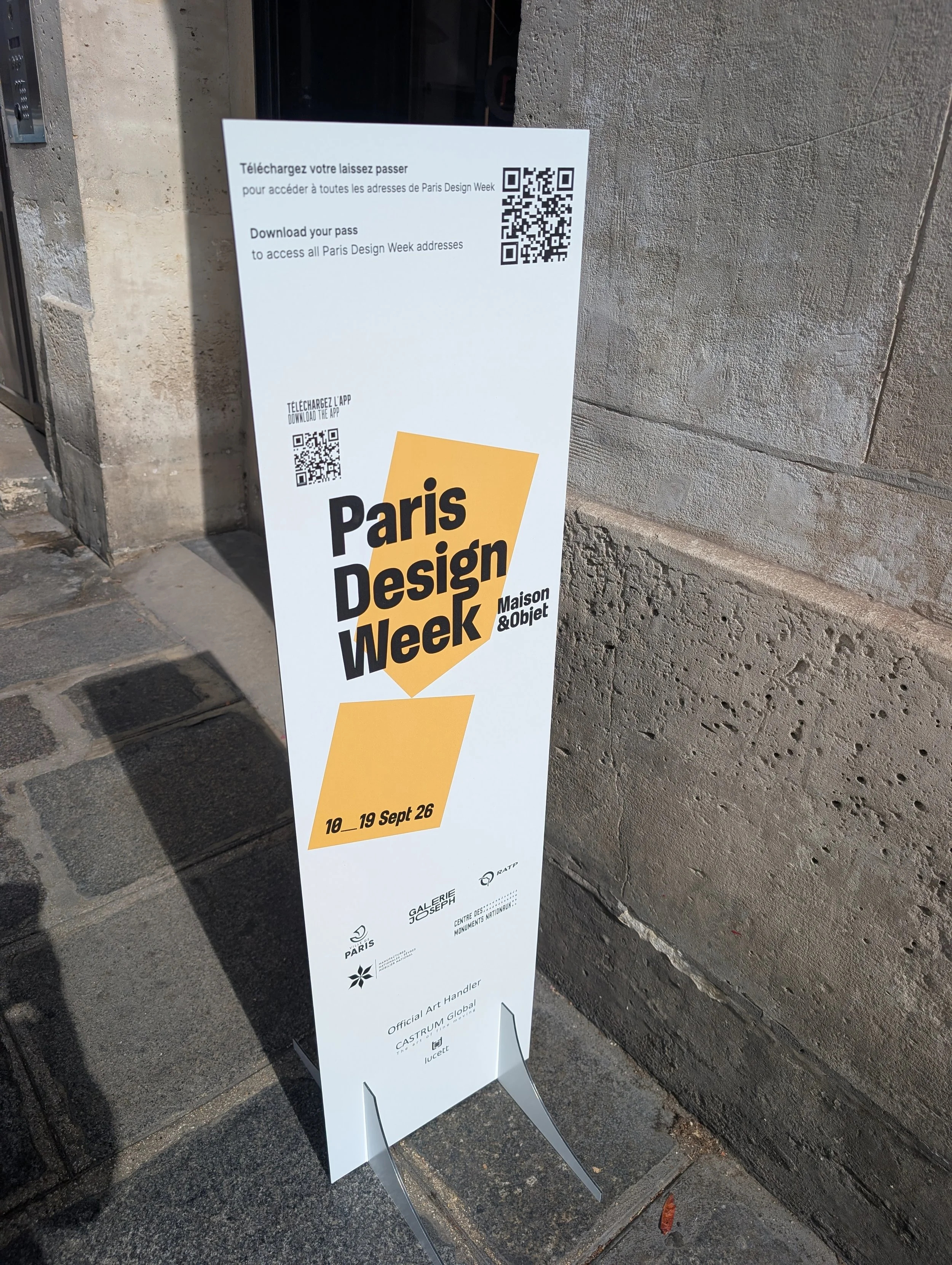
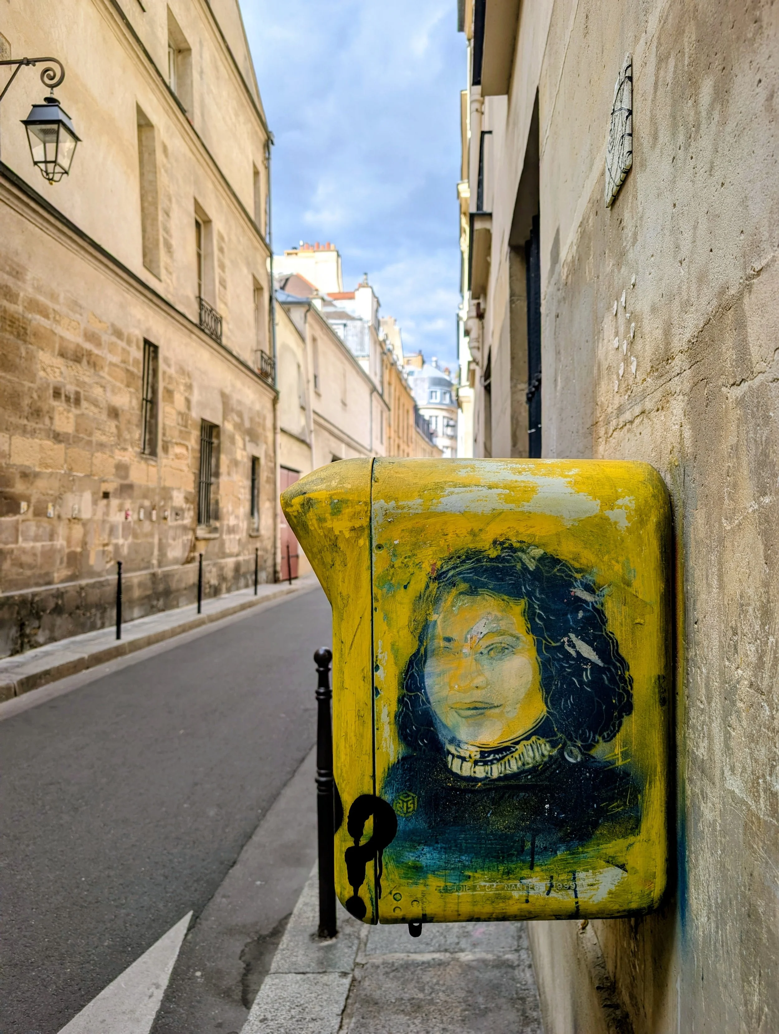
Beige had a good run. Paris just ended it.
That's the honest headline from four days I spent between Maison & Objet and Paris Design Week, two of the biggest design events of the year, both happening back-to-back.
Four days of installations, launches, and one very sore pair of feet later, I'm home, and I have a lot to tell you!
1. Colour Isn't Having a Moment, it's Having a Takeover 🌈
You know that feeling when a trend has been building for a while, and then suddenly everyone is doing it at once? That's what happened with colour in Paris.
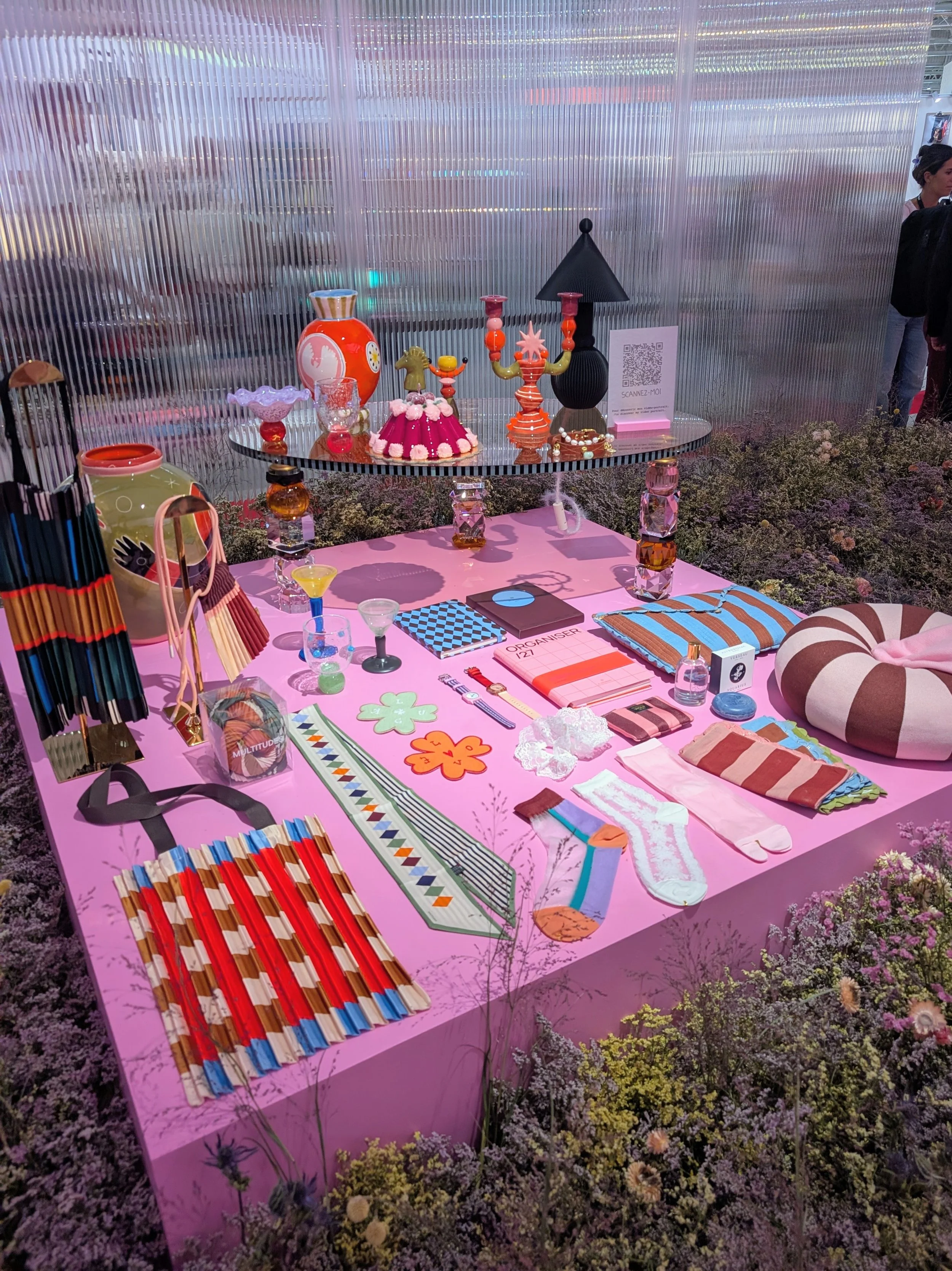
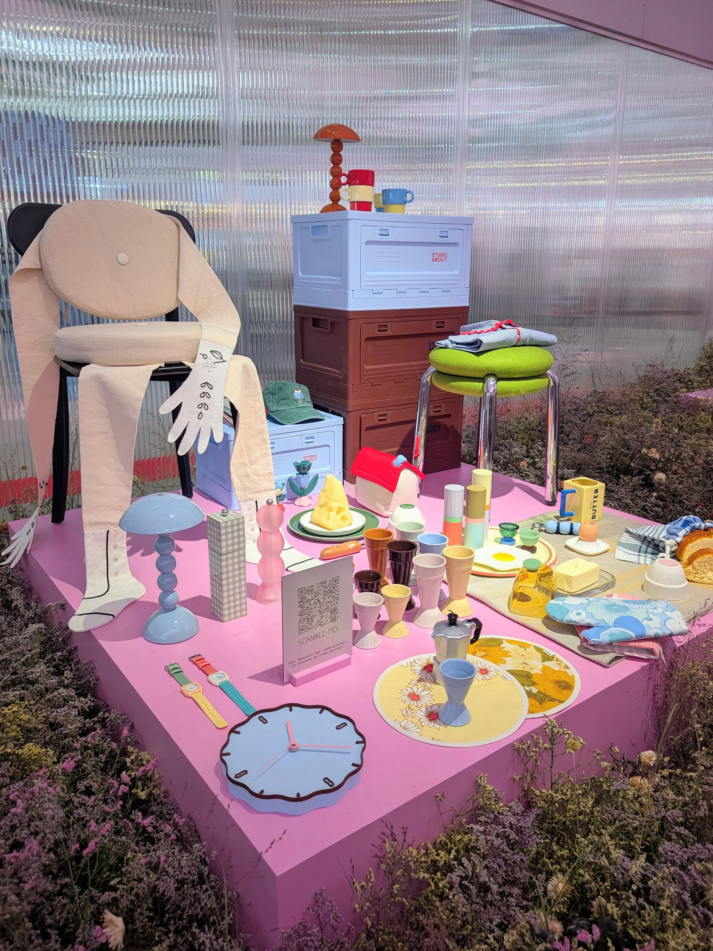
Every hall, every stand, every installation was drenched in it. Bold coral. Deep saturated pinks. Warm terracotta. Cobalt everywhere. The pastel wave from a few years ago has grown up — it's louder now, more confident, unapologetic in a way the design world hasn't allowed itself to be in years.
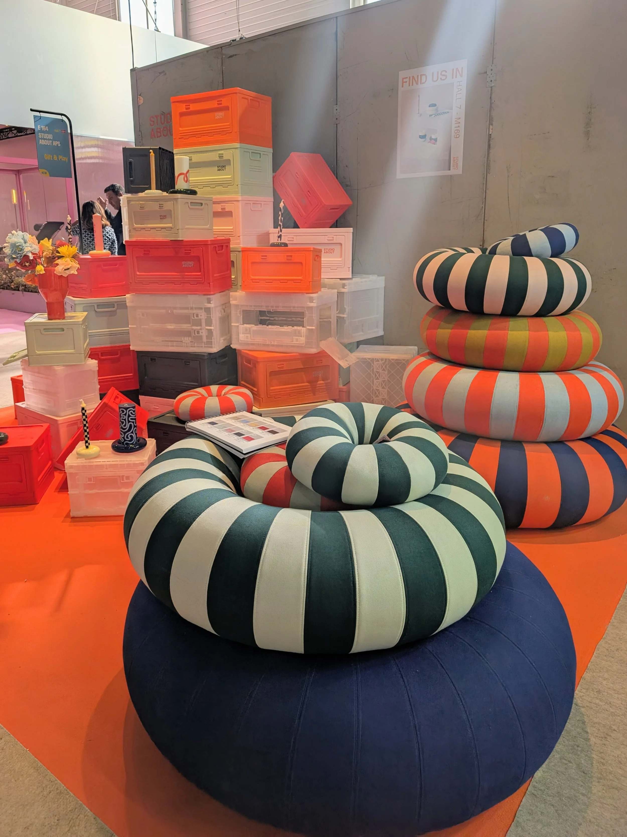
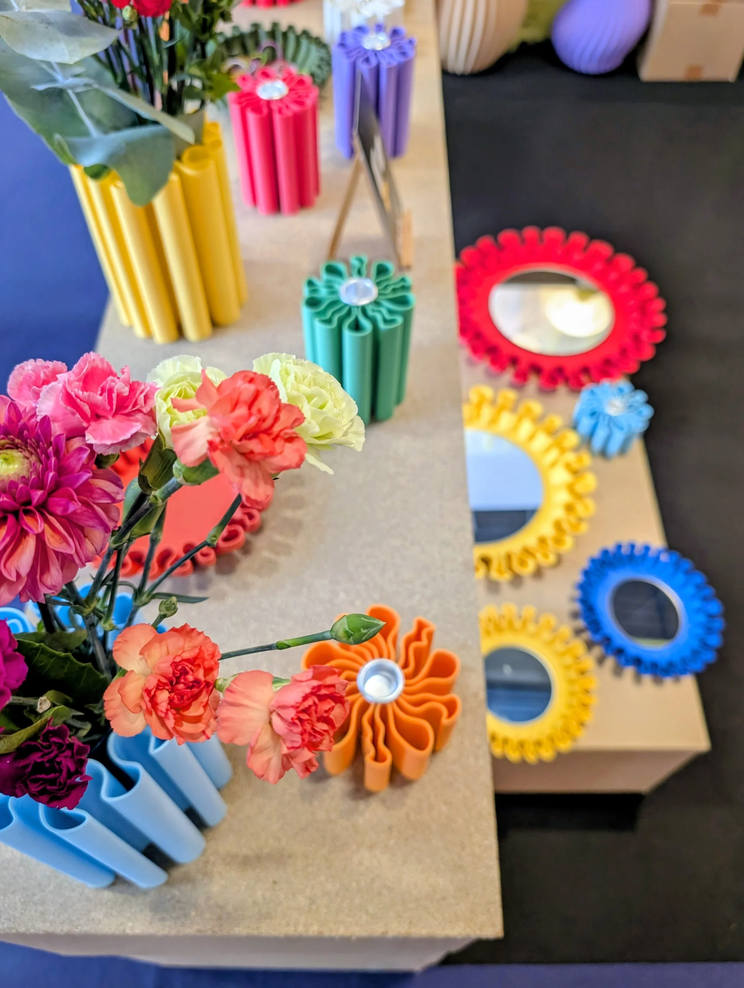
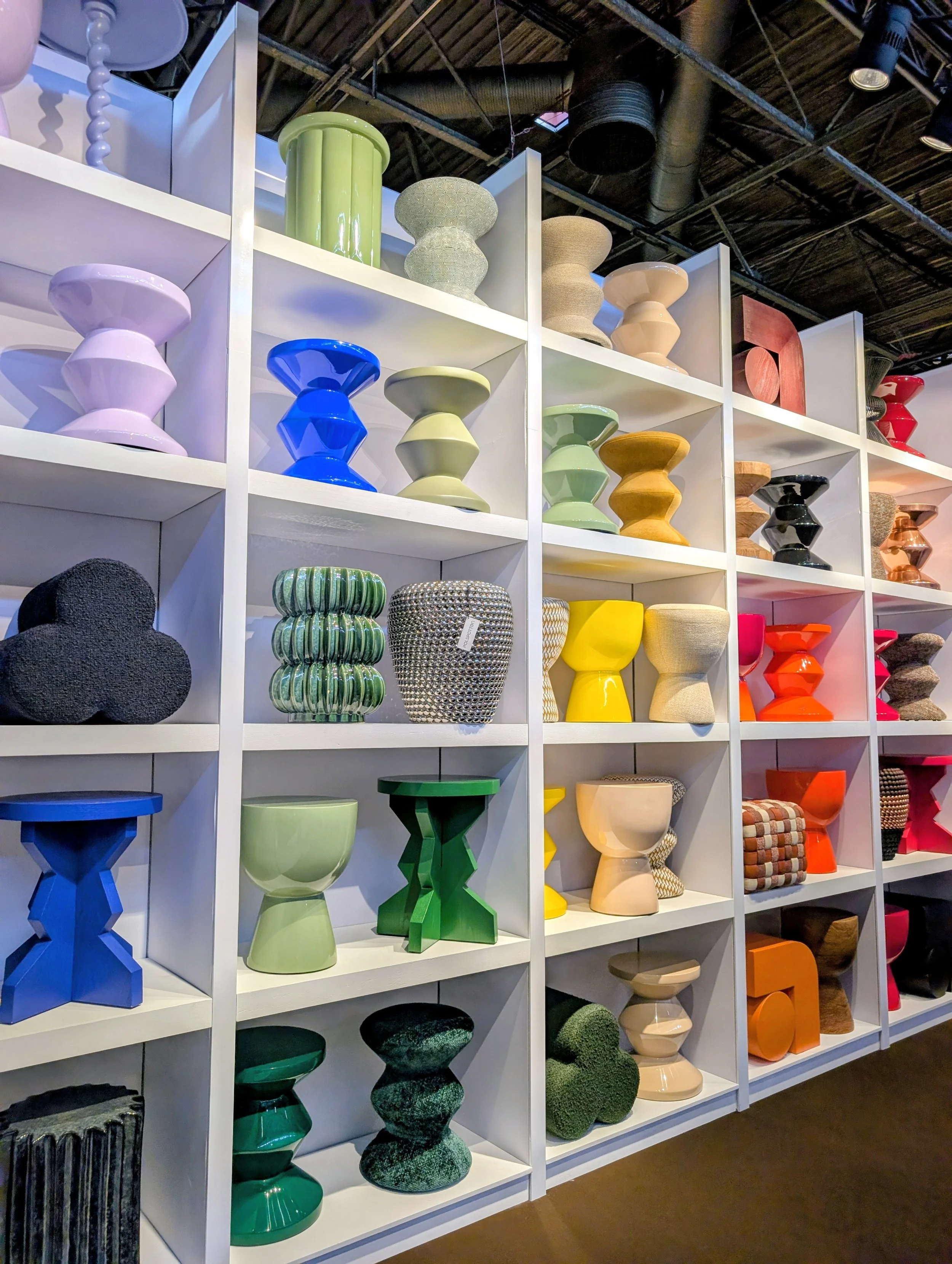
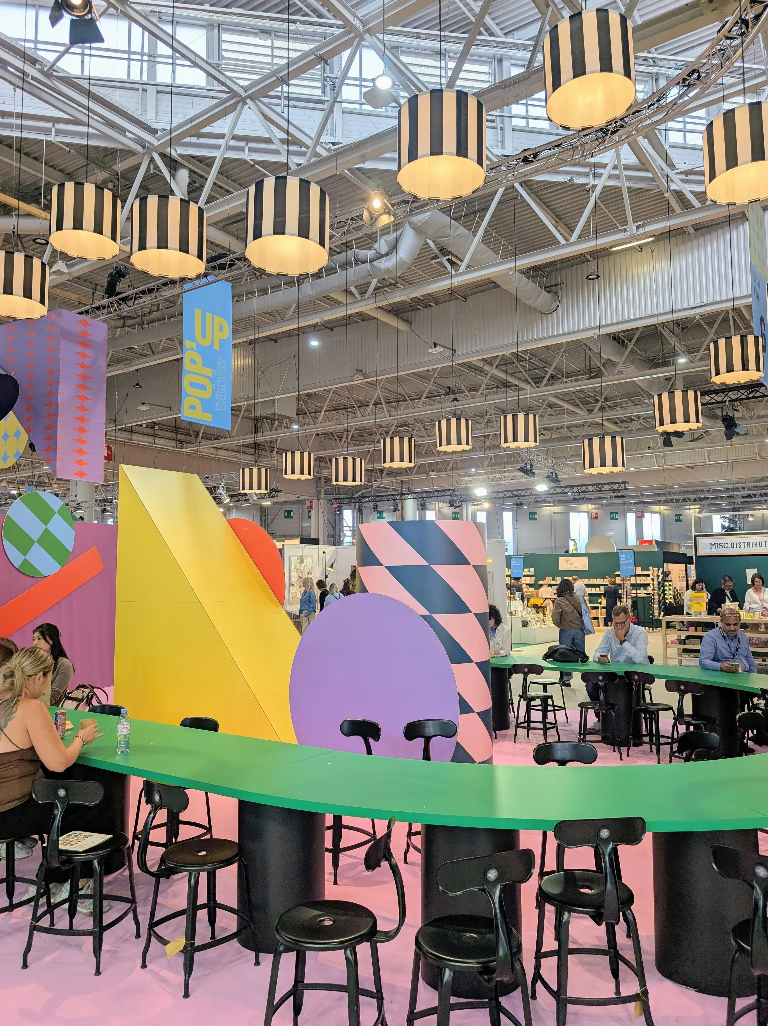
One of the standout colour moments: the 'Feel the shift' installation by Masquespacio, atmospheric, immersive, impossible to walk past without stopping. If you follow Masquespacio you already know their work is one part interior design, one part theatre. This installation was pure evidence of what happens when a studio commits to colour without hedging.
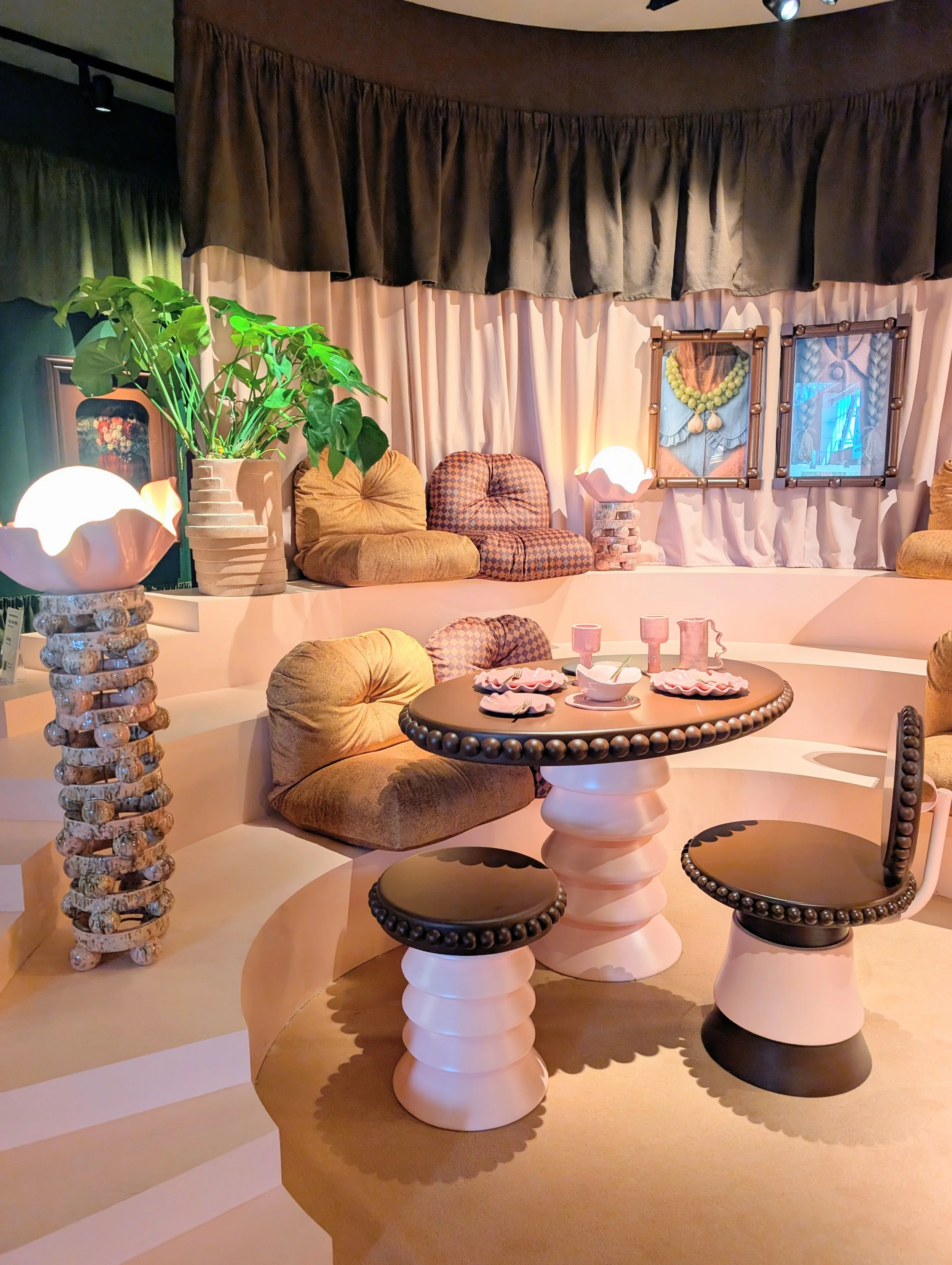
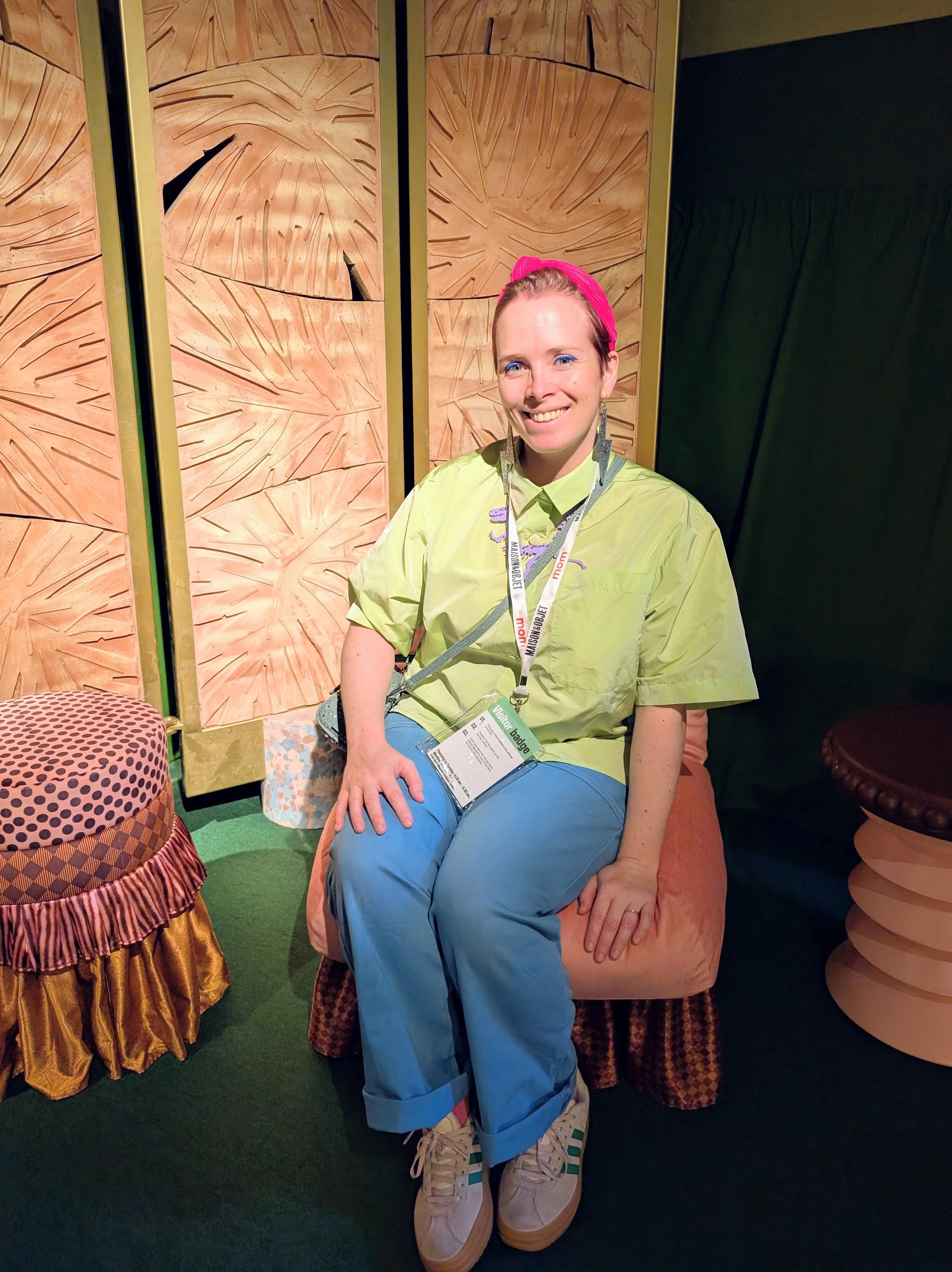
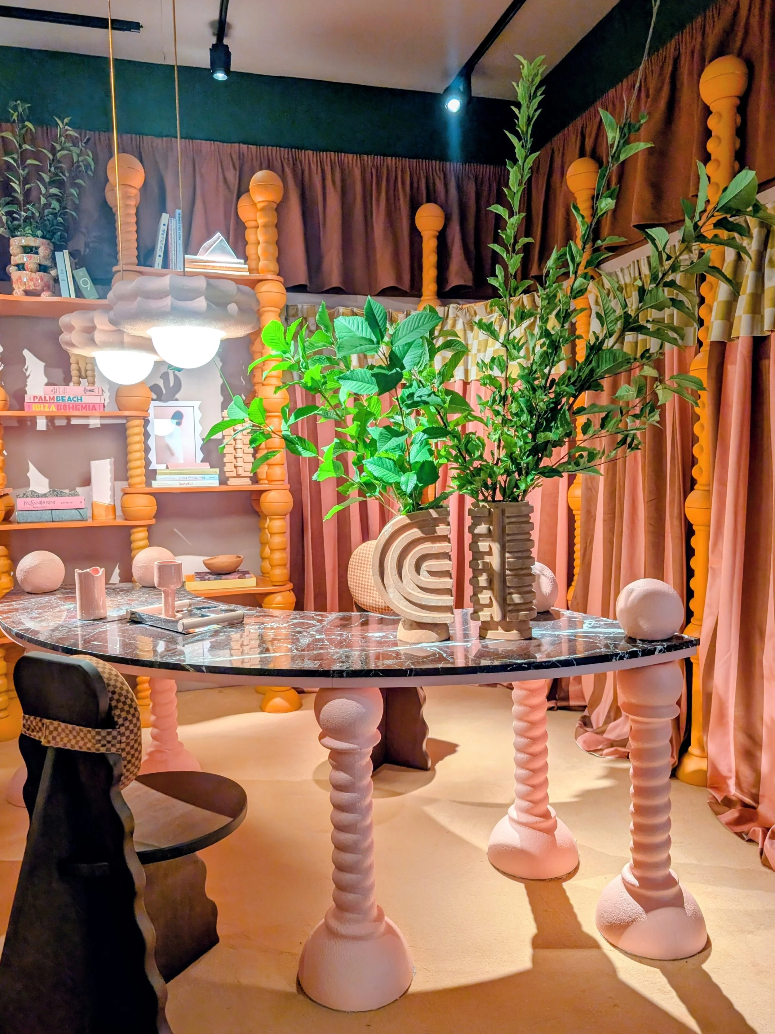
But the moment that made me realise how mainstream this shift really is? IKEA.
I visited L'Habitat de l'Année (The Habitat of the Year) — an immersive path designed by IKEA's interior architects exploring future lifestyles and the way our homes are changing. It was properly ambitious — thoughtful, considered, and drenched in colour. Not a beige neutral in sight. If IKEA — a brand that speaks to millions of homes across the world — is committing to bold colour as the direction of the future, that's confirmation the takeover has reached mainstream.
They were also showing their KONSTRUNDA Collection — a preview of a new limited-edition range blending art and affordable design, developed alongside both established and emerging artists. Fresh, playful, and priced to be genuinely accessible. This is what "colour for everyone" actually looks like in 2026: not a trend statement, a permission slip for real homes.
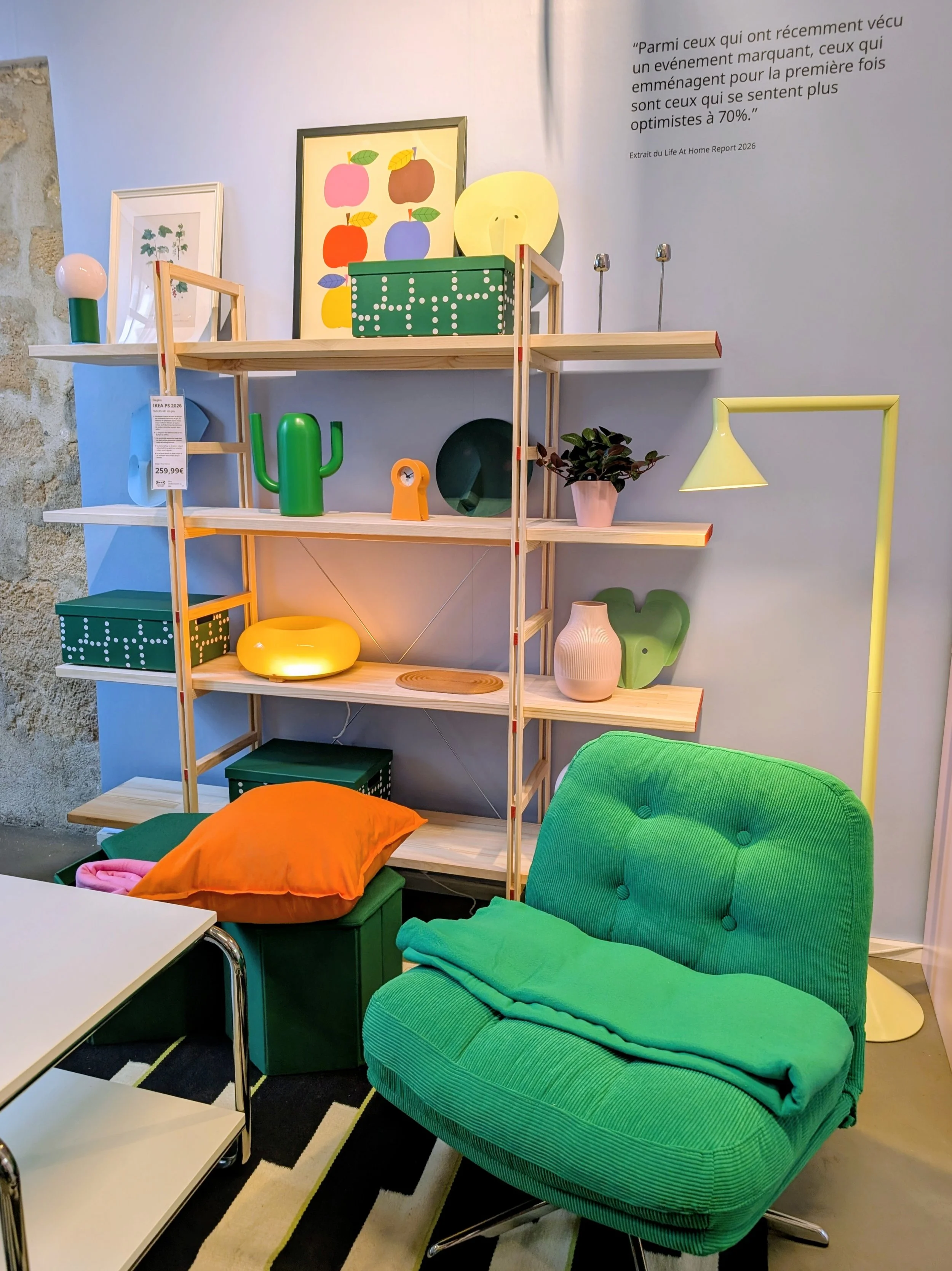
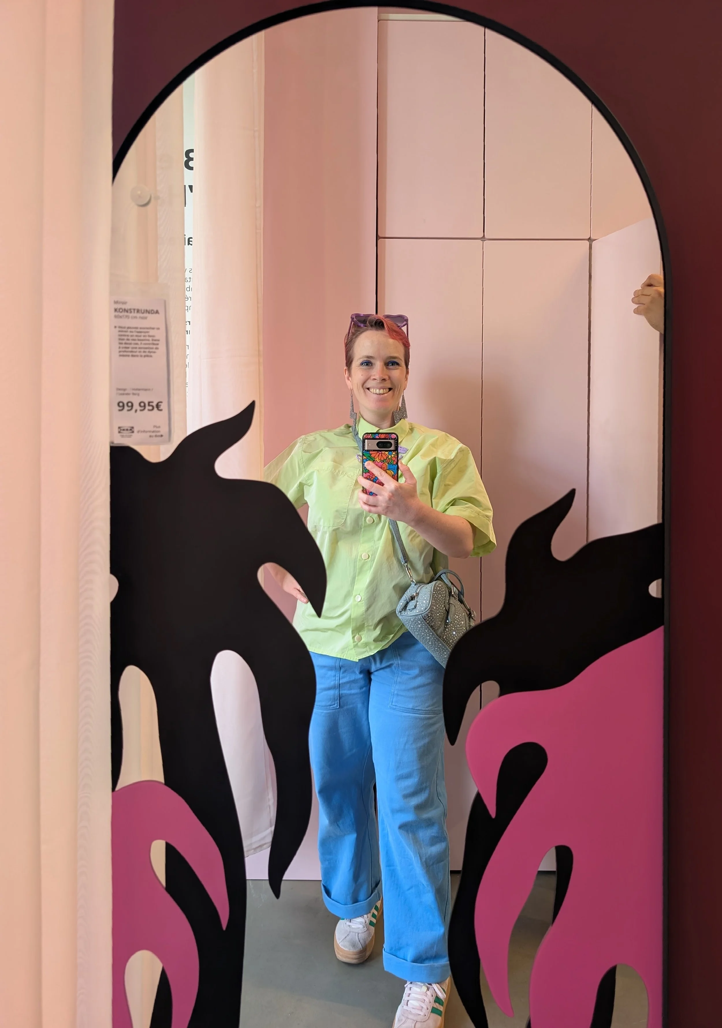
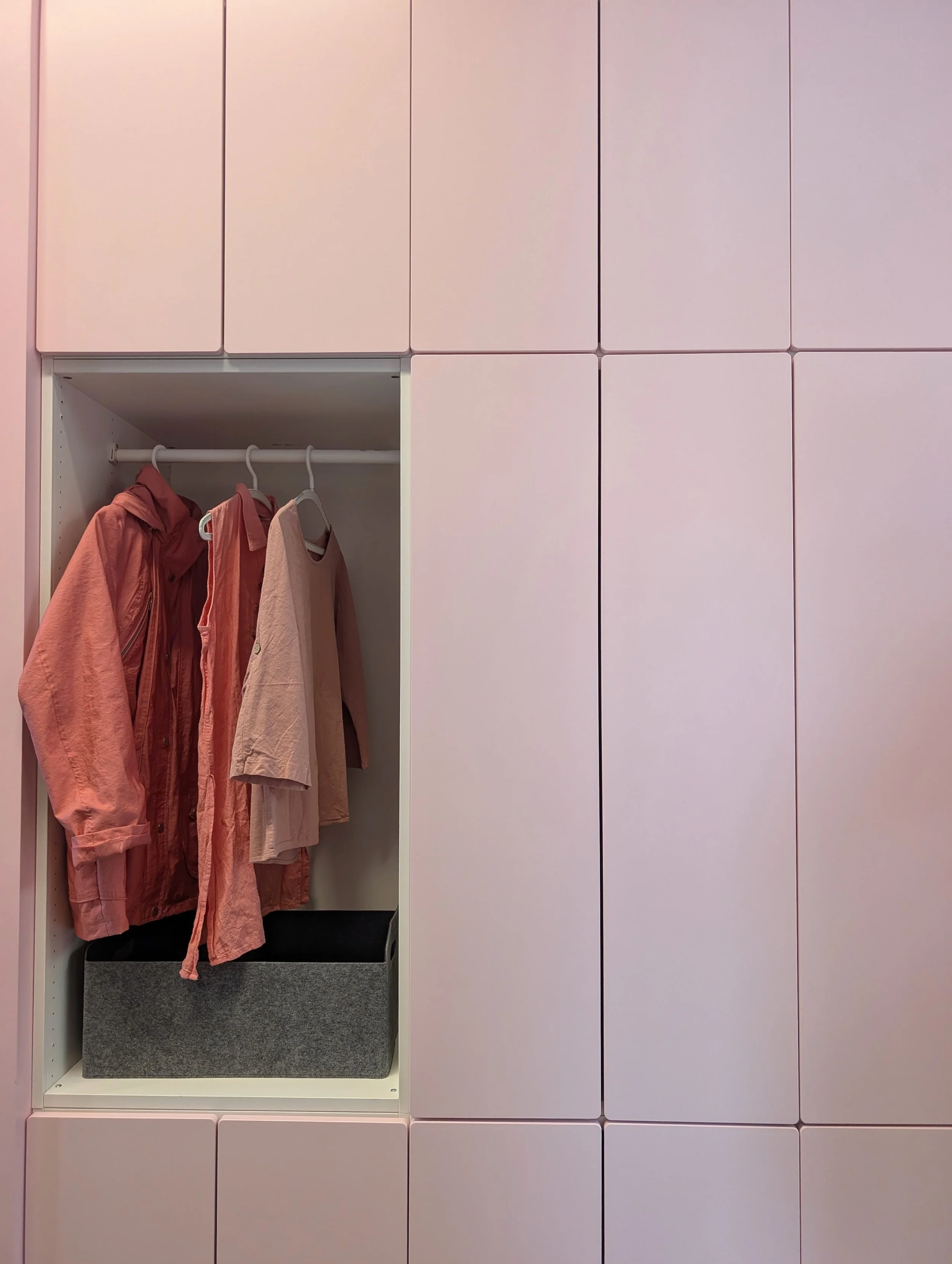
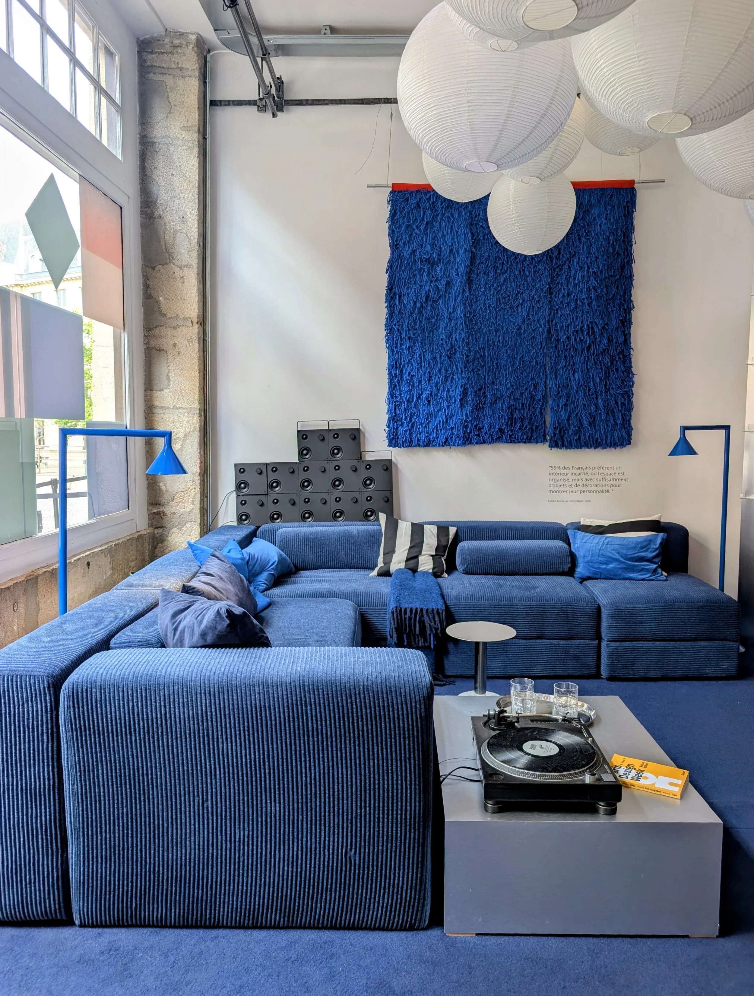
The takeaway for your own home: if you've been quietly waiting for permission to paint your walls something braver this autumn — this is it. Not a whisper of a trend. A full-volume shout.
2. Handmade Is Having A Proper Moment 🎨
Here's the section I could write a whole article about: craftsmanship absolutely stole the show.
For years, the design conversation has quietly been drowning in mass production. Everything smooth, everything clean, everything looking suspiciously like it came from the same factory in the same country with the same twelve finishes. Not this year. This year, every corner of Paris was celebrating the handmade — real craftsmanship, real makers, real evidence of a human hand in the work.
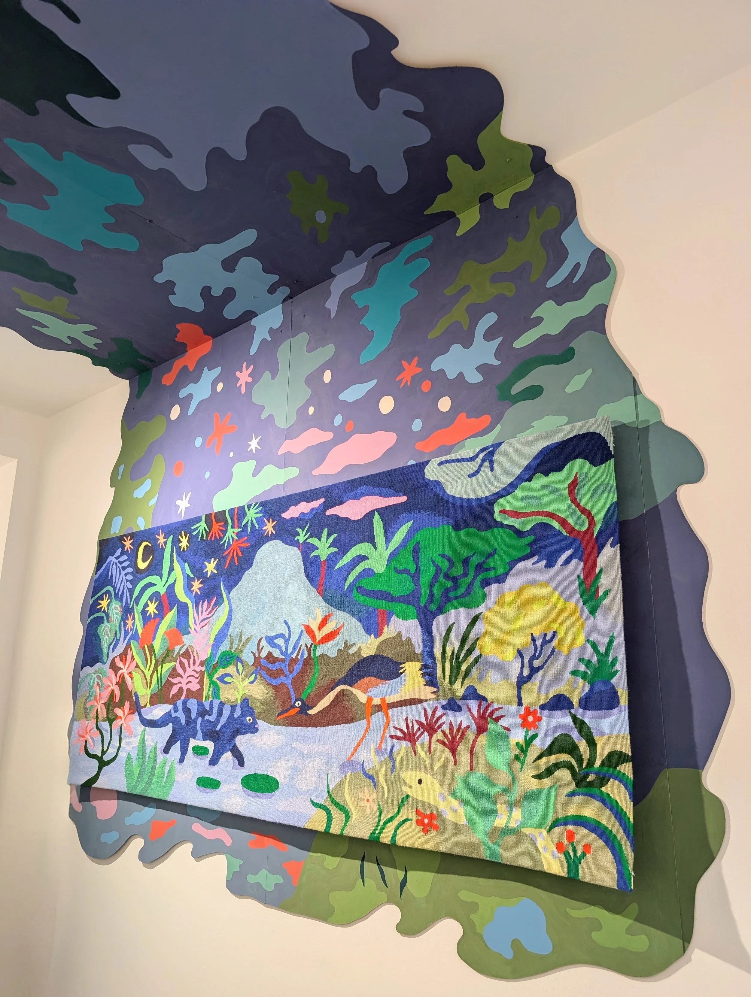
a standout:
the colourful 'Jungle' tapestry by Florence Voegele of Atelier A2 at the 'Oh my laine!' installation — the kind of piece you stand in front of trying to understand how many hours of work went into it. Then you stand there longer, just appreciating it.
What made this trend feel different from other "artisanal" moments: it wasn't precious. It wasn't about rustic minimalism or muted natural tones or "quiet luxury." It was joyful, colourful, weird, and defiantly unpolished. Craftsmanship with personality.
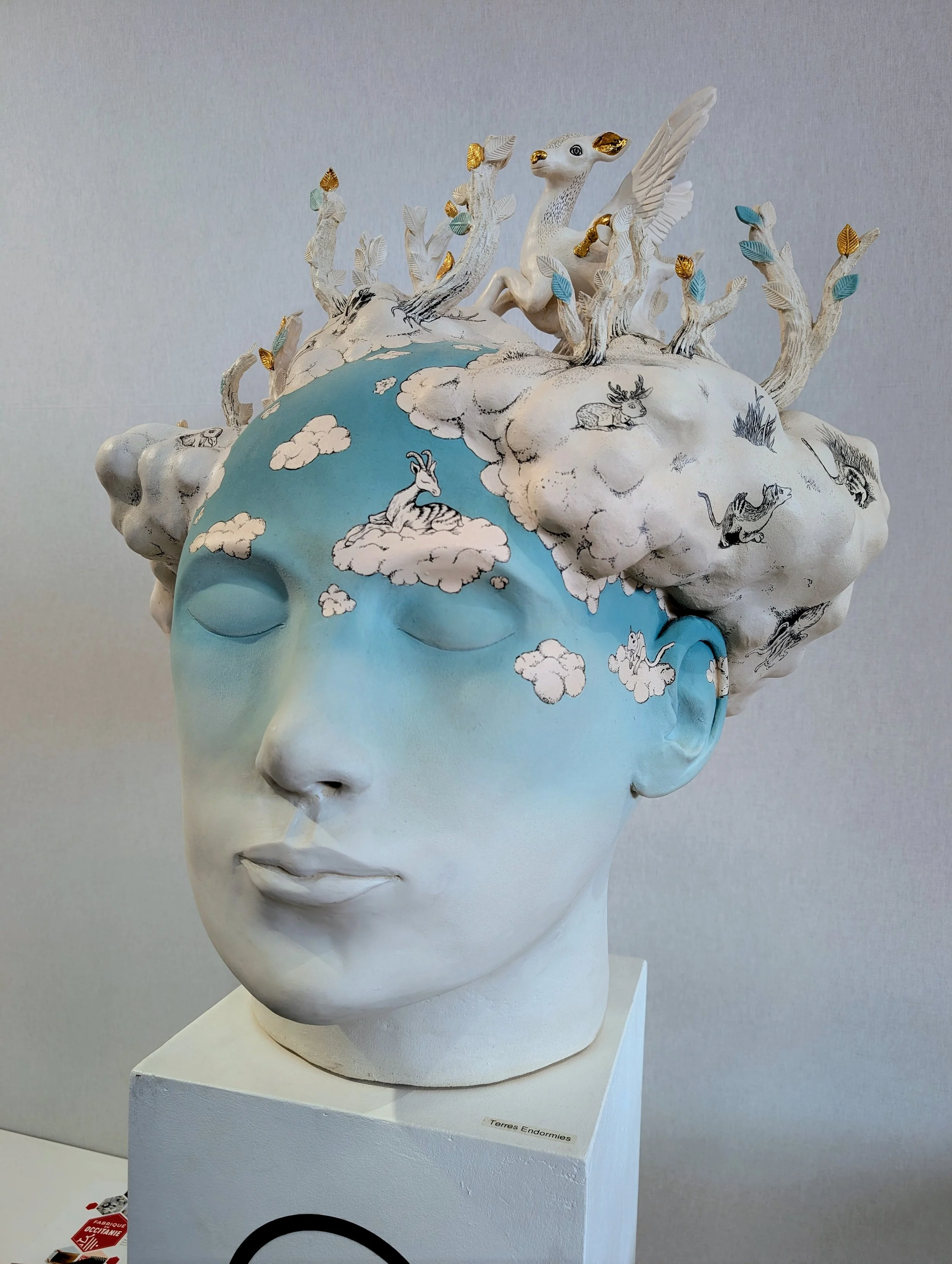
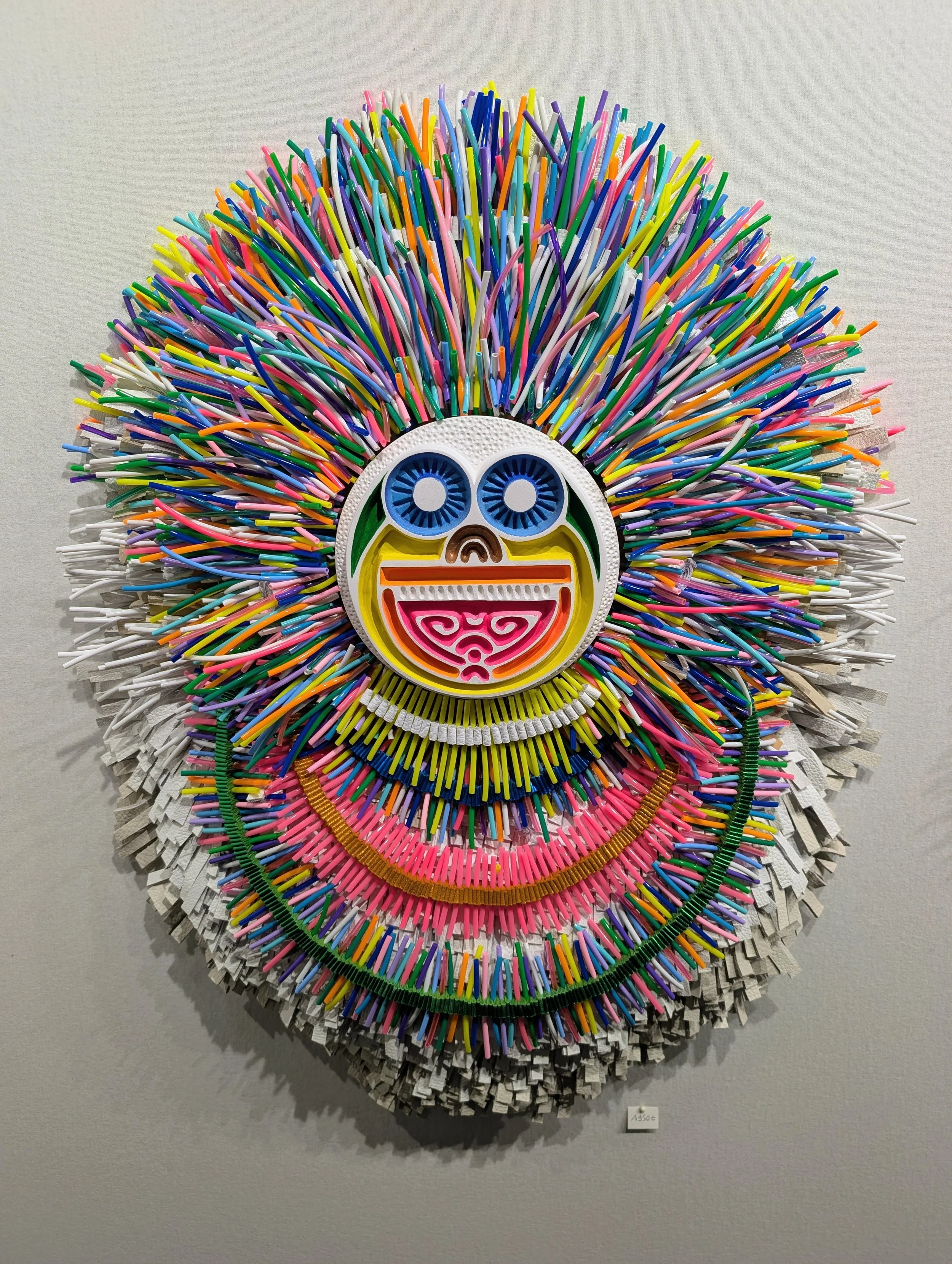
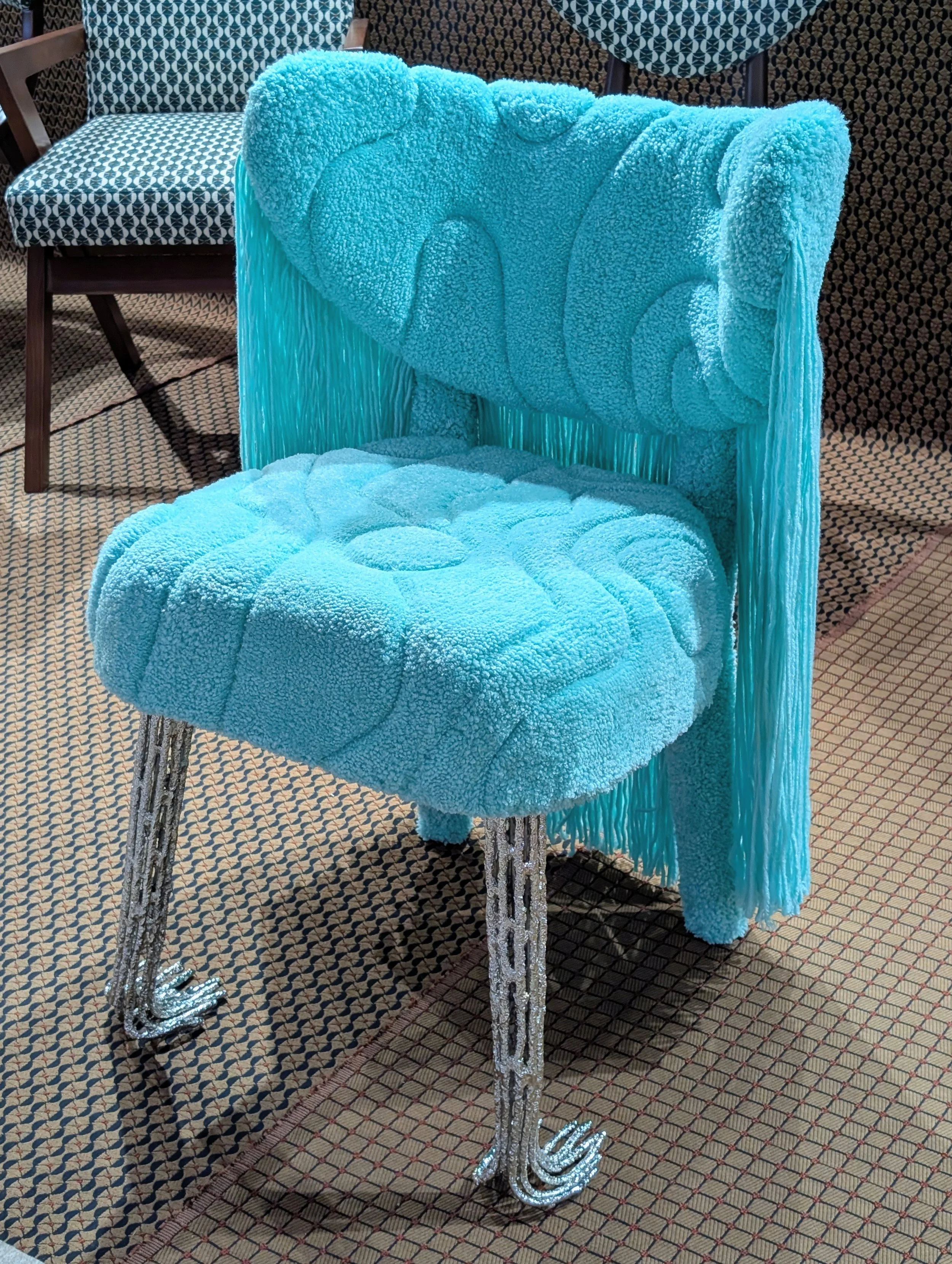
The takeaway: if you're going to invest in anything this autumn, invest in one properly handmade piece. It'll outlast three seasons of anything mass-produced, and it'll actually mean something in your home.
3. Playful Lighting Everywhere 💡
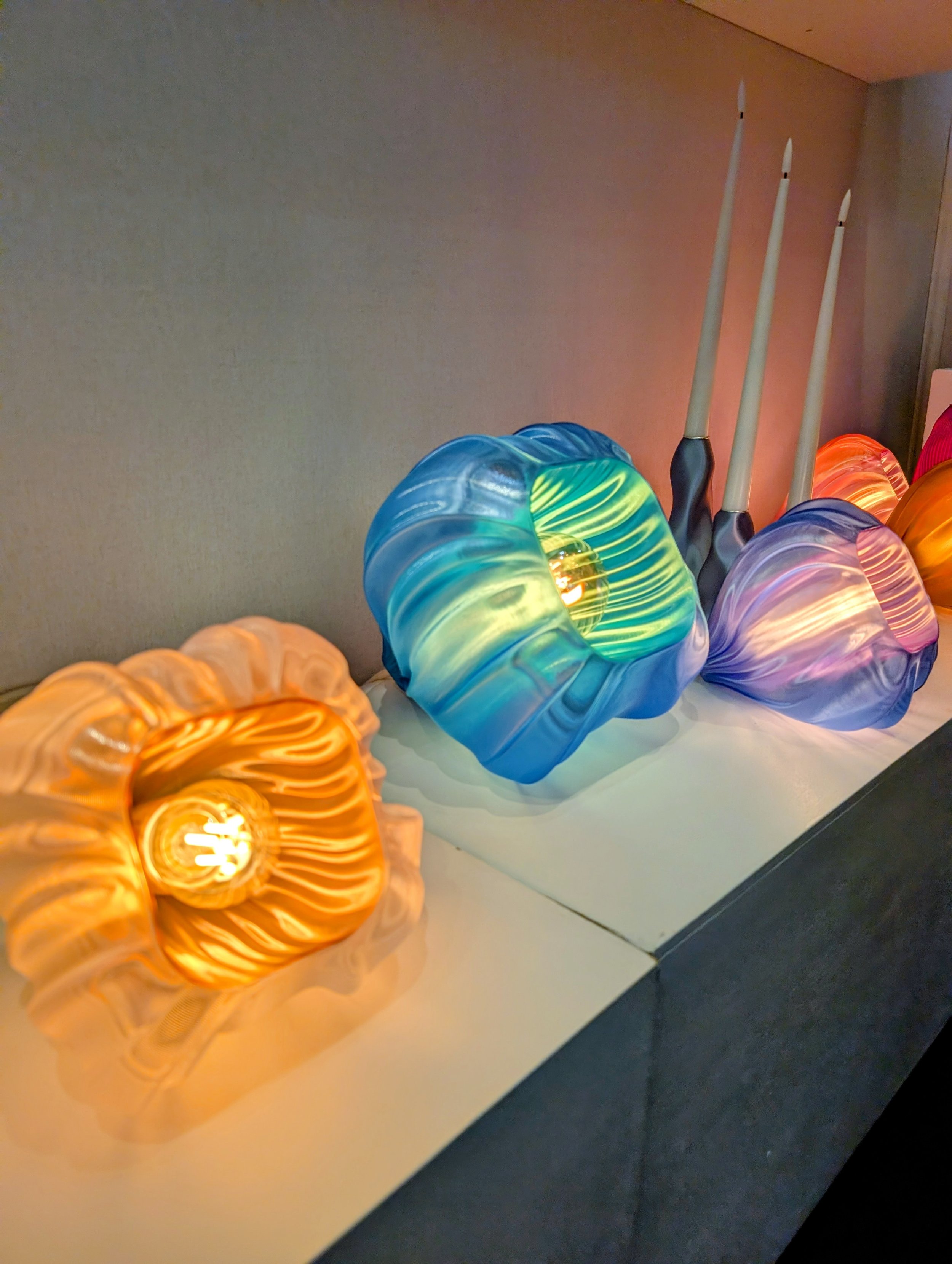
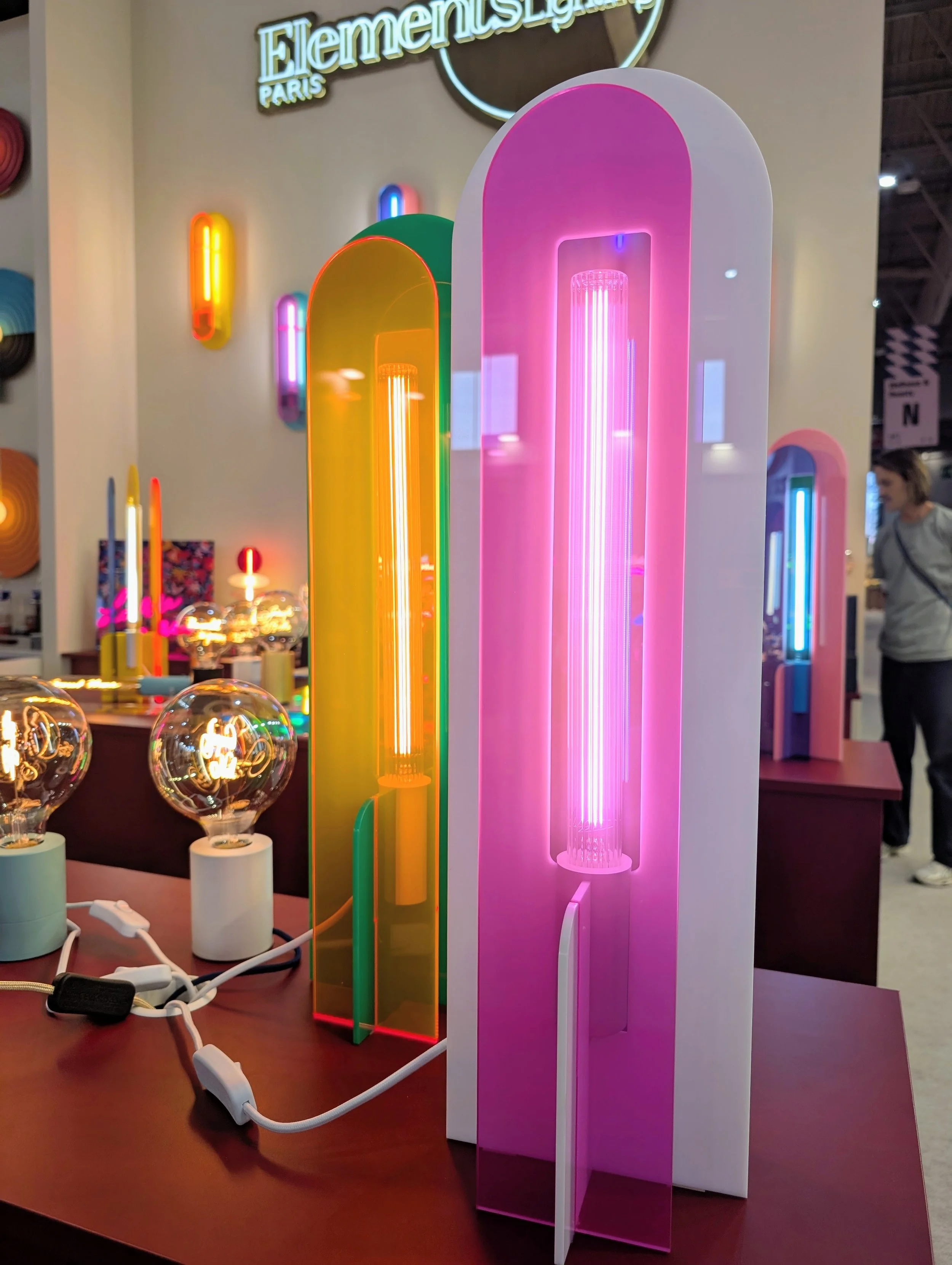
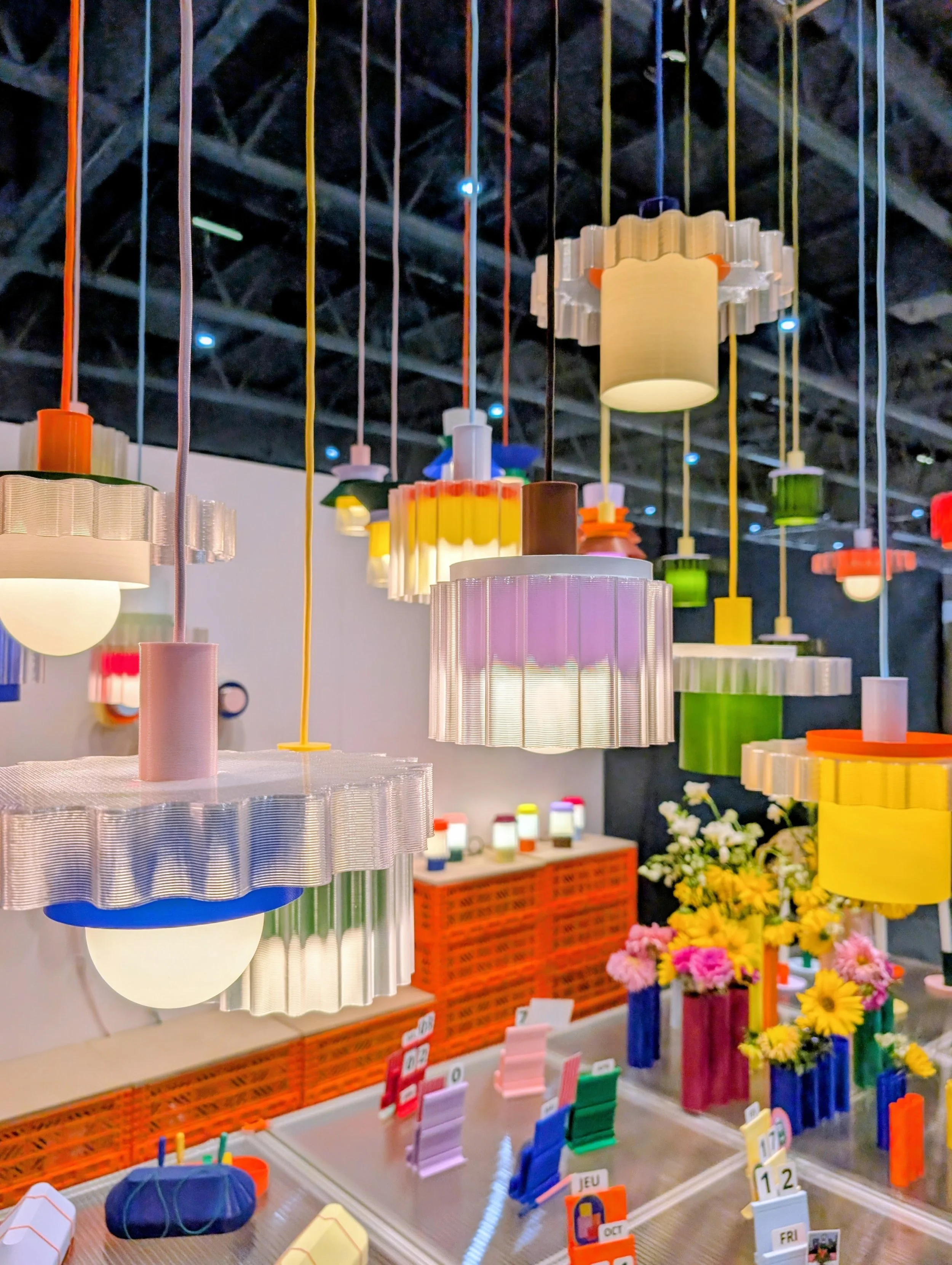
Every year, I go to Paris and try to guess which product category is about to explode. This year, the answer was obvious within about 15 minutes of walking around: lighting.
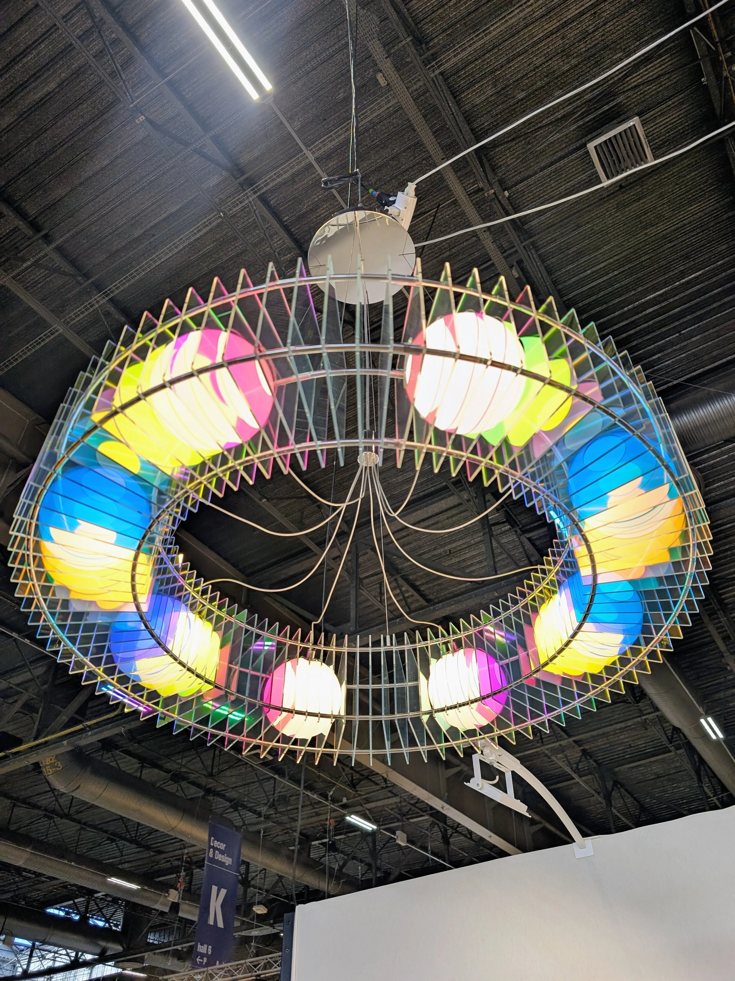
Not "lighting" in the practical sense — lighting as ART. Lighting as sculpture. Lighting as the piece your friends will notice first when they walk into a room.
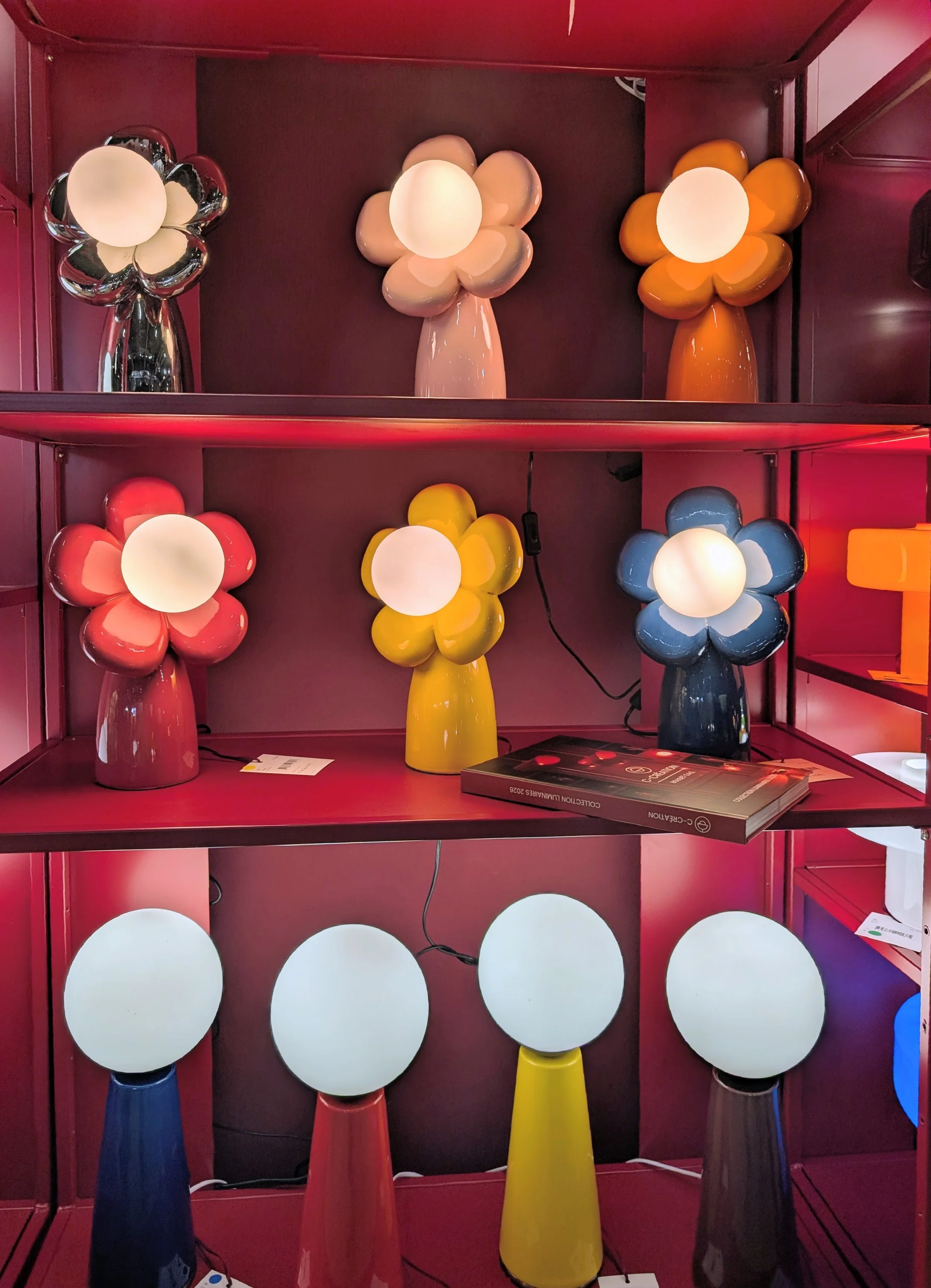
The standouts that made me pause:
The @maisonetobjet selection at 'What's New? In Retail' was a proper showcase of how far this trend has come. Playful shapes, sculptural forms, colour, character.
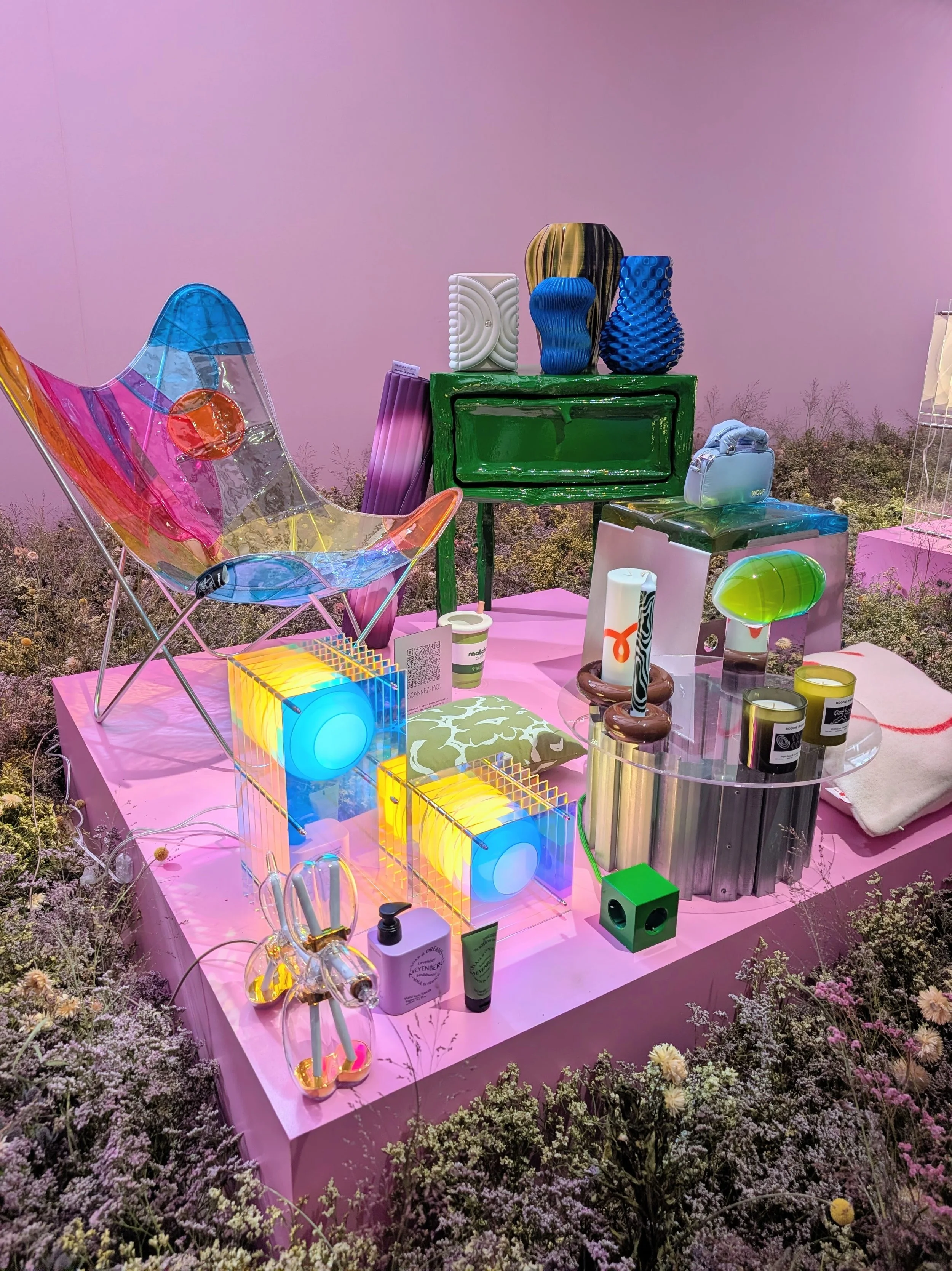
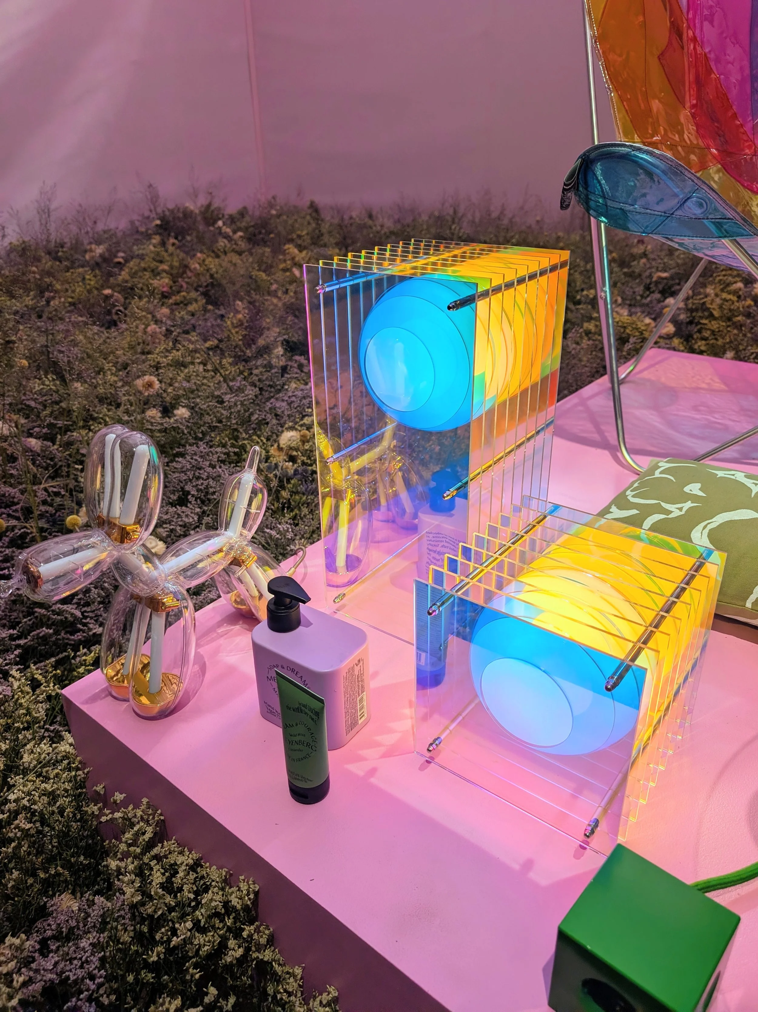
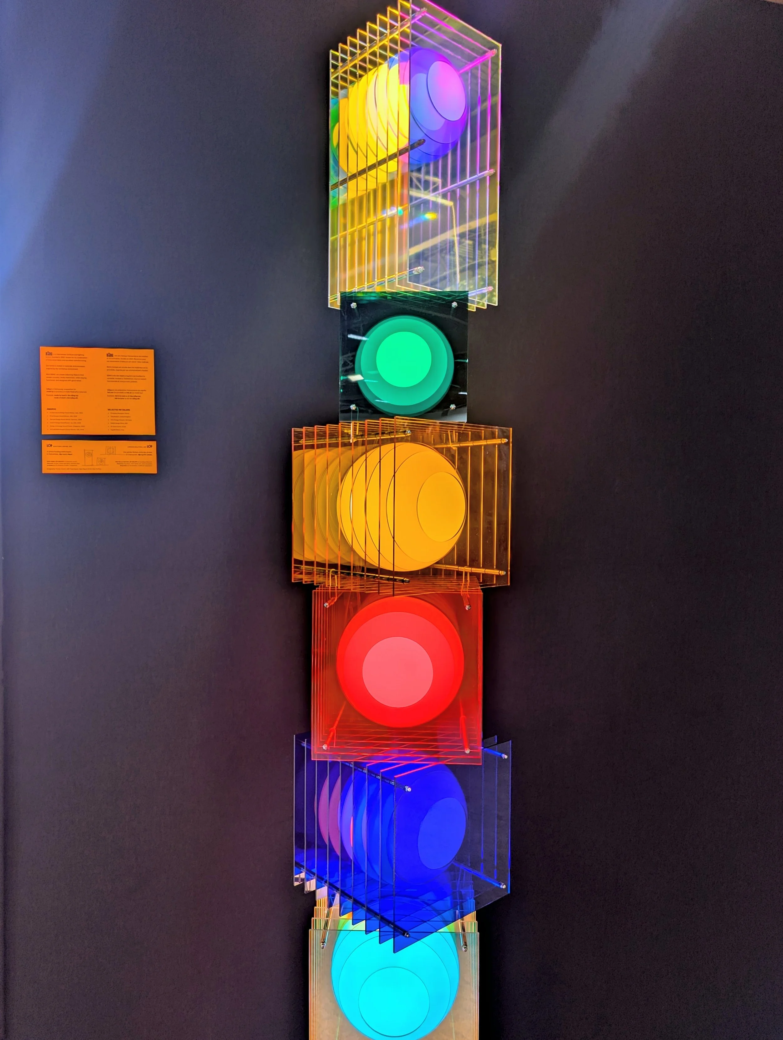
My personal soft spot? The Lop Dreamy iridescent lamp by Bang. I want it. I keep thinking about it. It's genuinely the piece I regretted not buying.
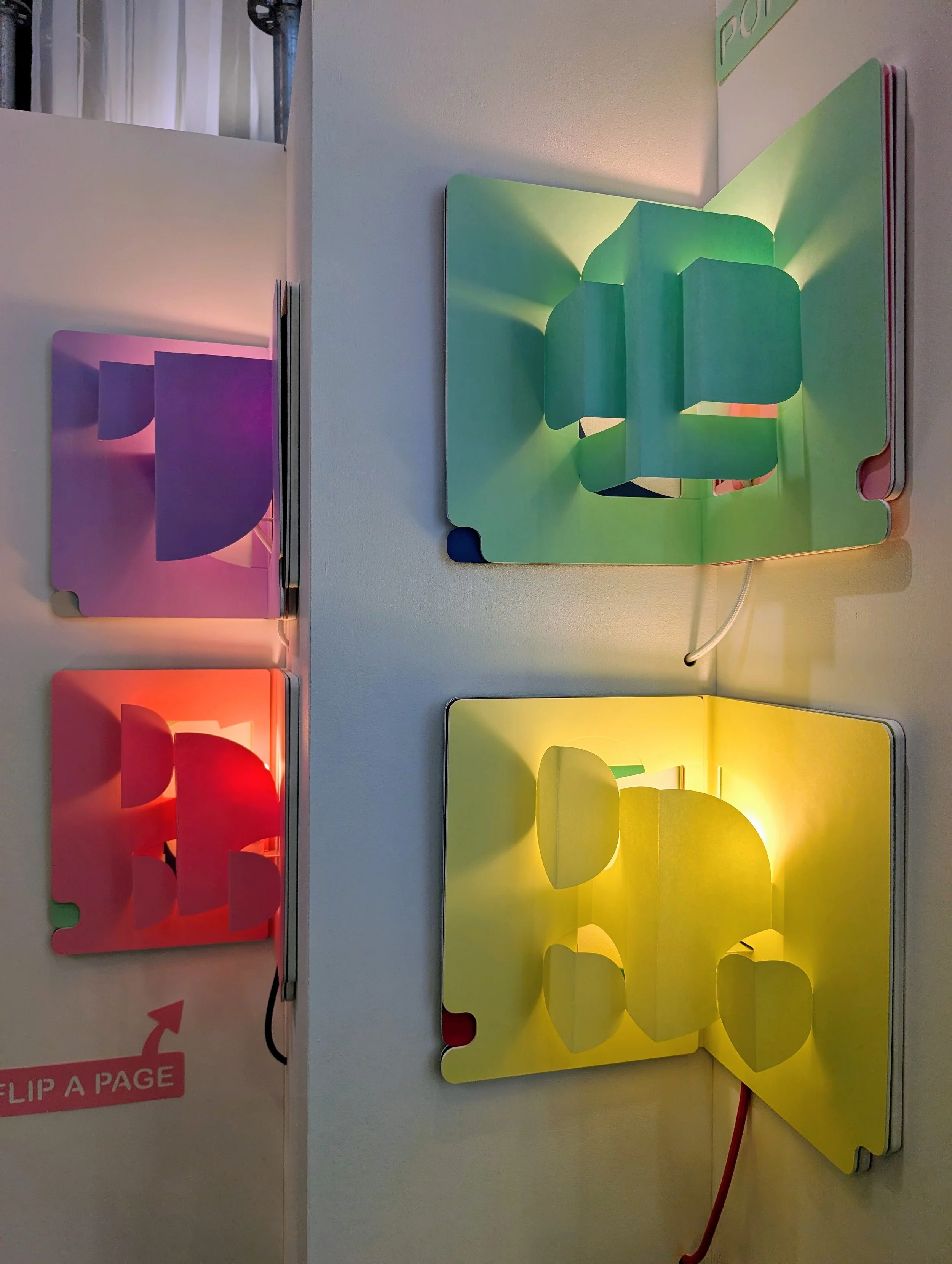
The Pop Up Lamp by Risette Shop — a lamp you literally read like a book.
Yes, really. It opens like a hardcover, the shade unfolds, the light emerges. Playful in a way that made me actually laugh out loud when I first saw it demonstrated.
The takeaway for a real home: a single sculptural pendant or wall sconce can genuinely transform a room. Save this year for lighting. It's the trend doing the heavy lifting.
4. And Then... The Animals 🐻
Ok — this is the section I need to devote to what I did NOT expect.
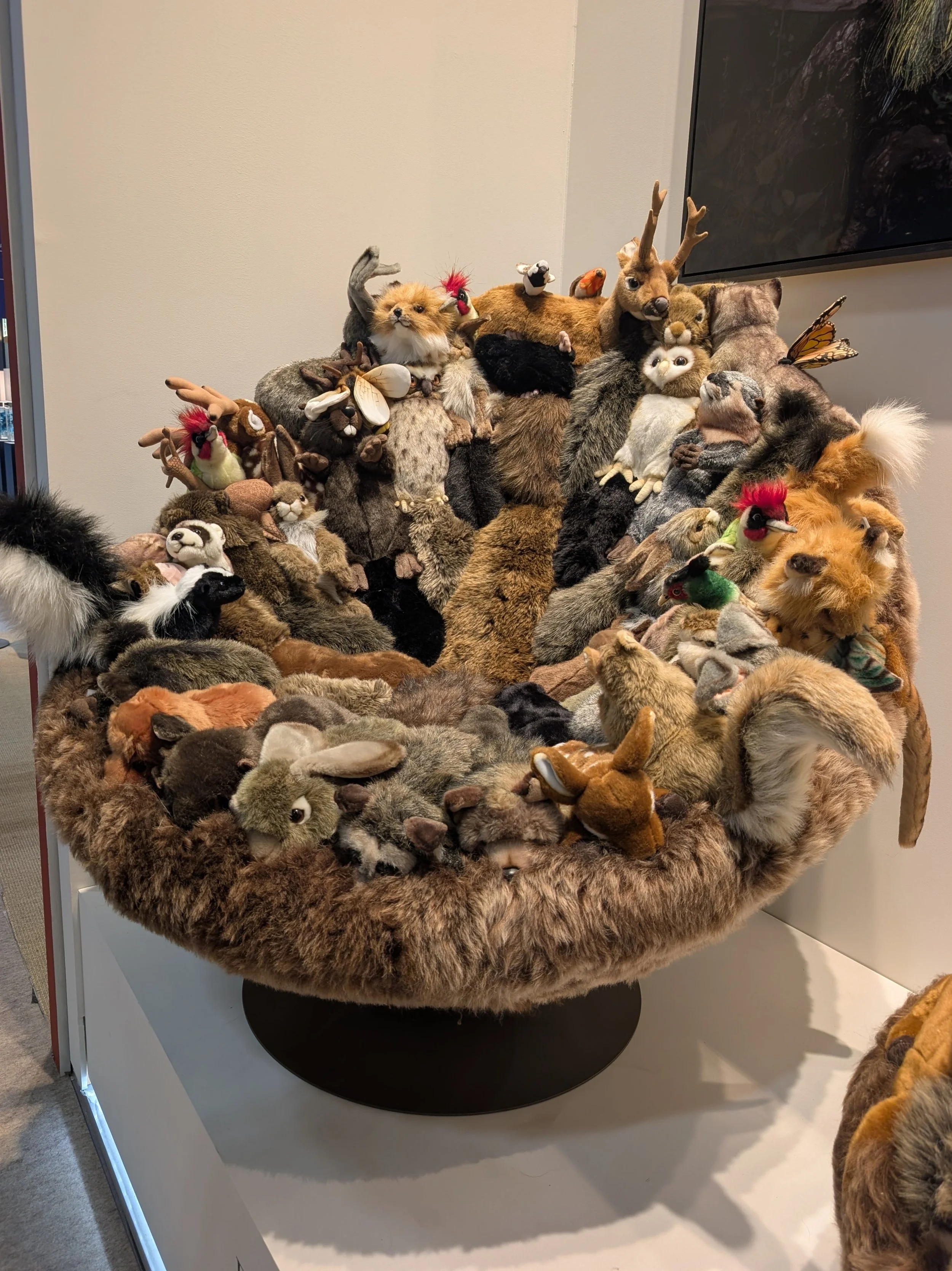
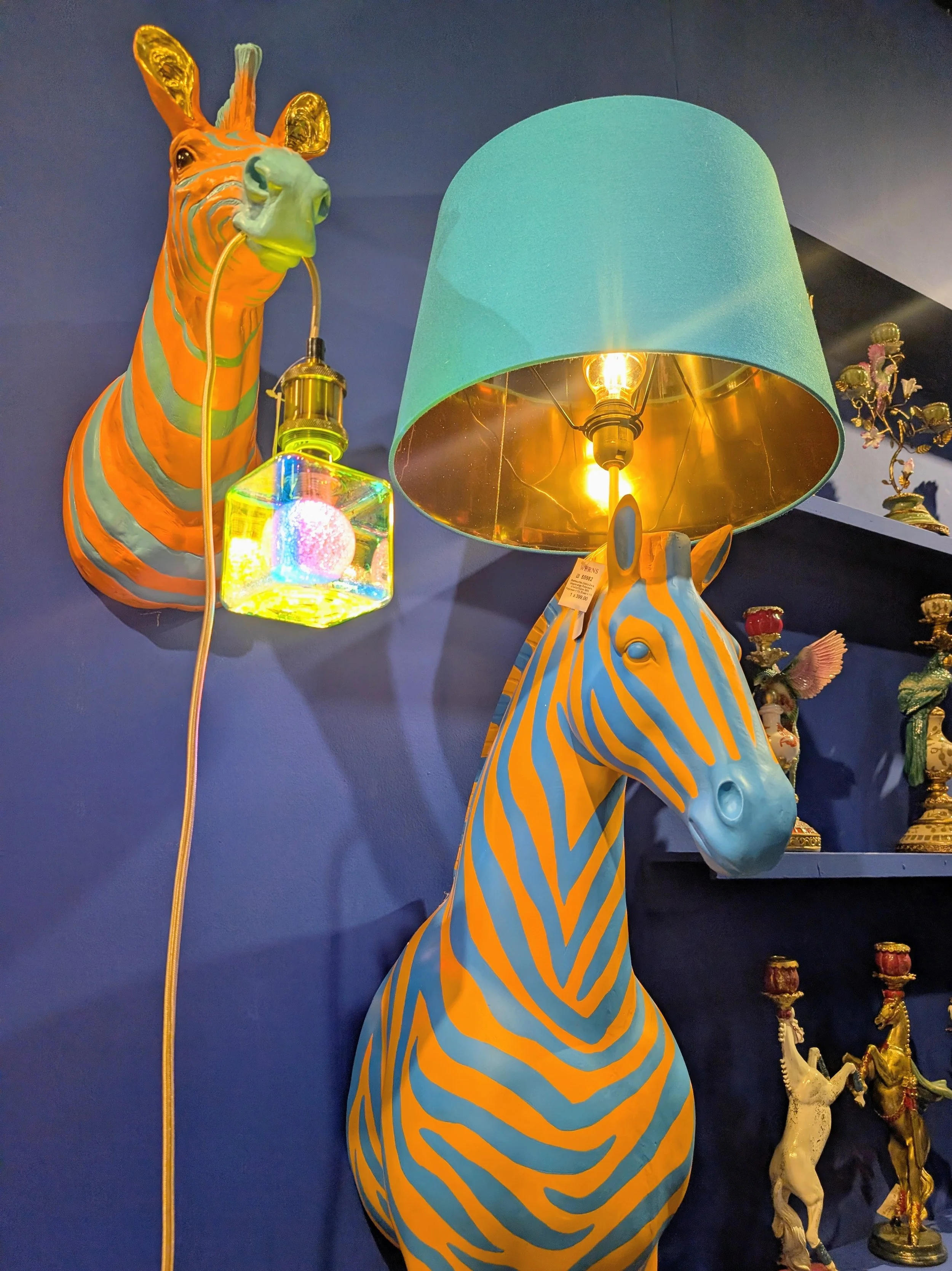
Everywhere I walked in both events, I saw animals. Everywhere. Sculptures, chairs, lamps, ceramics, tapestries. Real animals, cartoon animals, sculptural animals, plush animals.
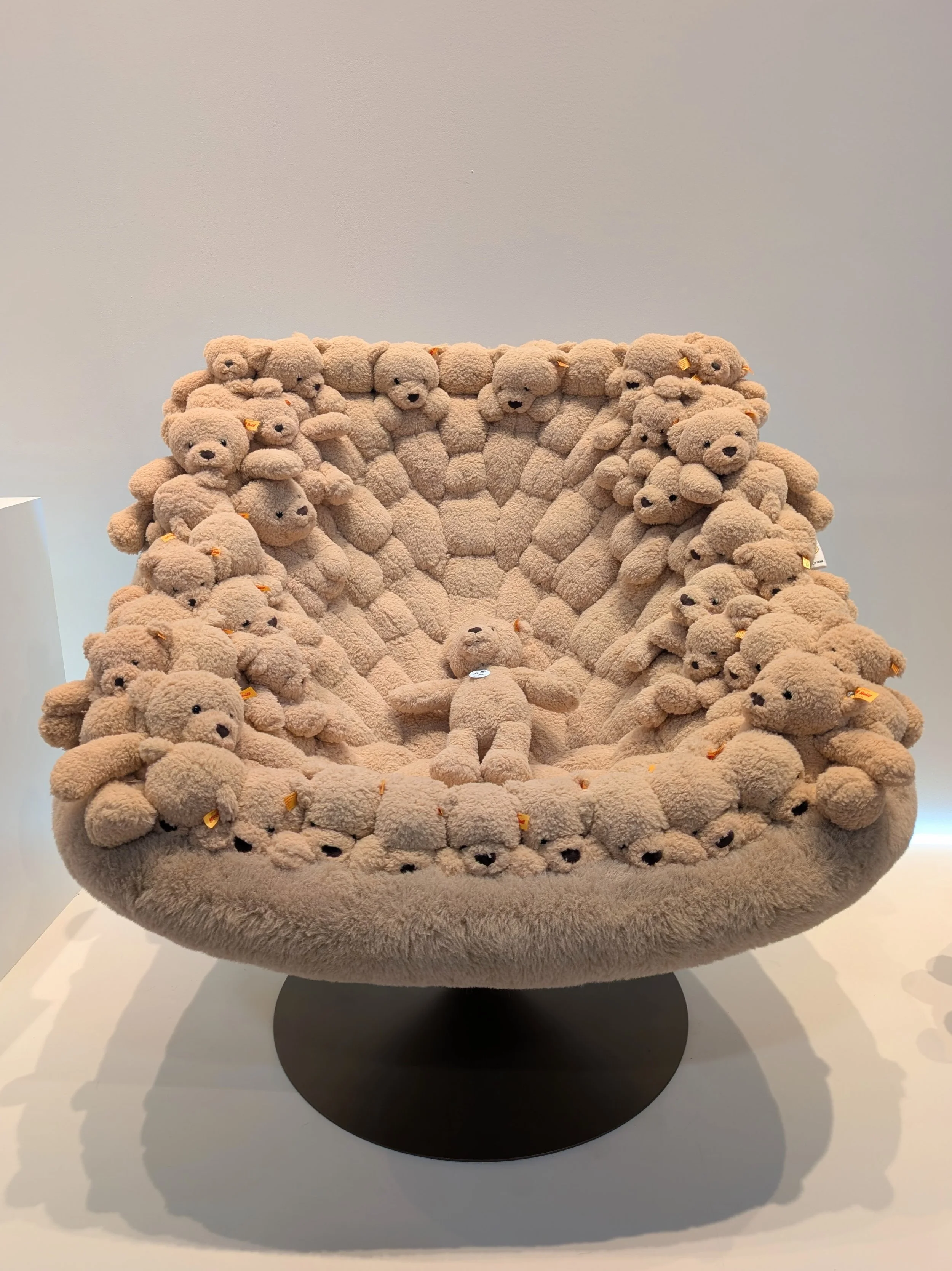
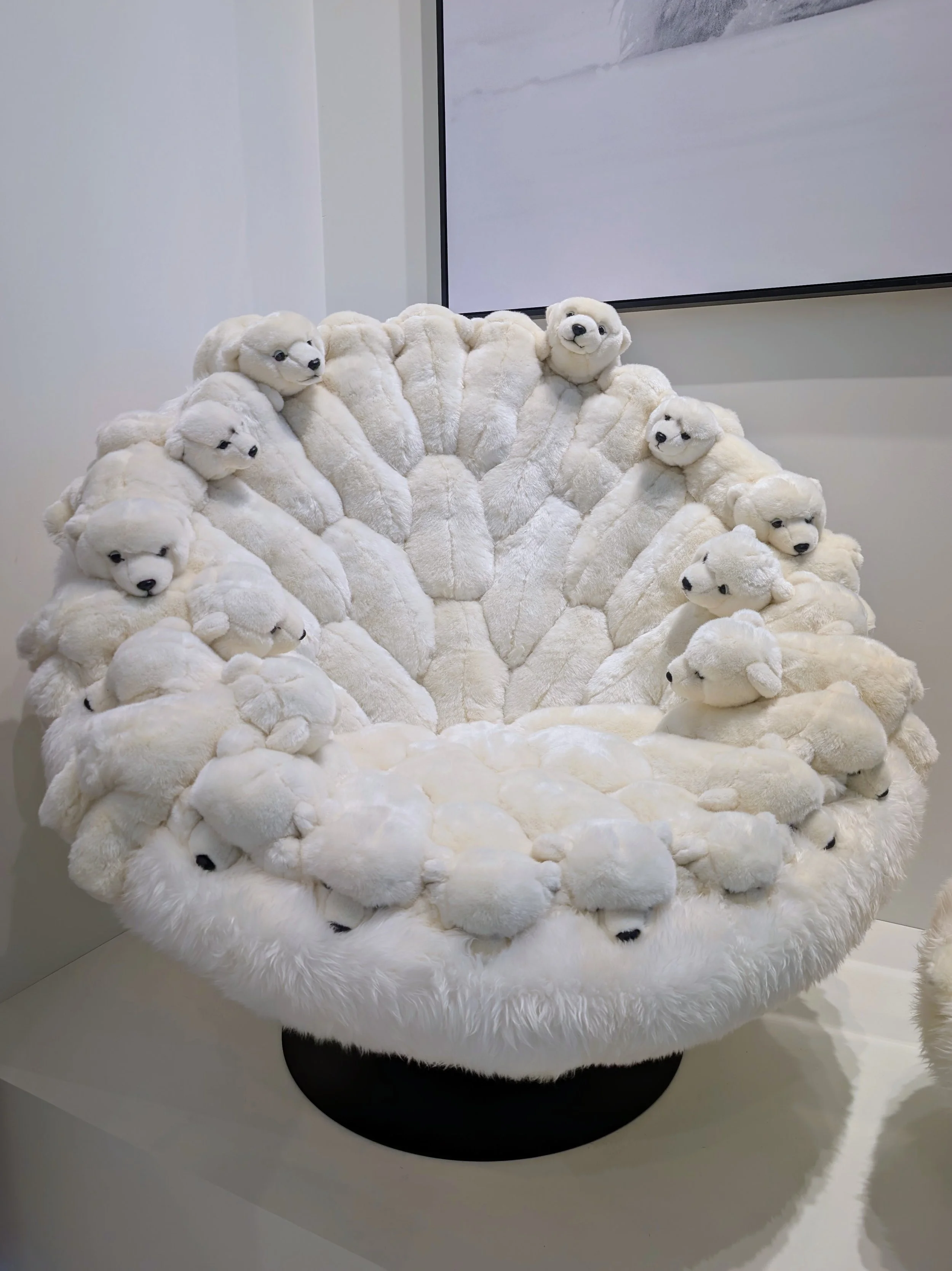
The obvious viral highlight: the Teddy Bear chair by AP Collection x Steiff— an armchair made in collaboration with Steiff (yes, the German plush toy company). Yes, it's exactly what you're imagining. Yes, it's genuinely for sale. Yes, it will probably end up in some very specific homes.
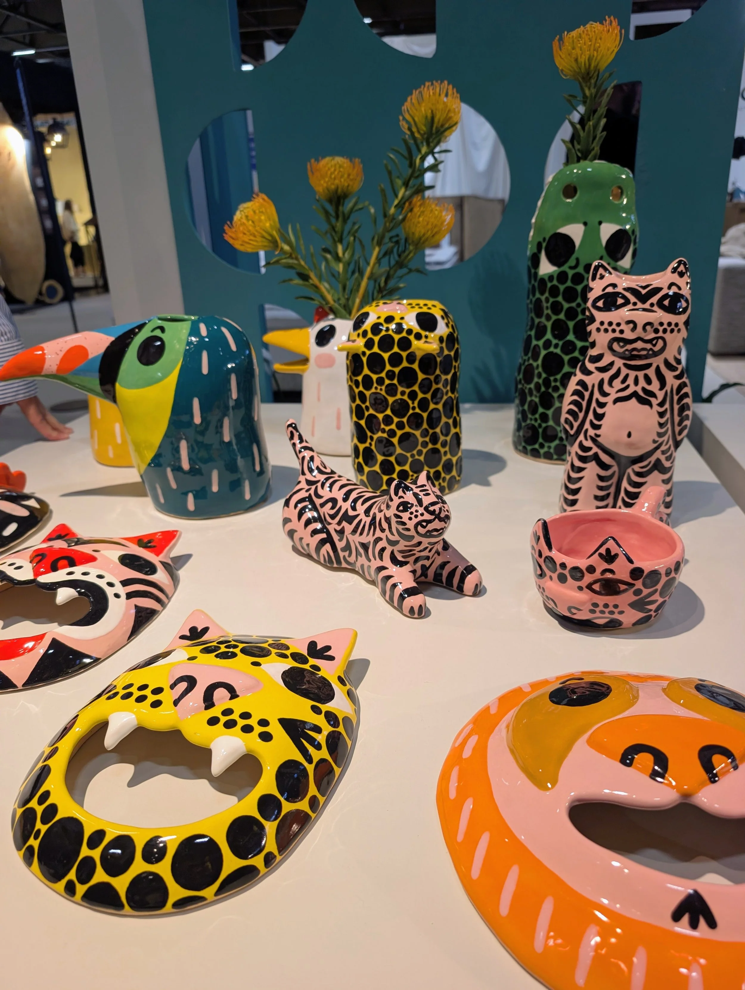
Another one that made me smile:
the colourful animal ceramics by Ceramiquinho — playful, imperfect, characterful. Weird animals, colourful glazes, the kind of pieces you either love immediately or you don't.
I've been calling this whole trend Cruella-core. It's playful, characterful, occasionally unsettling, and I still can't fully decide how I feel about it.
But here's my honest take:
I think the animal trend signals something bigger. Designers are giving themselves permission to be weirder, warmer, more theatrical. After years of "quiet luxury" trying to convince us home should look like a hotel, this is the design world remembering that home should also be a bit fun. A bit strange. A bit personal.
Whether Cruella-core specifically takes off in real homes? Ask me in six months. But the underlying trend — playful, characterful, unafraid pieces — is absolutely happening.
5. Where Art, Poetry and Interior Design Blurred Into One 🌸
The moments I keep thinking about weren't chairs or lamps or paint swatches. They were installations — the kind that don't fit neatly into "product" or "art" categories, and are all the more memorable because of it.
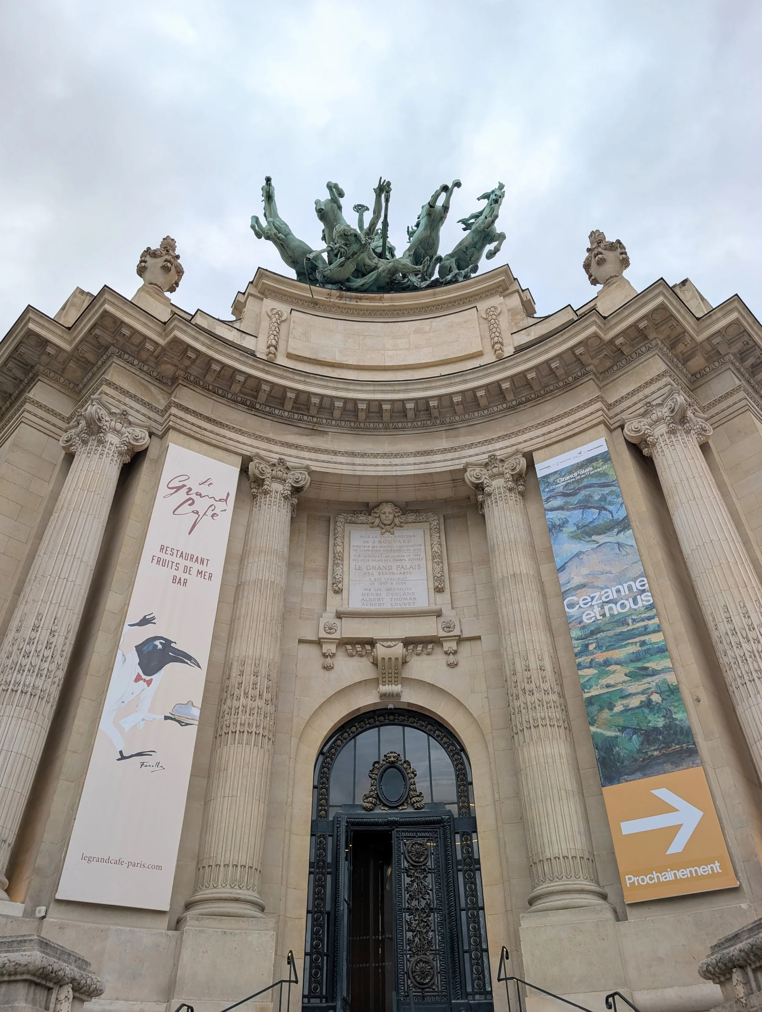
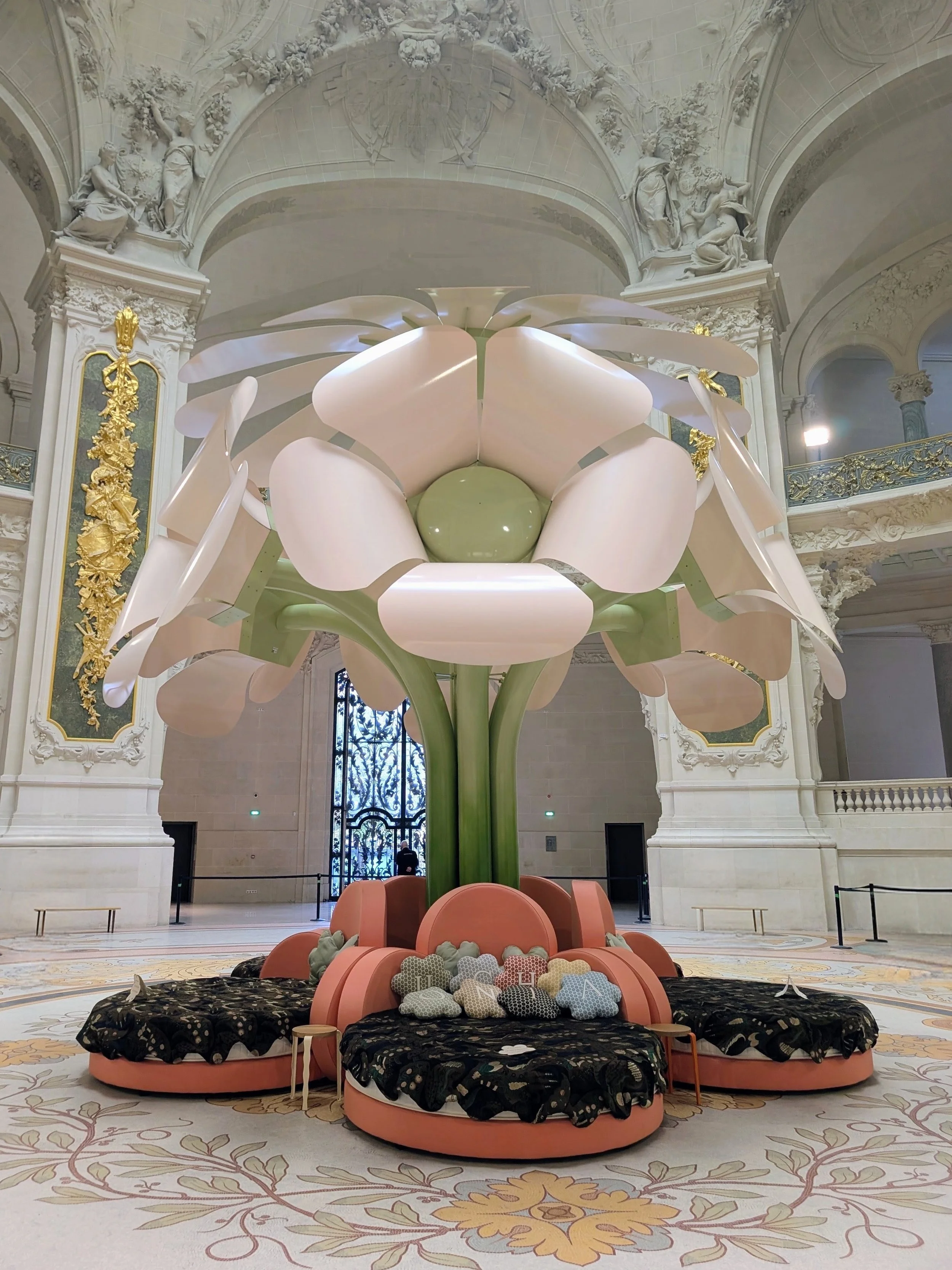
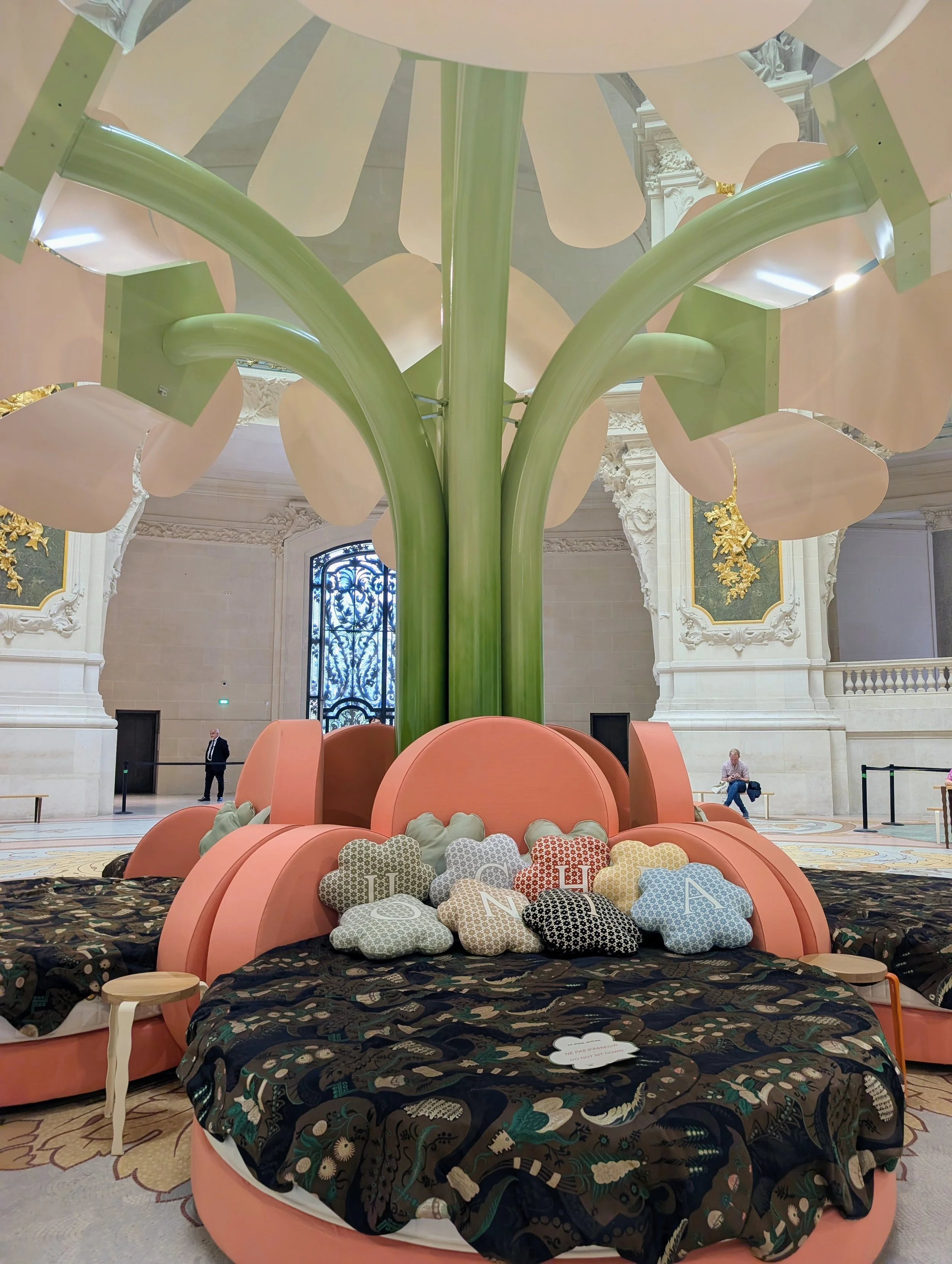
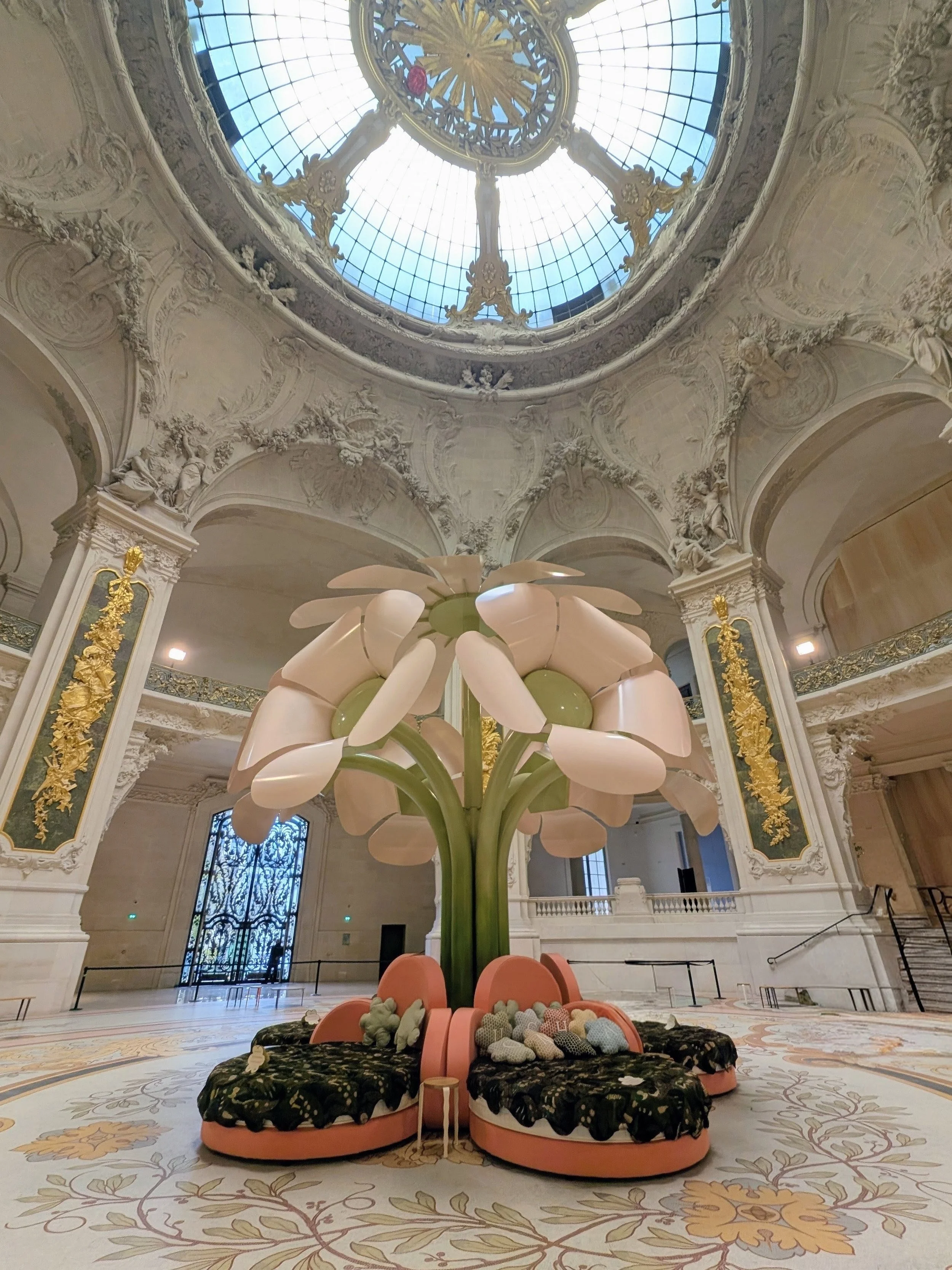
Le Grand Bouquet by Uchronia, blooming under the dome of Le Grand Palais, was objectively the most iconic moment of the whole week. If you haven't seen photos of this yet — go look. The scale, the joy, the pure celebration of colour on a monumental architectural stage. That single installation, honestly, tells you everything you need to know about where design is heading.
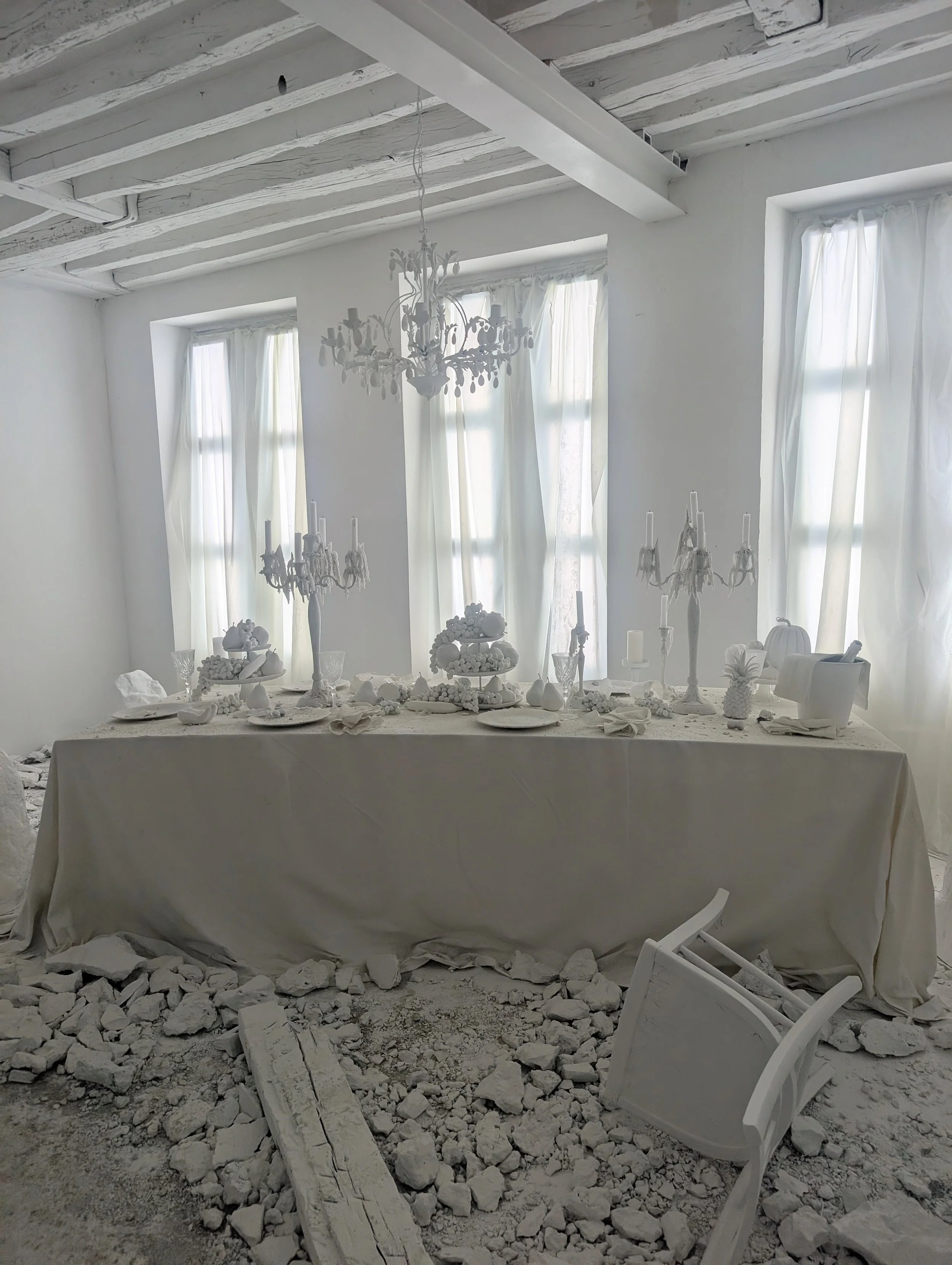
Equally memorable in a completely different way: L'hôtel des Possibles by Maison Kyka — an installation capturing that specific fleeting moment just before a renovation begins, when a space still holds its full potential. Genuinely poetic. The kind of concept that lodges in your brain and won't leave.
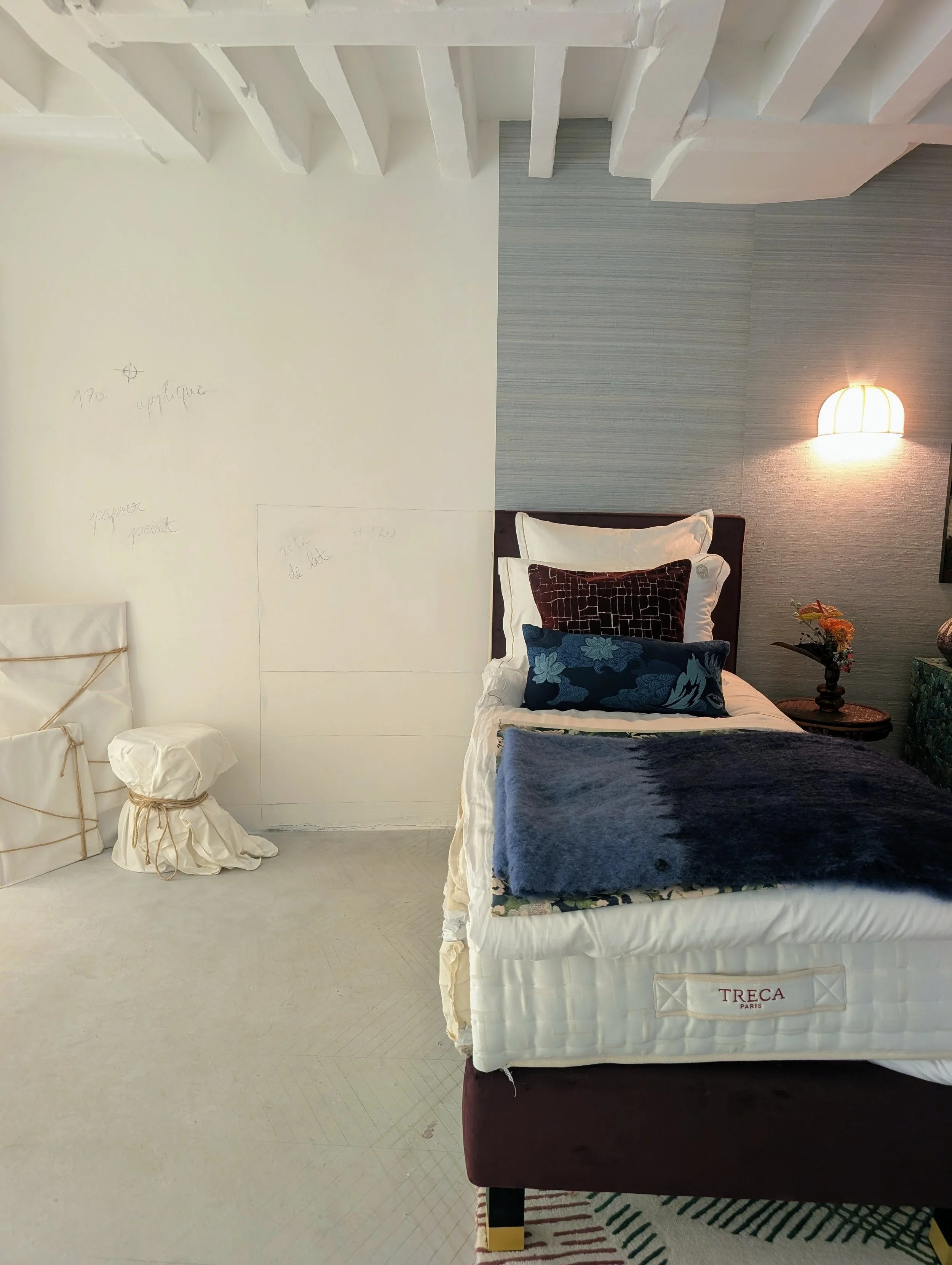
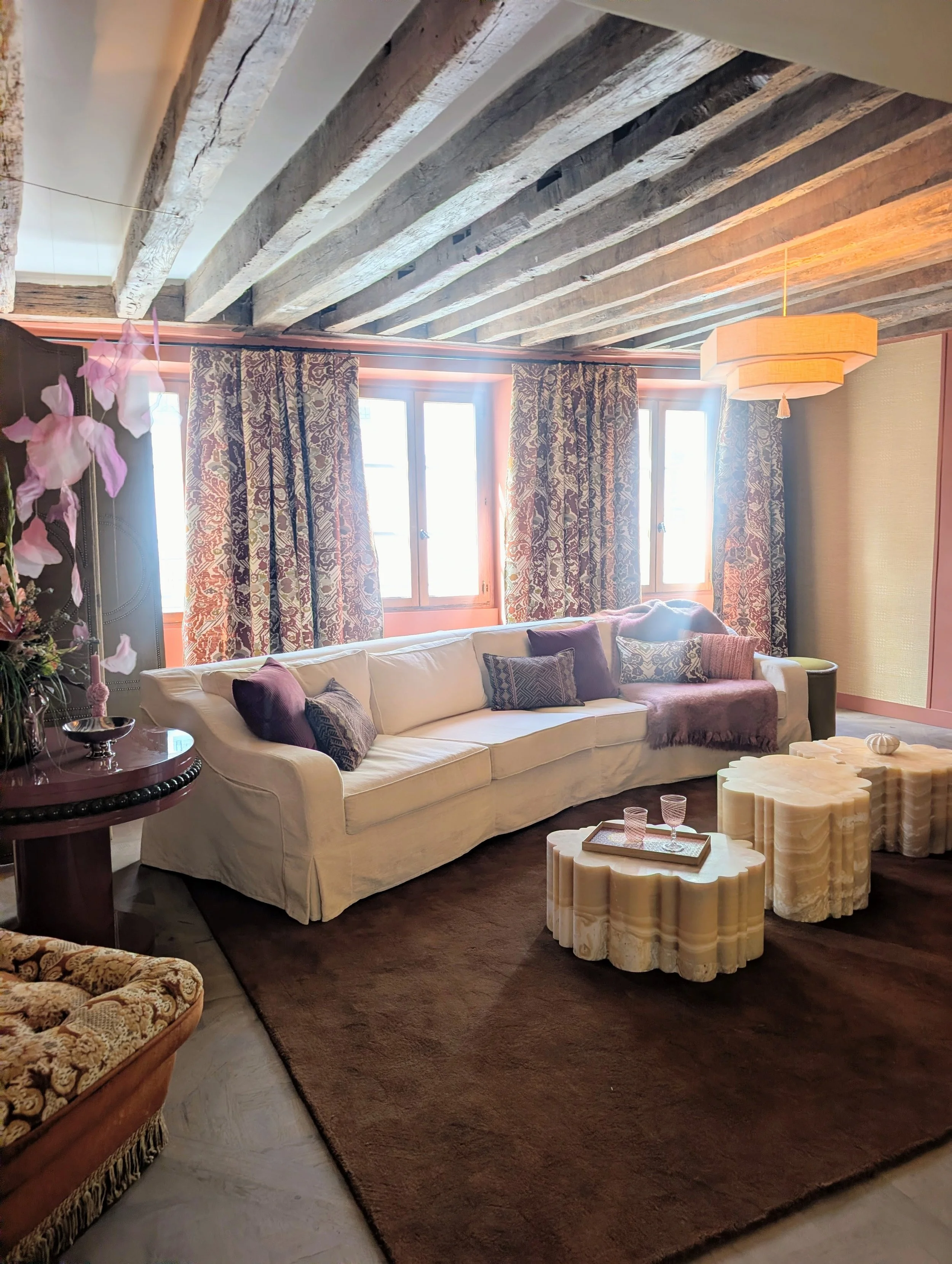
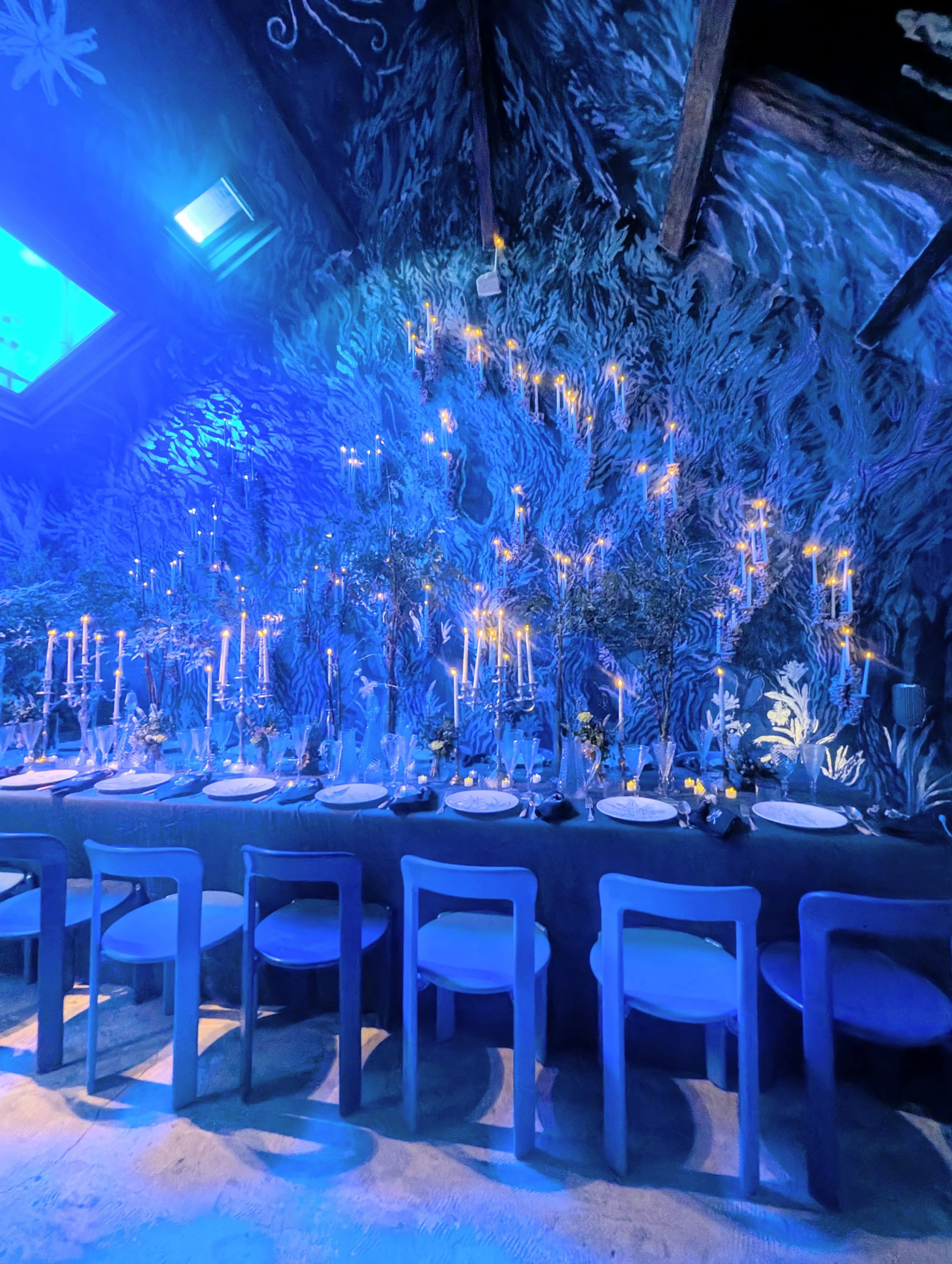
And then there was the joyful, quirky chaos at Espaces Commines + Galerie Joseph— including @napalosa_, @lisa.alegot.art, Muna Space and @wearedecadentstudio. Genuine playful energy across every corner. This is where the fun of Paris Design Week lives — smaller spaces, independent makers, work that hasn't been sanitised by a big brand's marketing team.
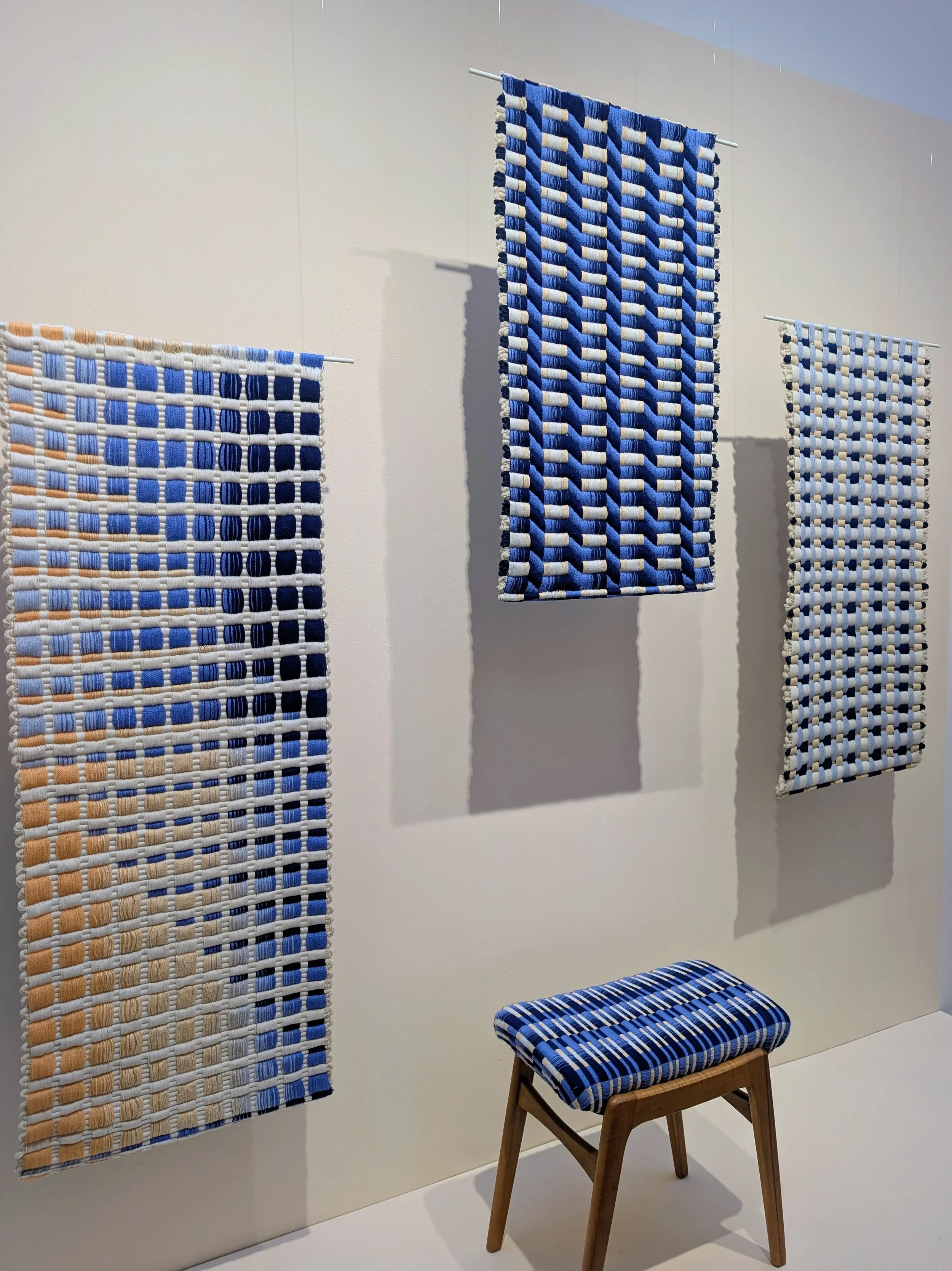
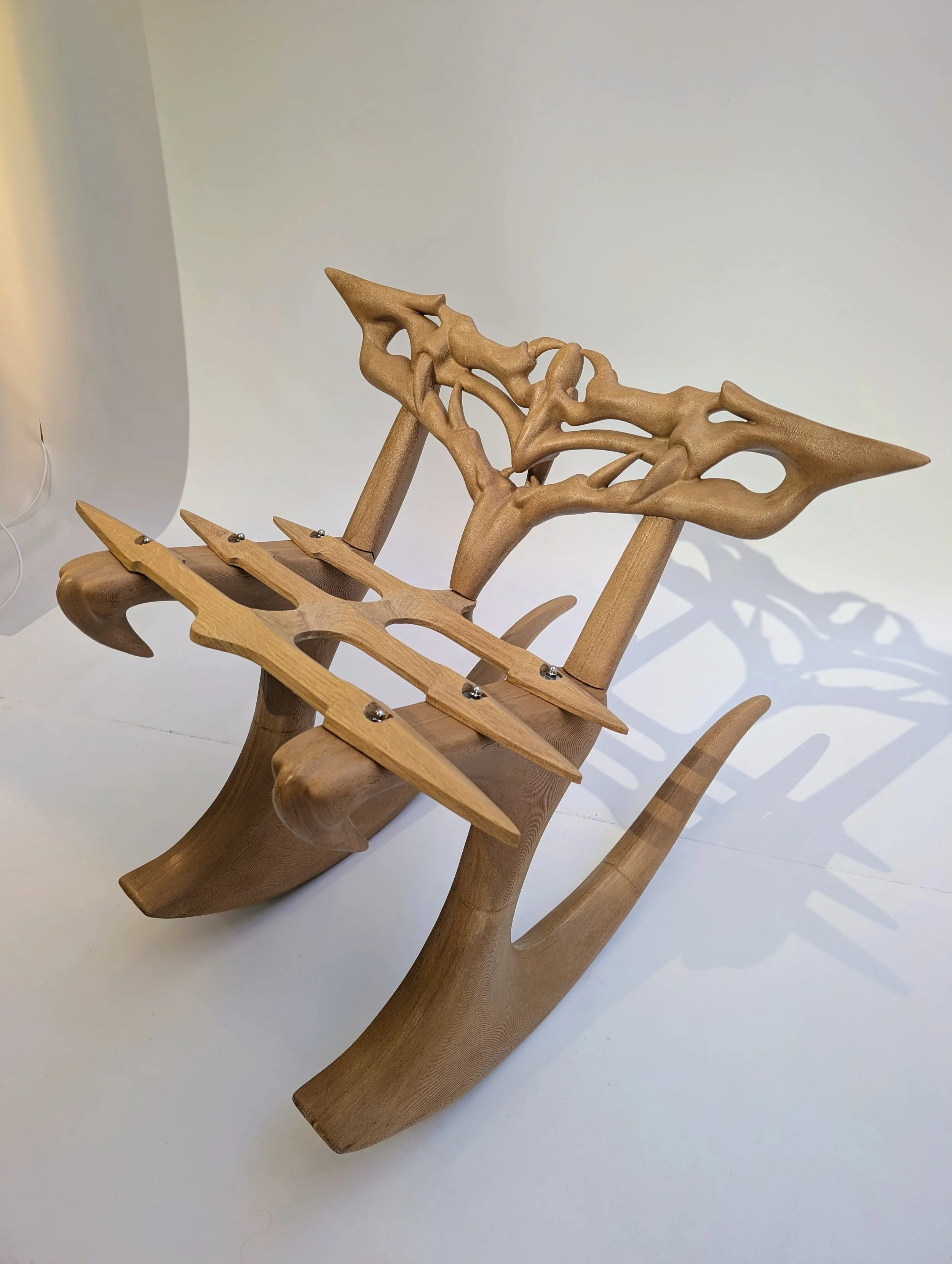
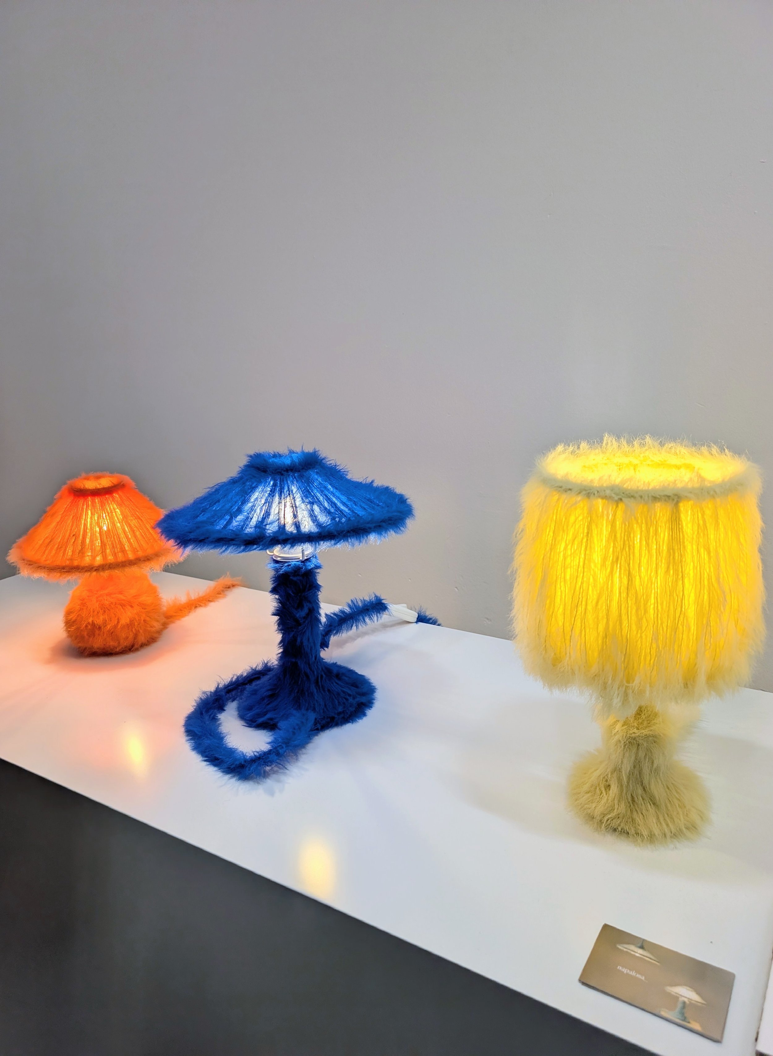
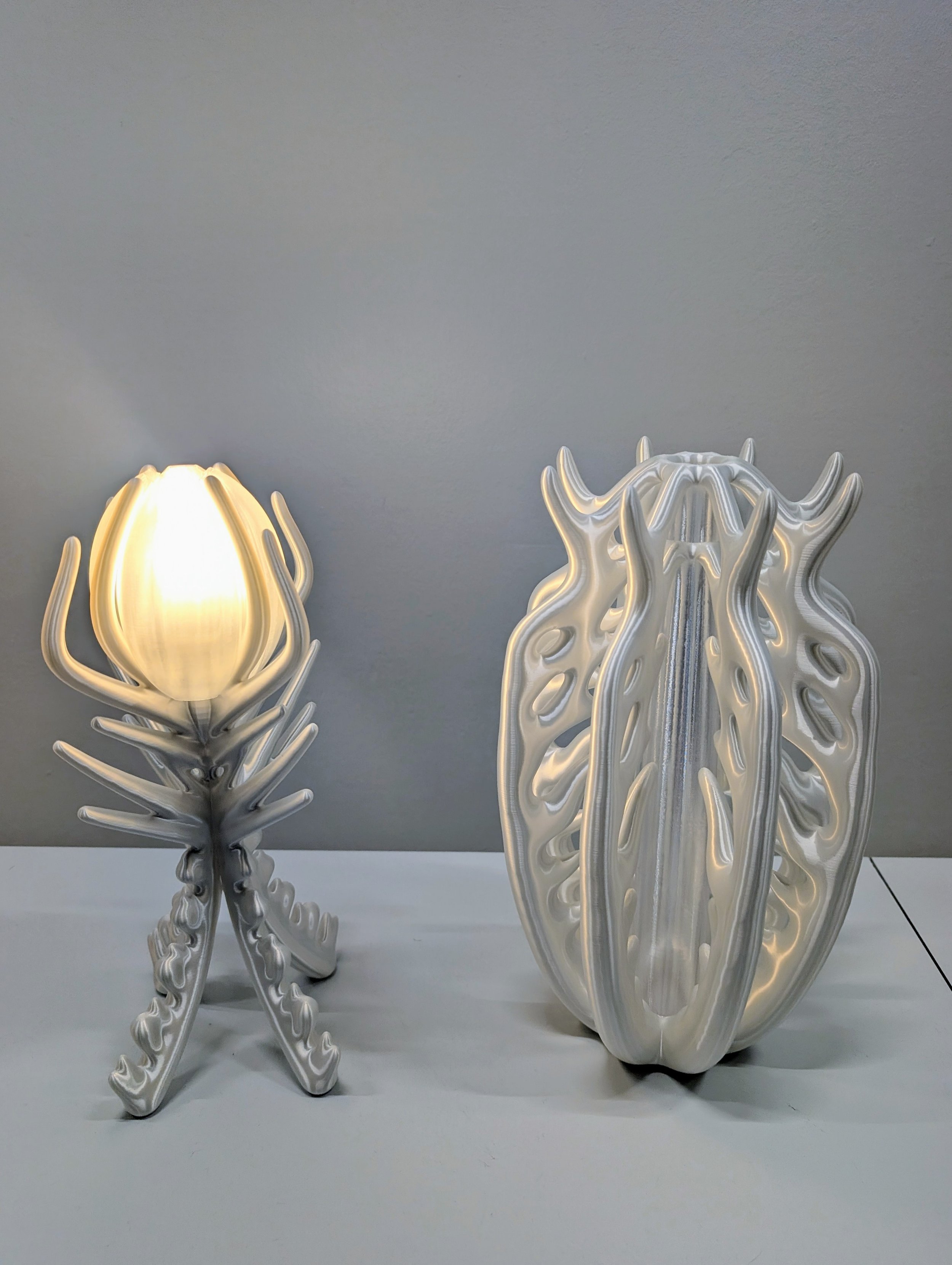
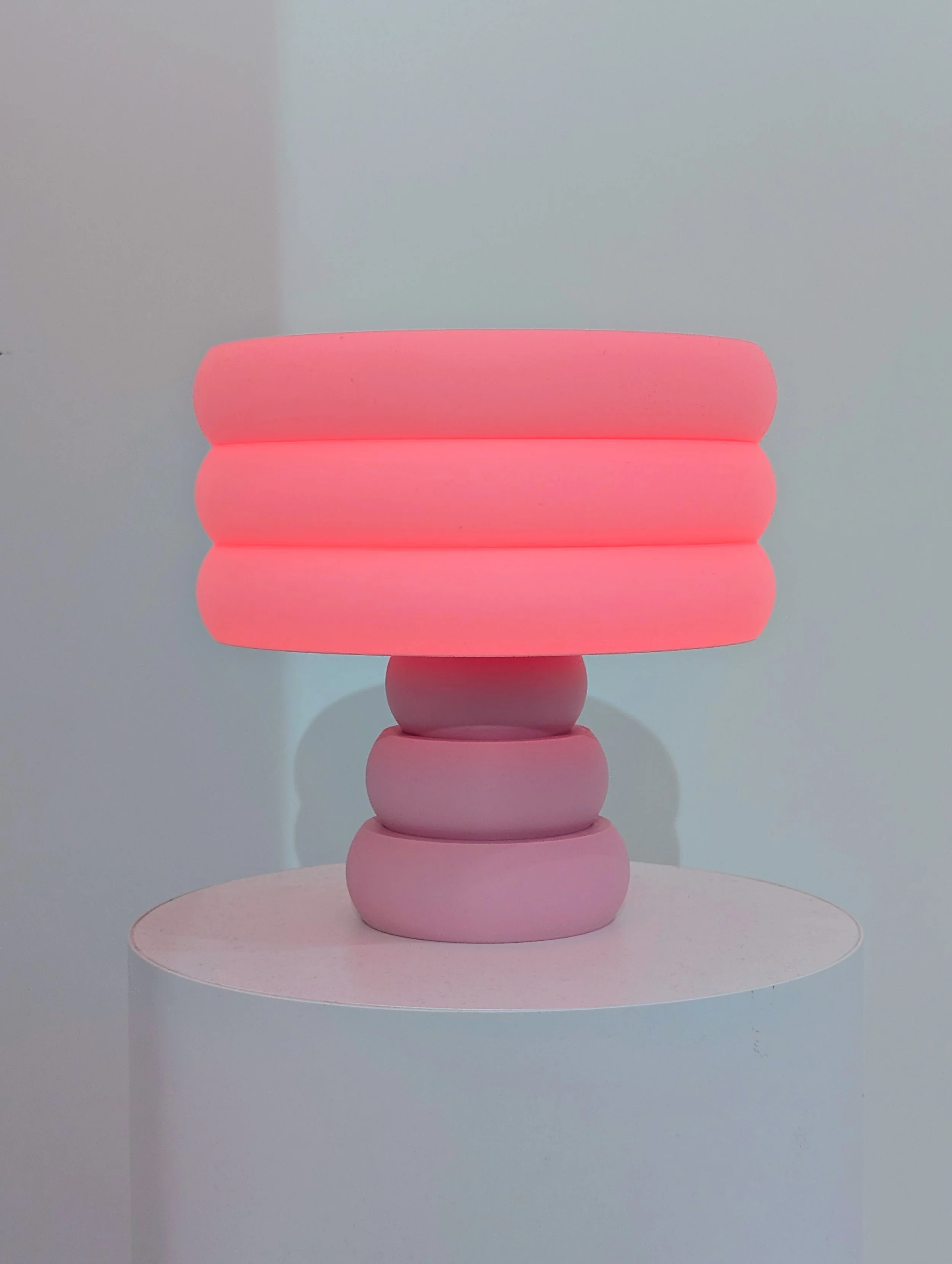
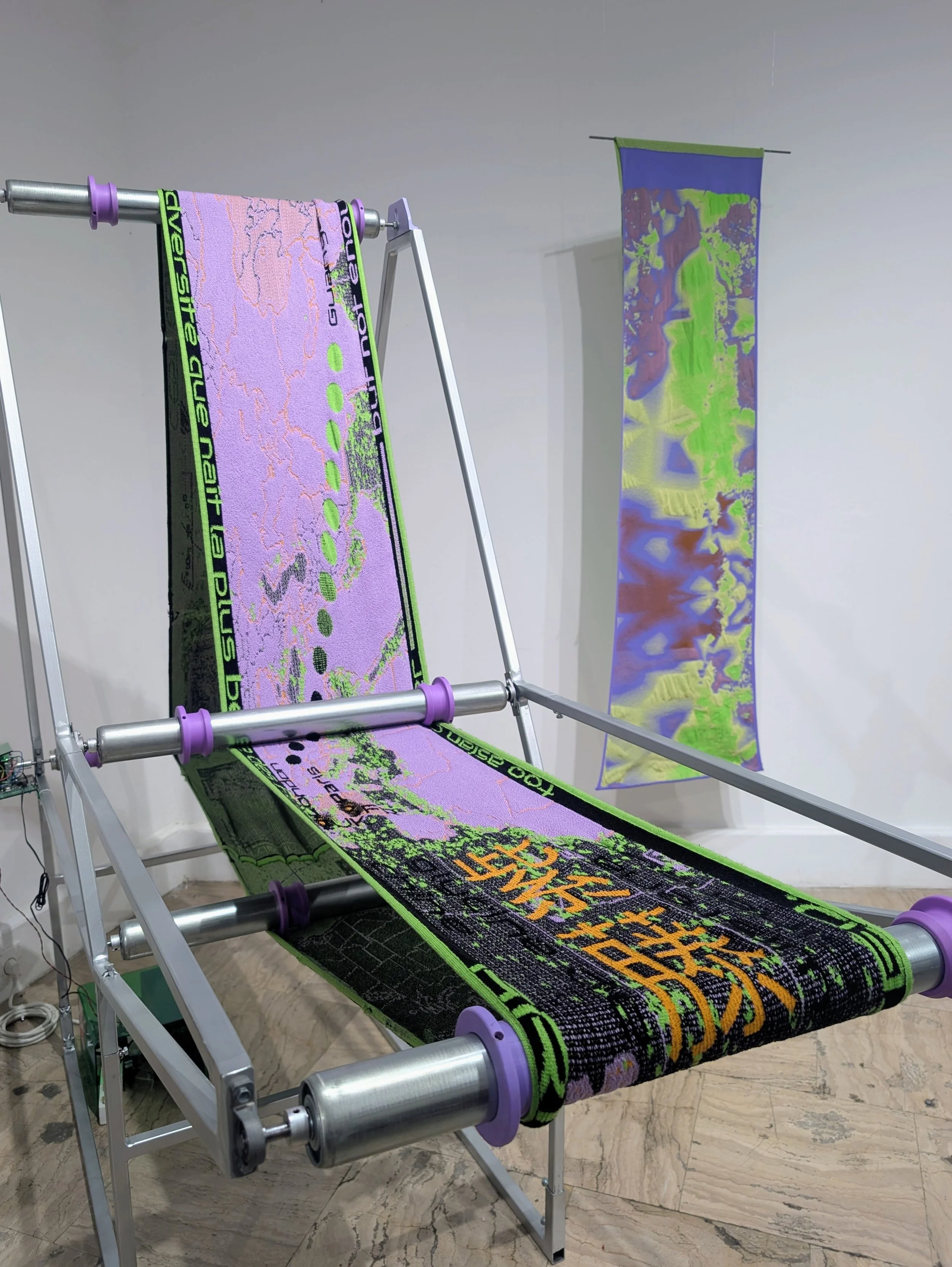
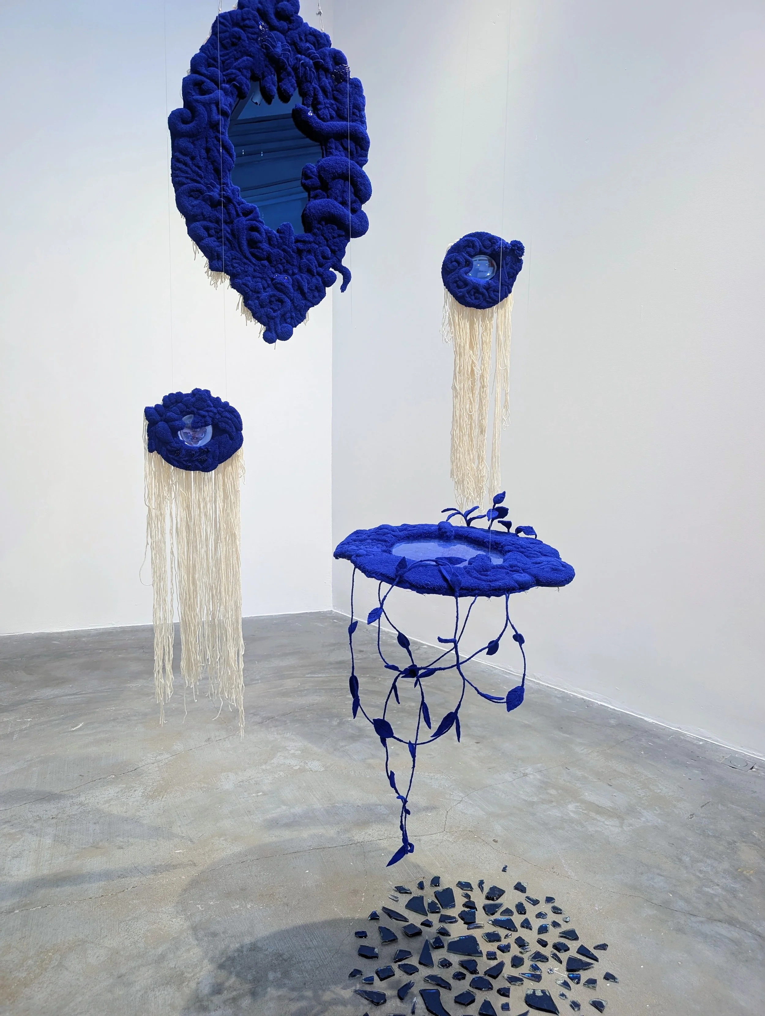
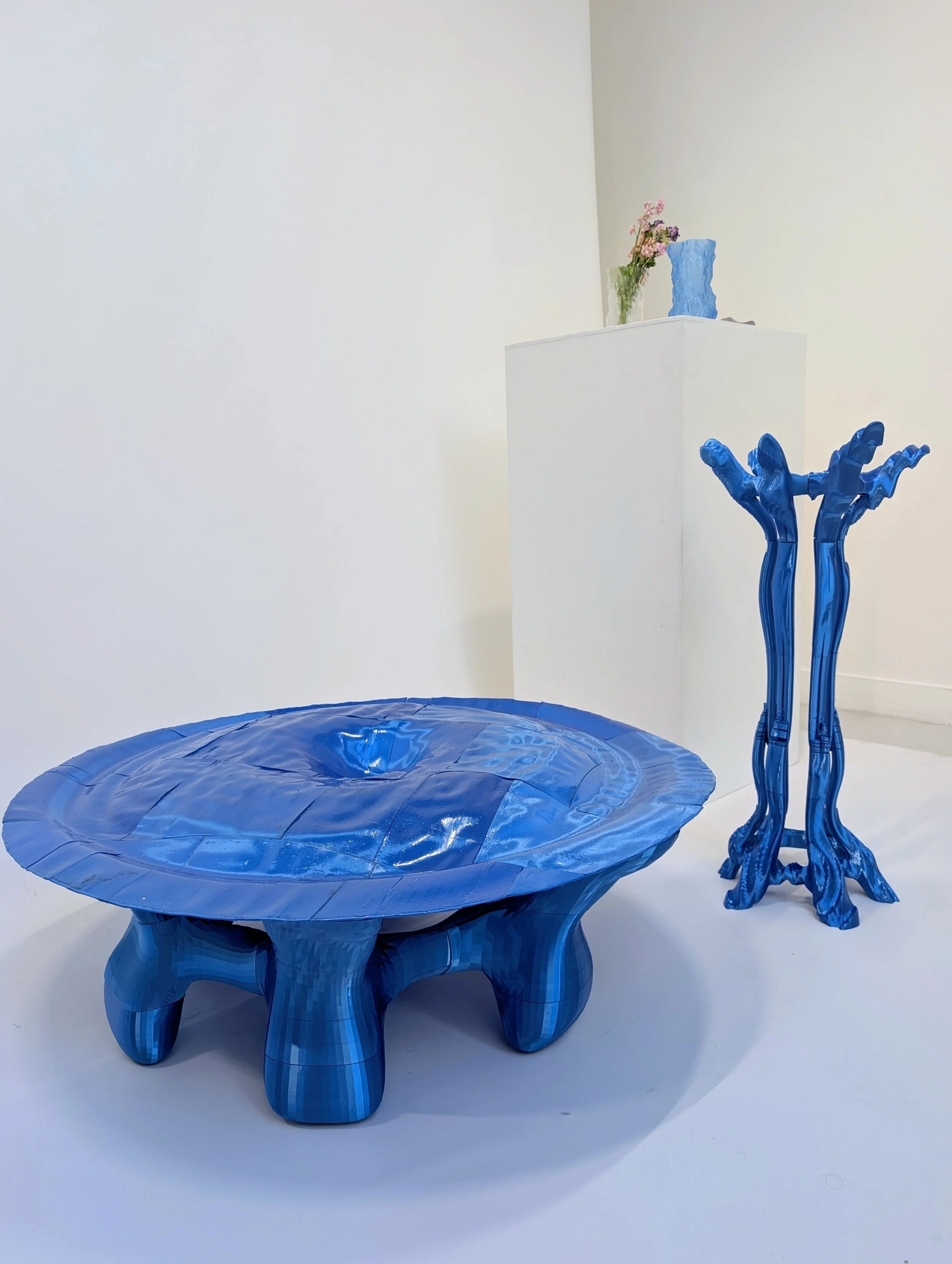
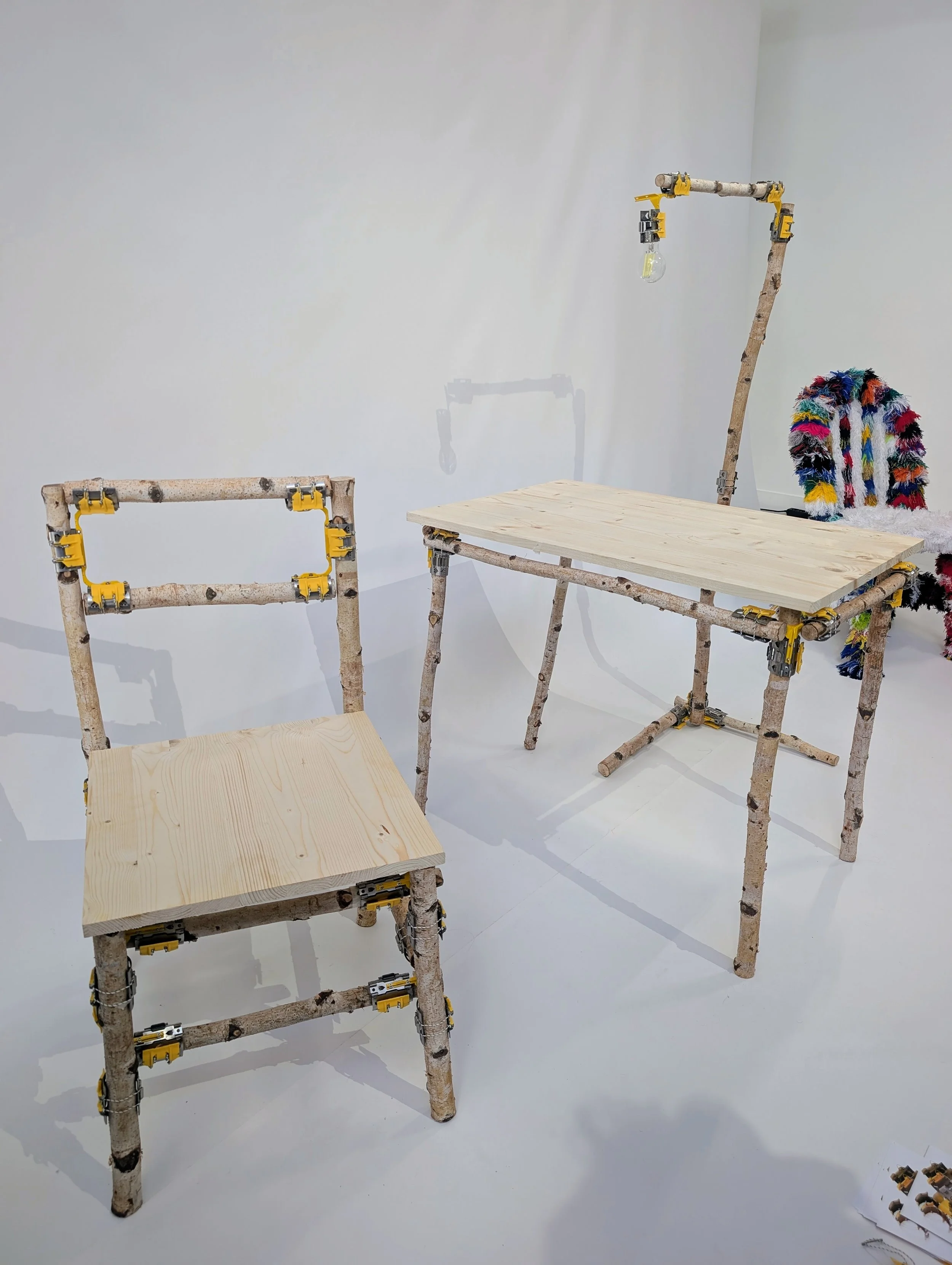
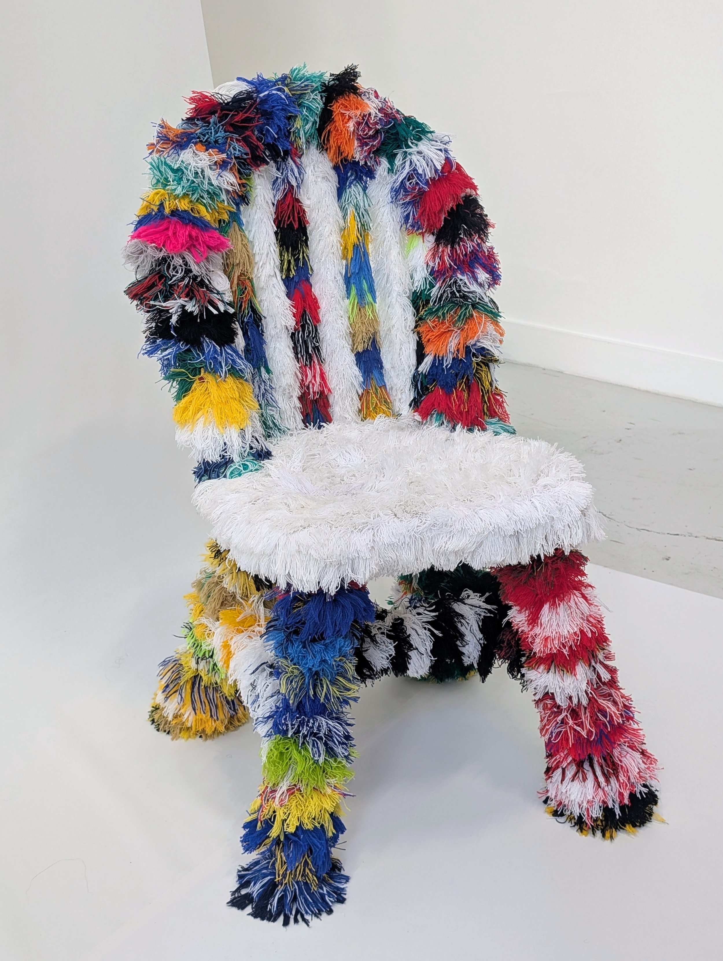
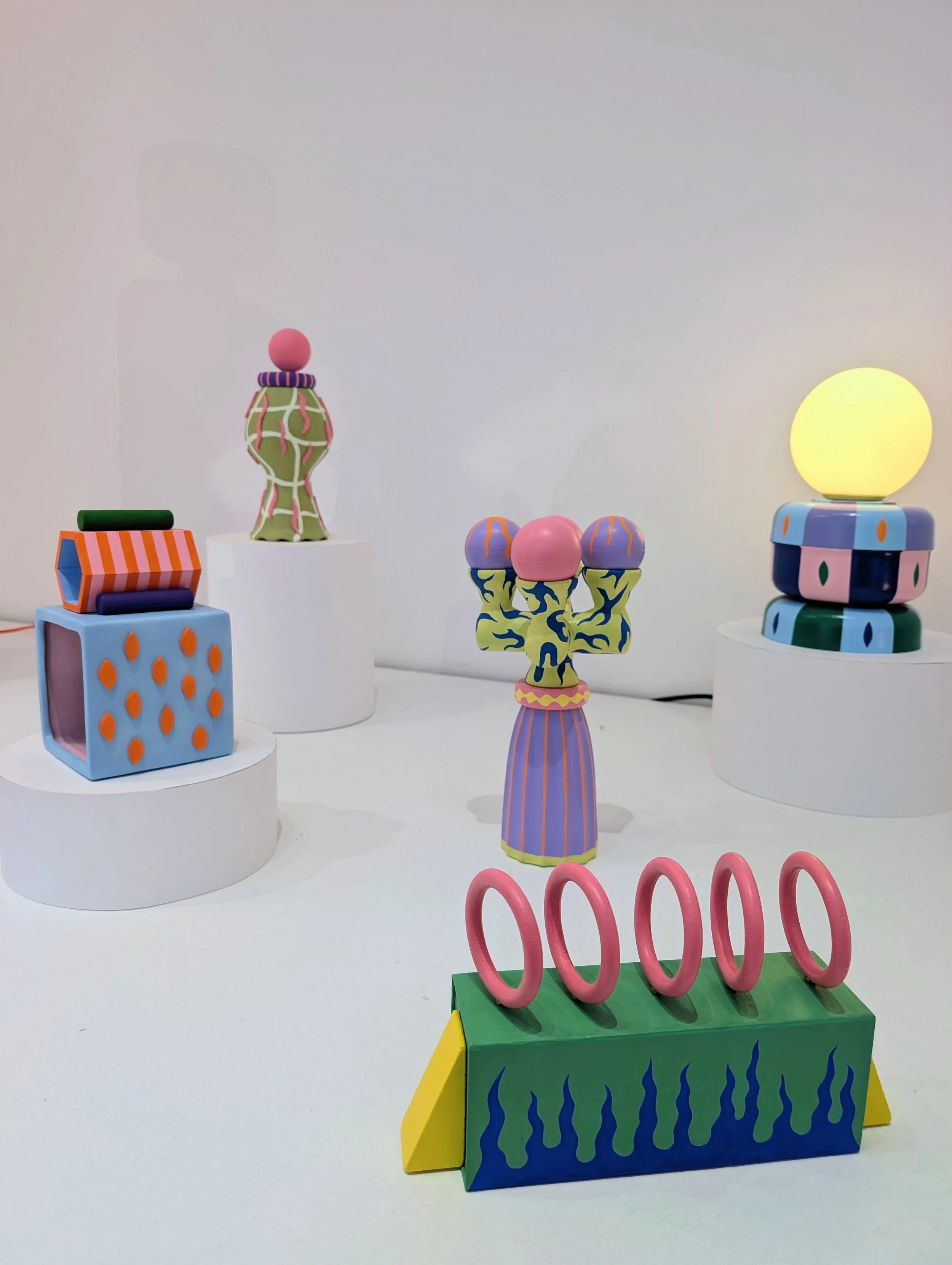
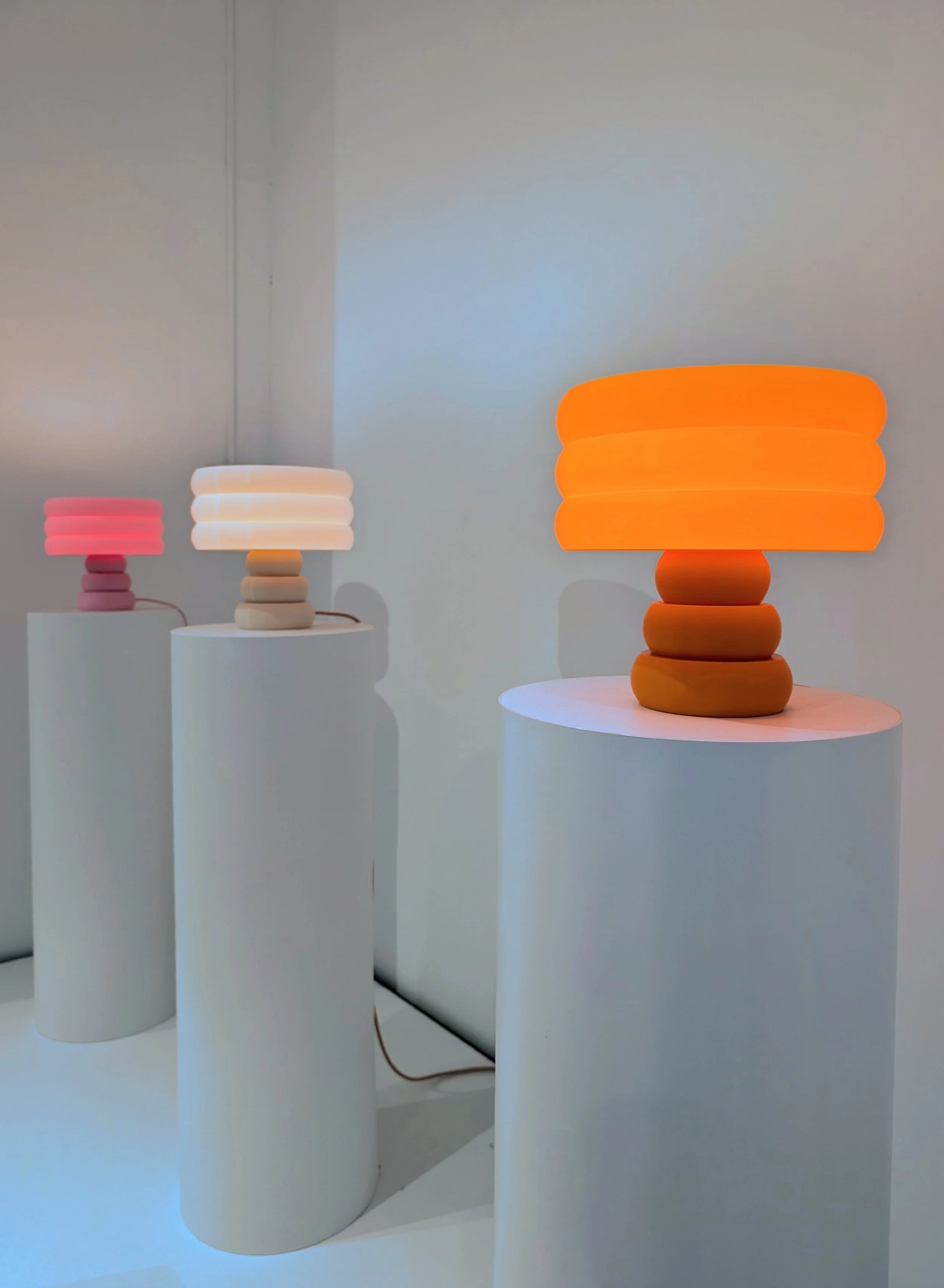
What all these moments had in common: they refused to stay in a category. Design bleeding into art. Art bleeding into architecture. Poetry made physical. That's the sweet spot Paris hits when it's at its best, and this year it was hitting properly.
6. The Best Part Is Always The People 💛
One quick warm note before I wrap up: the highlight of my whole trip wasn't a product or an installation.
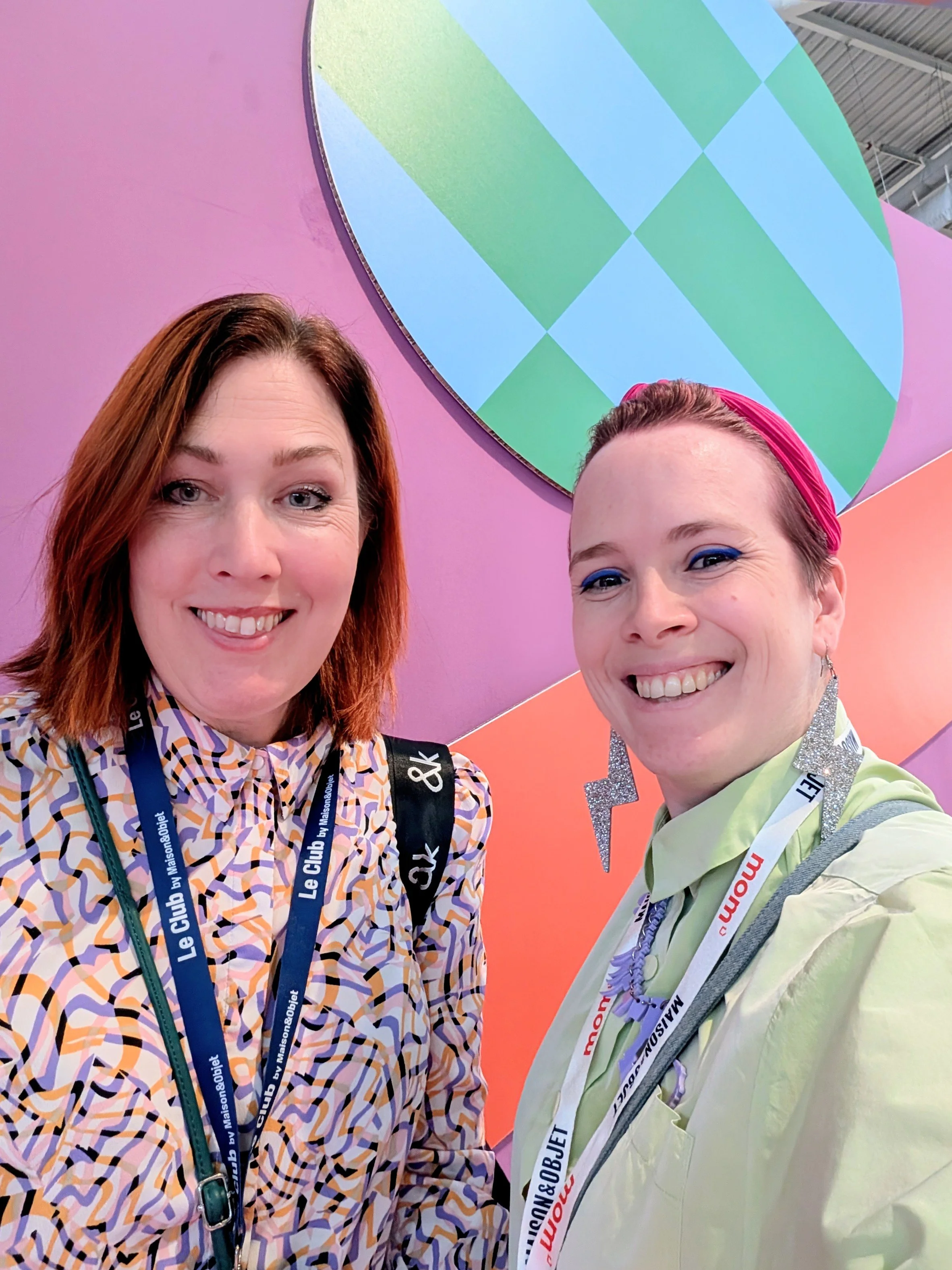
It was meeting Cissi Åhlén (@mylifeinmulticolor), a proper kindred spirit, a colour lover, and one of those humans whose energy makes you leave a conversation feeling ten times more optimistic than when you started. Cissi, if you're reading, thank you 💛.
Trend reports come and go. Products get produced and forgotten. But meeting your people is what makes the whole industry worth being in.
7. What I'm Bringing Home 🌈
Here's what I want you to take from this, because trend reports are only useful if they actually change how you think about your own home.
Colour isn't optional anymore. Every project I take on this autumn is going to lean bolder.
Handmade over mass-produced. Even one properly crafted piece changes the personality of a room.
Lighting is the trend to invest in. A single sculptural piece does more than three "safe" ones combined.
Permission to be playful. The design world just gave you the green light to add character to your home. Take it.
Weird is welcome. After years of restraint, weird is having its moment.
Playful just quietly became the most grown-up thing you can put in a home 🌈
If you've been quietly thinking about bringing colour, playfulness, or personality into your space this autumn — the whole design world just told you it's time.
🌈 Want help bringing this energy into your home this autumn?
My autumn calendar is officially open — and after seeing what Paris was celebrating, I'm more excited than ever to work on colourful, characterful, personality-forward homes across the UK.
Whether it's one room, a full project, or just a Discovery Call to figure out where to start, I'd love to chat!
Or if you'd rather learn to see design the way I do — colour, contrast, personality, the whole toolkit, you can find it all inside my online course: